01The full site
The Publion homepage, in motion
Recorded on the live site: the homepage as a visitor sees it, from the headline to the landscape beneath it.
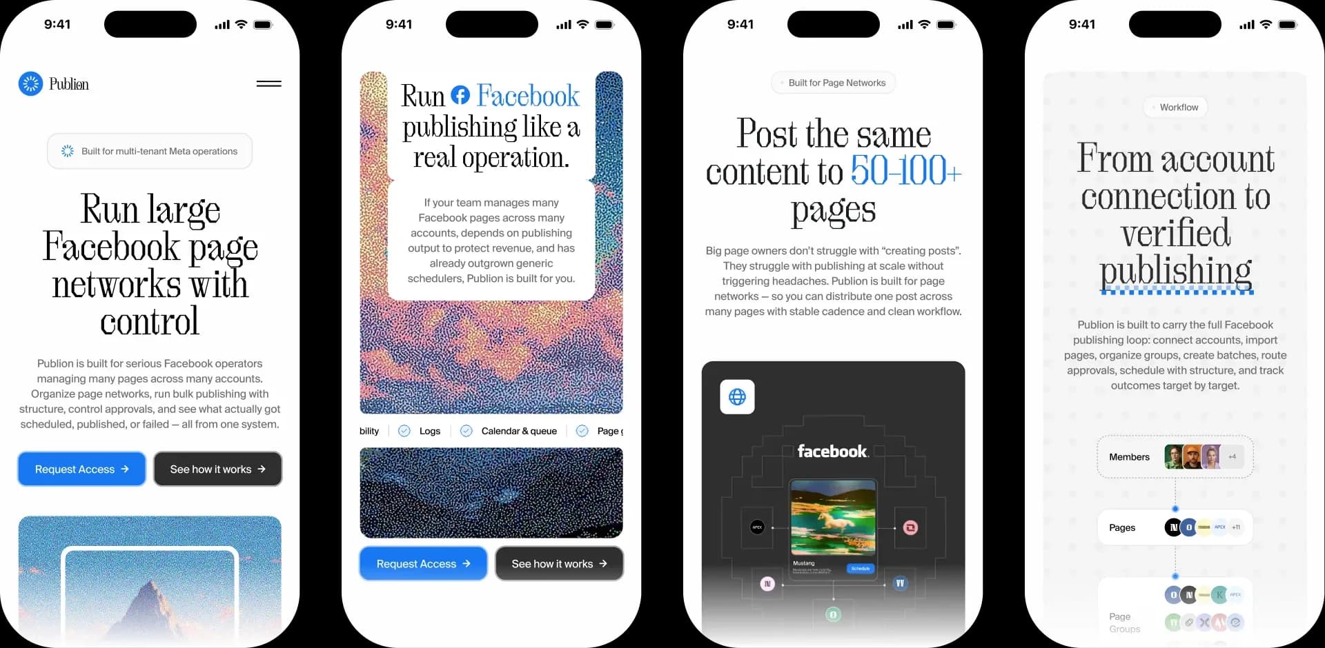
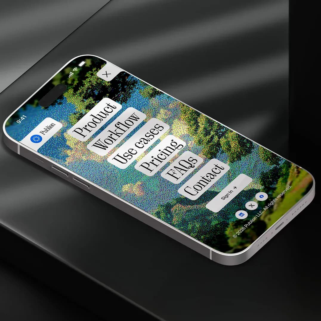
Built for the phone too
The headline, the flow and the landscapes carry down to a phone screen, so an operator can check on their network from anywhere.
02The challenge
Running fifty or a hundred Facebook pages is an operations job, and the software for it should look like it knows that.
Built for operators, not for casual posting
Publion is for people who manage many pages across many accounts. They need to organise networks, run bulk publishing without improvising, control approvals, and see exactly what was scheduled, what published and what failed, all from one system.
Most social tools speak to an individual posting from one account. That is a different buyer with different fears. The brand had to say it before the first demo: this is built for scale, and it keeps you in control.
03Strategy
Structure, control, clarity
For operators running Facebook page networks, Publion is the system that keeps every page, approval and post in order, so scale feels controlled instead of chaotic.
- 01
Structure
Page networks organised and bulk publishing run with a method, instead of improvised across accounts.
- 02
Control
Approvals handled in the system, so nothing reaches a page without passing through the right hands.
- 03
Visibility
A clear view of what was scheduled, what published and what failed, at network scale.
04Identity
A circular mark for continuous flow
The symbol is a circular system mark. It stands for continuous publishing flow, distribution across a network and workflows kept in sync across many pages. A circle has no loose ends, which is the feeling an operator wants from a publishing system.

Editorial type for the brand, a clear one for the product
Typography pairs OT Brut with Suisse Int'l. OT Brut gives headlines and key brand moments a distinctive editorial voice. Suisse Int'l keeps dashboards, interface and supporting copy clean and easy to read, so the product stays calm even when the data is dense.


05Imagery
Landscapes as quiet metaphors for oversight
Software for operations tends to default to dashboards and stock UI. We chose calm landscapes instead. Each scene stands for an idea the product delivers: visibility, workflow control, approvals, publishing health, structure and operational oversight.
A dithered, pixel-grain finish gives the pictures a texture of their own and ties them to the screen they live on.

06In the world
Built for scale, not casual posting
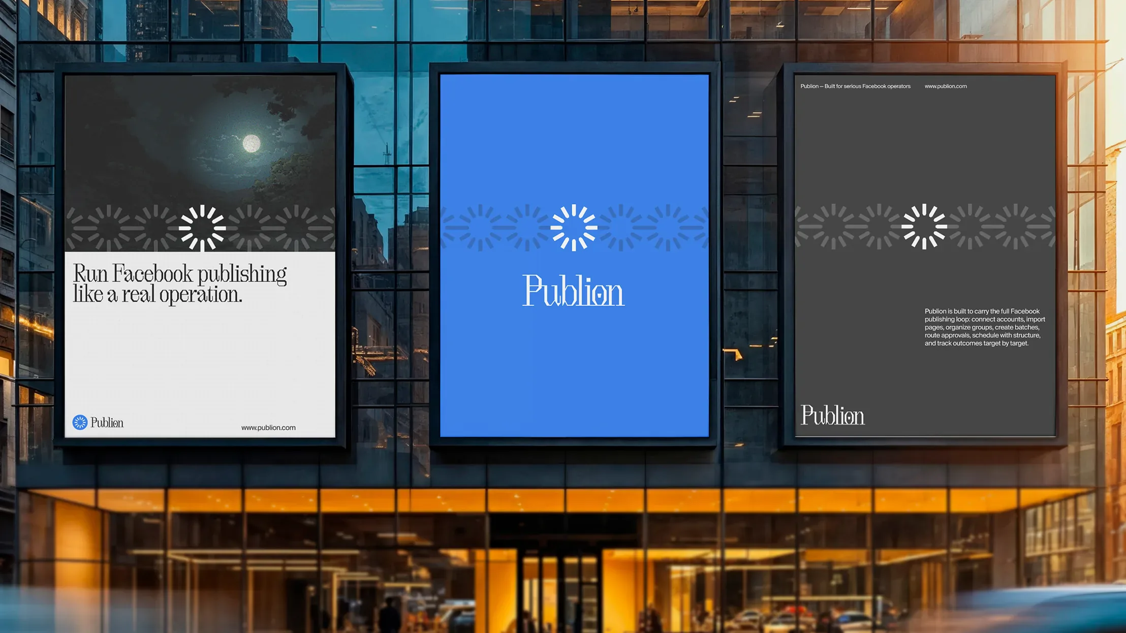
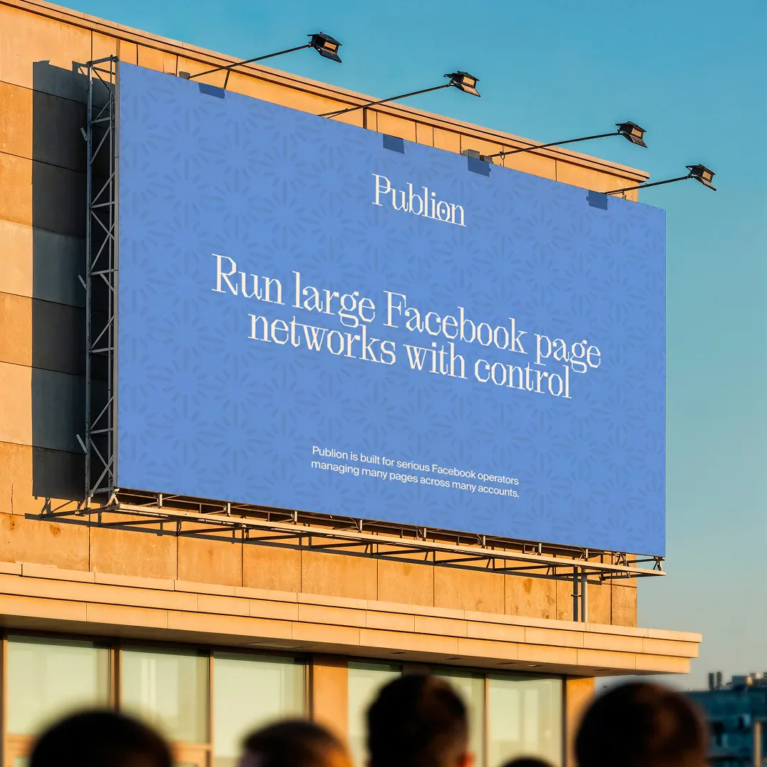
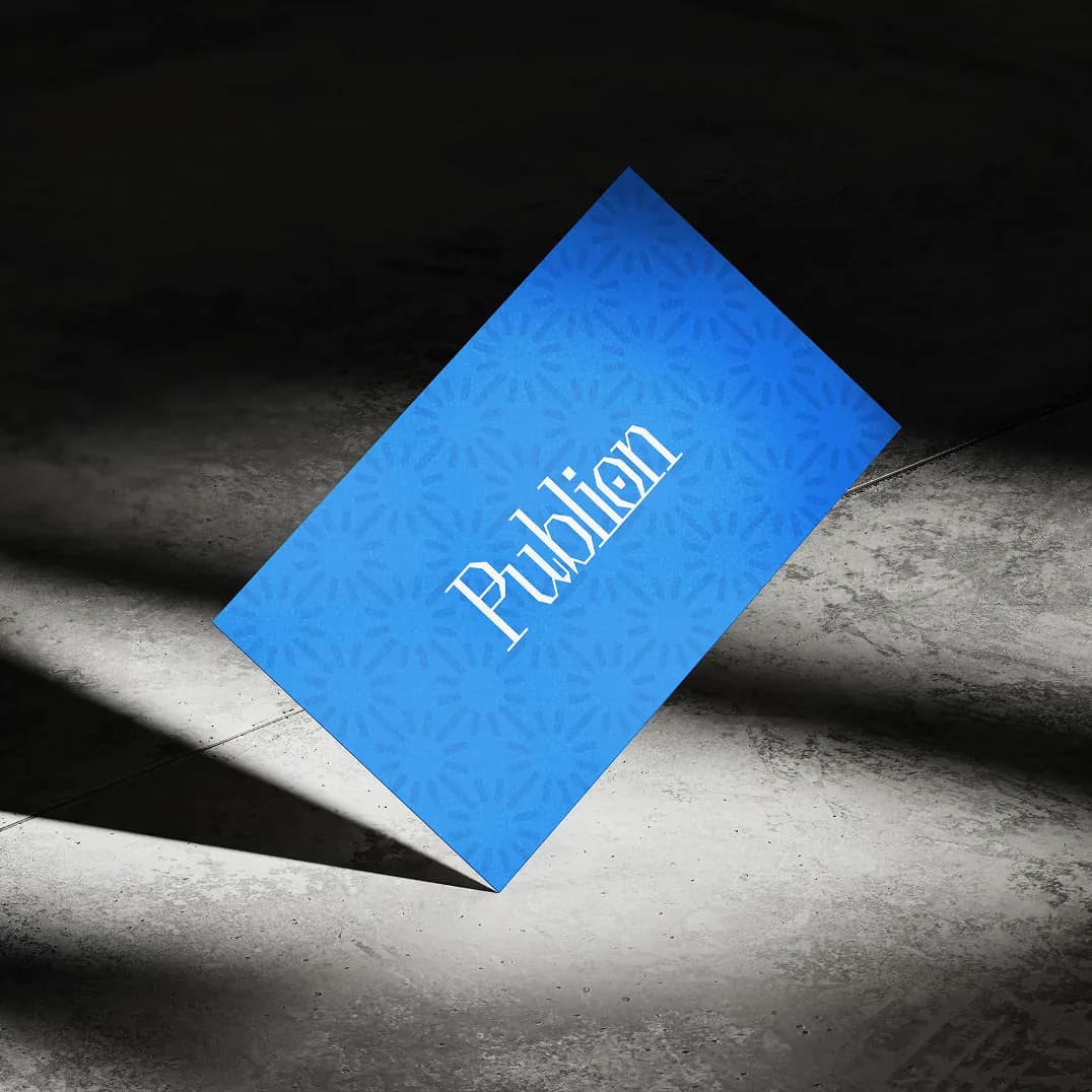
The system carries off the screen too: billboards and building posters, and the things a team carries and wears.





07Impact & proof
- 1,000s
- Pages automated in single publishing networks
- 10M+
- Monthly post impressions handled without delay
- 100%
- Zero-latency automated post scheduling
Metrics published by Publion operators as of 2025 across active page networks.
Brand
- Logo and circular symbol
- Typography system
- Imagery and art direction
Website
- Site design
- Mobile layouts
- Motion
Development
- Front-end build
- Responsive implementation
Applications
- Billboards and posters
- Stationery and ID
- Merchandise