01The challenge
A newsletter has no product to hold, so the brand and the reading experience are the product.
An independent voice in a crowded inbox
The Output is an independent, irreverent playbook for people building companies. It distils messy experiments in growth, content and AI into crisp, evidence-packed stories that founders and marketing leaders can use on Monday morning.
Growth media is crowded and mostly interchangeable. The brief was to look and feel like a publication with a point of view: independent, a little irreverent, and obviously built by people who do the work.
02Strategy
Field notes, not noise
The idea behind the brand is the idea behind the writing: take raw thought and make it meaningful. The identity had to show that transformation, from noise to signal, without turning into a metaphor nobody needed.
Built for Monday, not someday.
03Identity
A symbol that turns noise into a wave
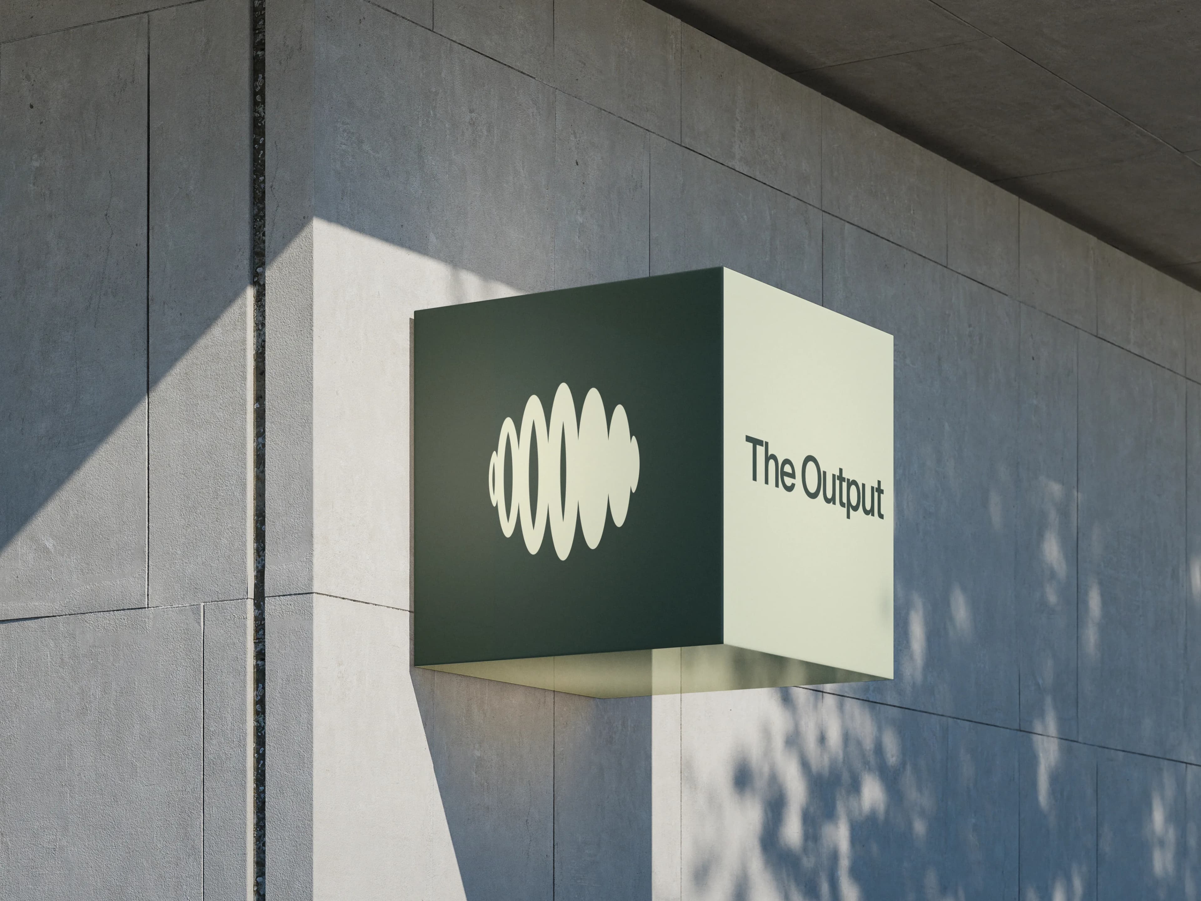
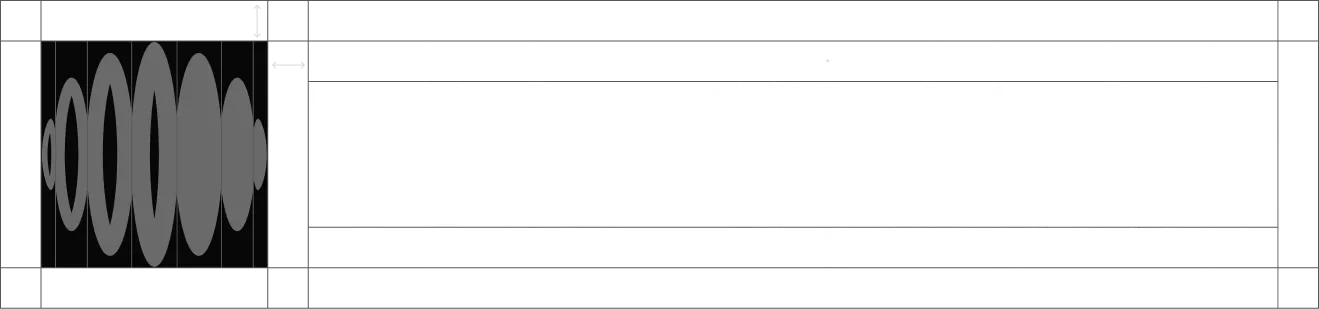
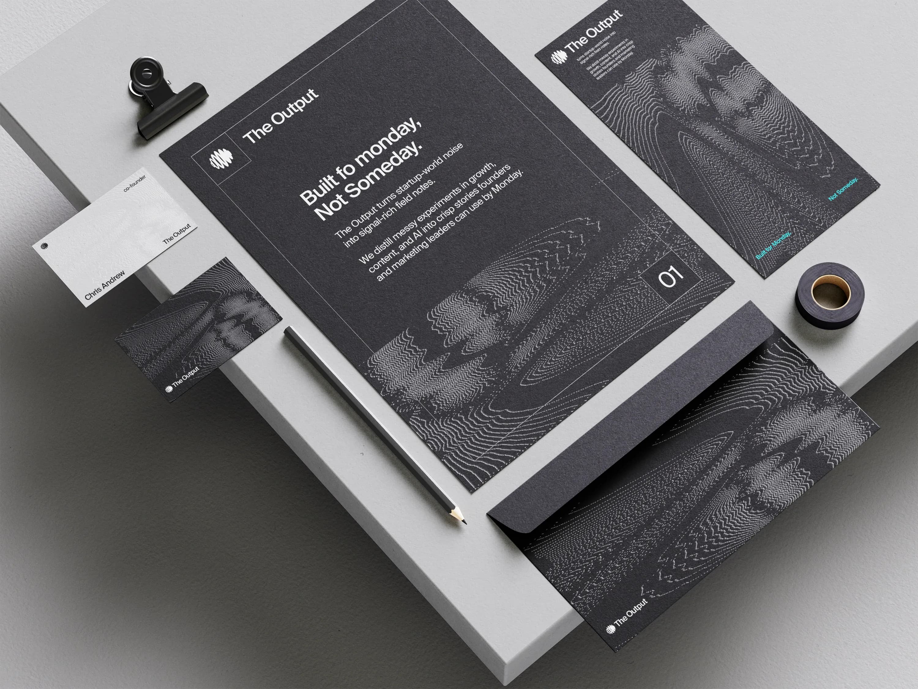
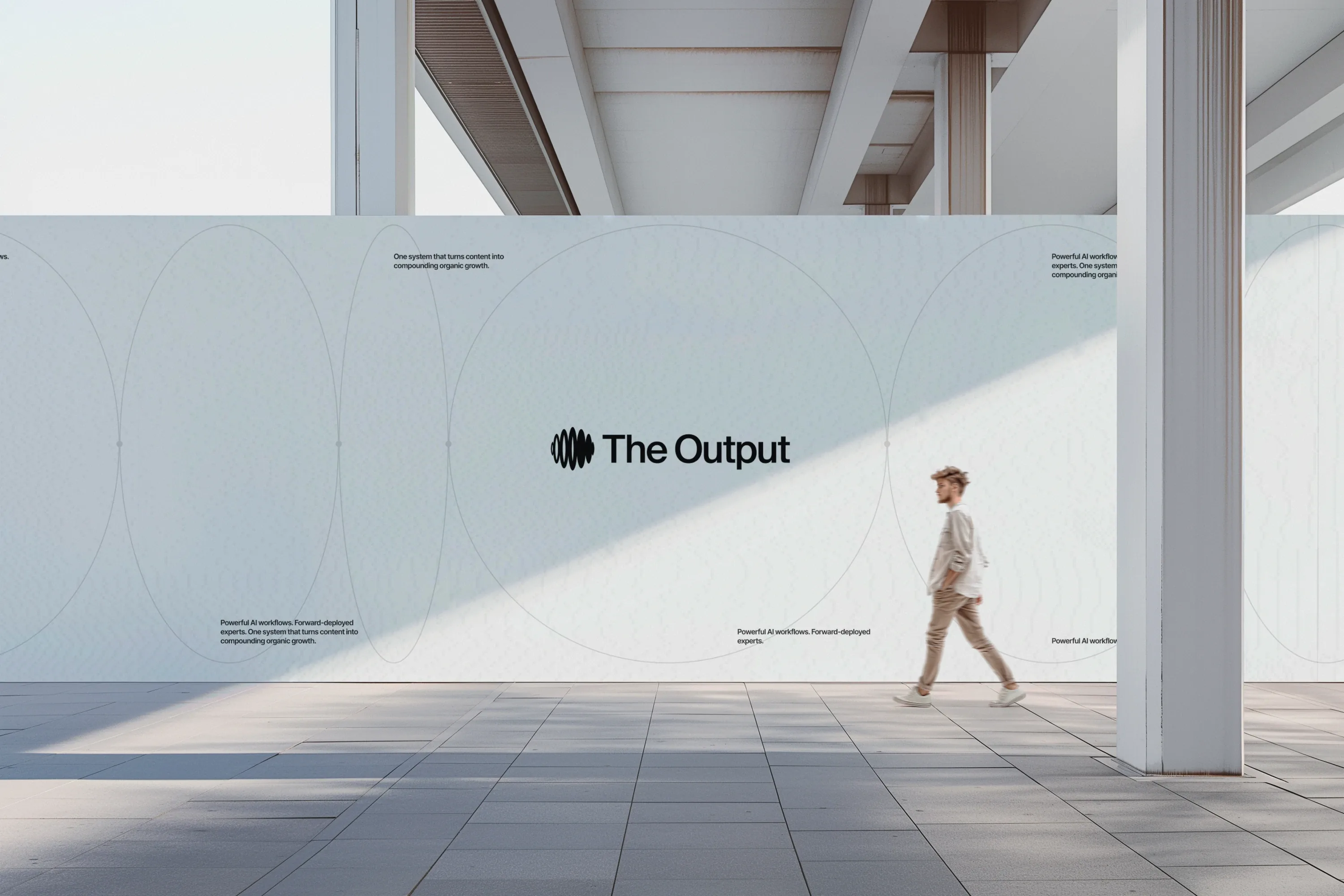
The symbol draws on signal flow and data noise: stacked ellipses that swell into a waveform. Paired with a type-based wordmark, it makes a complete and balanced logo that reflects the name and the core idea, turning raw thought into clear communication.

04Imagery
Signal, drawn in dots and lines
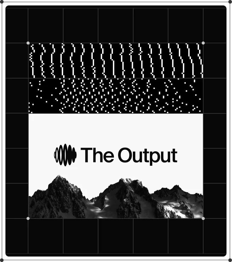
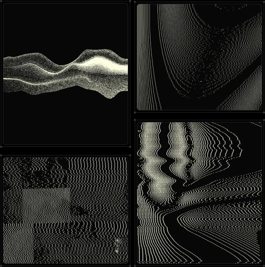
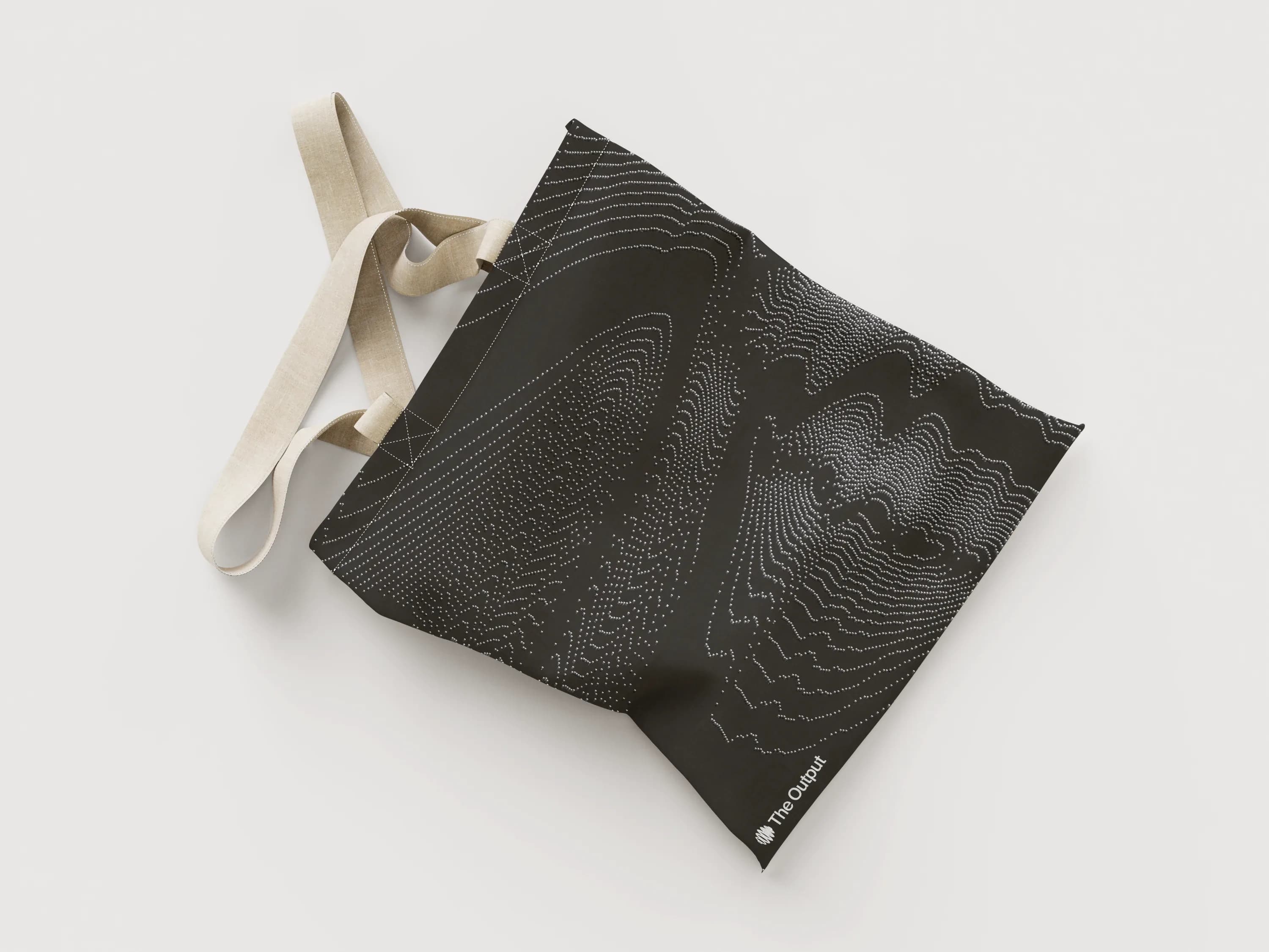
Imagery and illustration follow the same idea: contour lines, stippled waves and pixel patterns that are visually iconic and quietly suggestive of data. They give the publication a recognisable texture without leaning on stock photography.
05Typography
Editorial type that lets ideas land
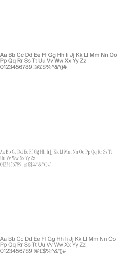
For a publication, type is the main interface. We paired Suisse Int'l with Instrument Serif in an editorial system that balances sharpness with space and structure with spontaneity. It is minimal and modern, and it is made to let the content speak.

06Website
A site that puts the writing first
The website is where the playbook lives: 'Charting the messy middle of growth', with feature stories, author portraits and clear ways to subscribe. The layout stays out of the way of long reading, and the brand shows up in the details.
07Impact & proof
- 50,000+
- Executive and founder readers subscribed
- 4 mins
- Average reader dwell time per deep dive
- 100%
- Custom responsive editorial design system
Metrics published by The Output across subscriber analytics as of 2025.
Brand
- Strategy and essence
- Symbol and wordmark
- Illustration and pattern
Type
- Typography and hierarchy
Website
- Website design
- Development