01The challenge
Men's health is a category that talks down or shouts. Compound wanted to be insightfully honest.
A program built on deep insight and accountability
Compound is an integrated, personalised healthcare program from Australian digital healthcare company Eucalyptus. It helps men optimise their health and pursue longevity through performance and incremental change, delivered across telehealth, an in-app experience, in-clinic diagnostics and tailored supplements.
Its difference is analytics and programming. Clinical-grade diagnostics, including Dexa scans, VO2 max tests and detailed blood work, let clinicians find issues, set measurable goals and keep clients motivated with credible insight. The brand had to make that rigour feel approachable, in a category that is cluttered with hype.
02Strategy
Workshops first
We worked with Eucalyptus's leaders and Compound's program heads through workshops, interviews and hands-on experience of the diagnostics. Going through the tests ourselves shaped the essence and ambition of the brand, and what makes it distinct from every other health offer.
To the power of.
03Naming
A name that is also the strategy
We wanted the name to connect truth and strategy, so we ran the naming and strategy work streams together as a feedback loop. 'Compound' points at long-term, consistent positive action: not just repeated effort, but small improvements that, reinvested, create lasting impact. It is also the way a healthcare program actually works.
The idea 'to the power of' amplifies it: your health and fitness goals are the result of your own consistent, compounding actions.
- 01
Insightfully honest
Straight, evidence-led and never patronising.
- 02
Own the struggle
Real effort, acknowledged and respected.
- 03
Consistency compounds
Small steps, reinvested, become big change.
04Brand system
Old and new, gothic and digital
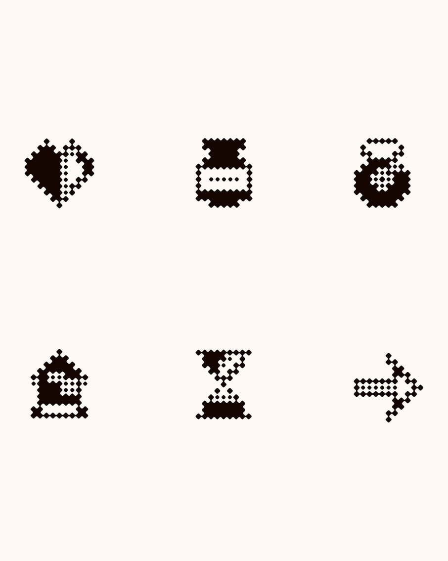
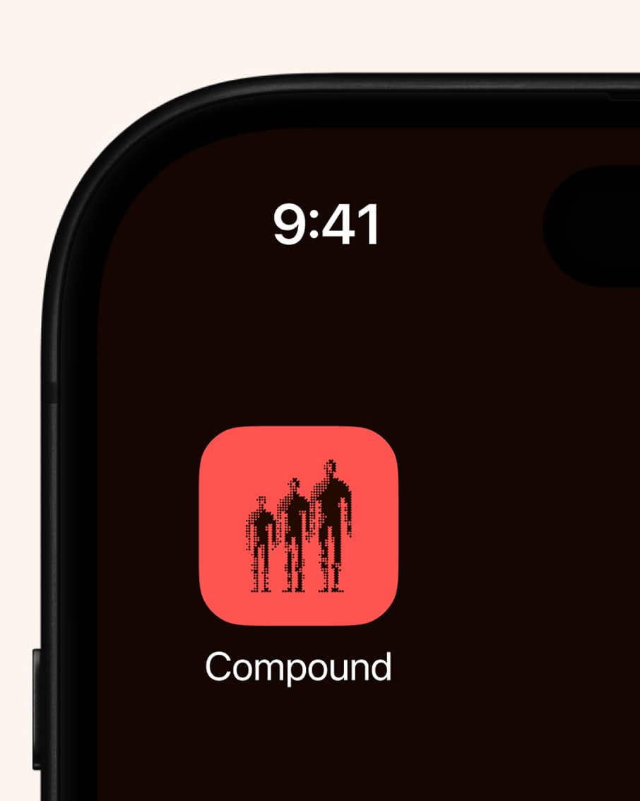
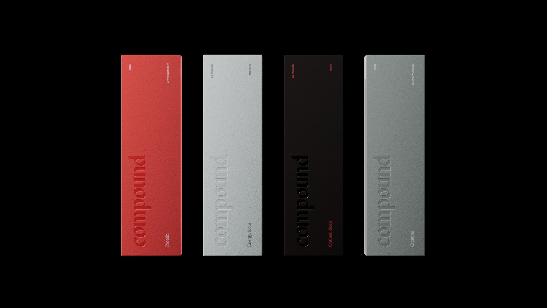
At the heart of the brand are the wordmark and icon, drawn between gothic letterforms and pixels. Old and new together suggest the truth of the analytics and the ambition to build a better you. Rhetorik and Neue Haas Grotesk carry the same balance of old and new in the type.
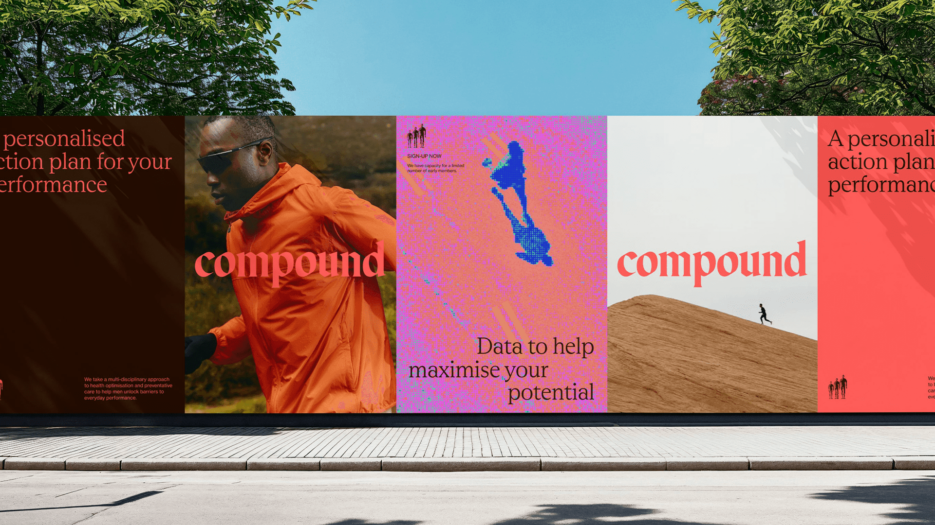
Imagery references the Dexa scan, a full-body x-ray, moving from warm tones to vibrant, electric colour through glitched moments. The brand can stand out when it needs to and still deliver sensitive health information in a calm, trusted tone.

Your name, in your own hand
As a program with a passionate cohort, the brand gives clients a place in it. Using PolyCam, traditional before-and-after photos become 3D headshots, and space is left for client-written versions of the name (signed, scrawled, written) that appear through the journey to give each health story its own character.
05In use
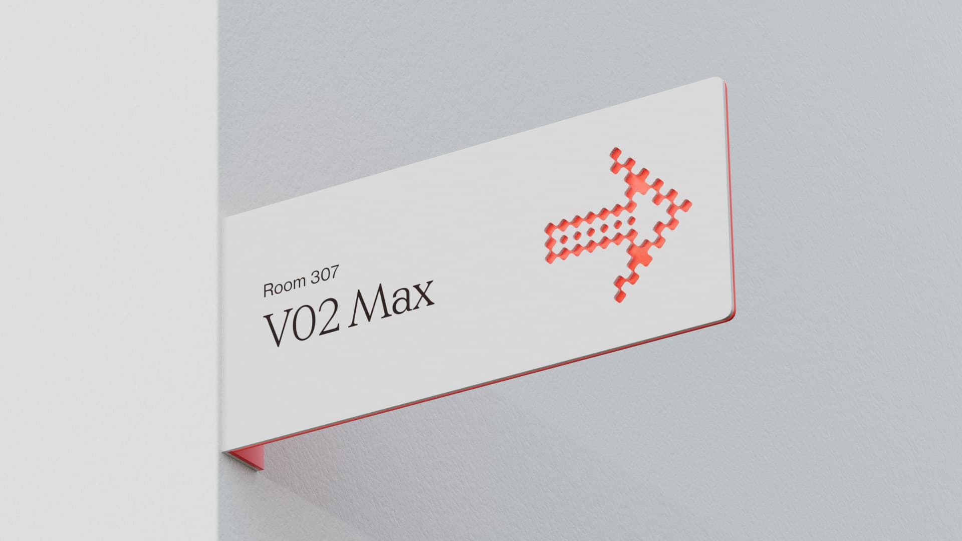
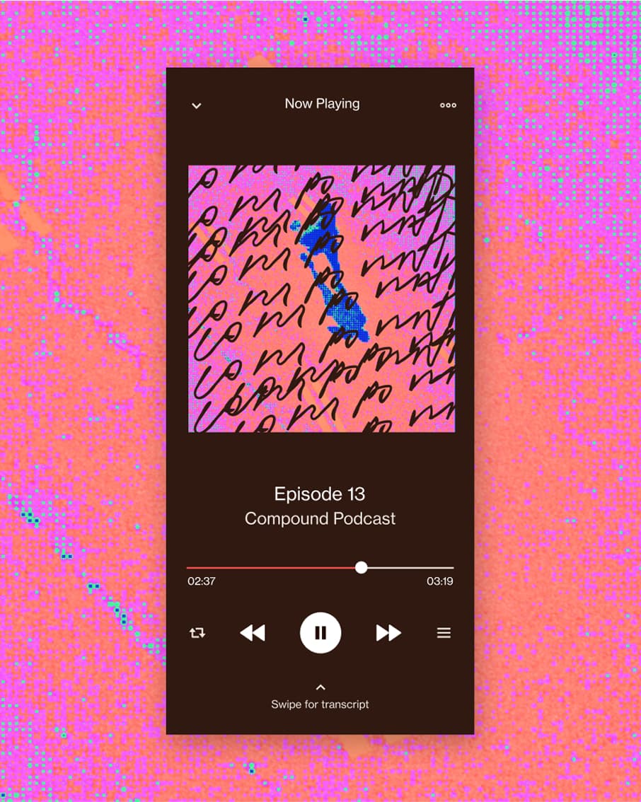
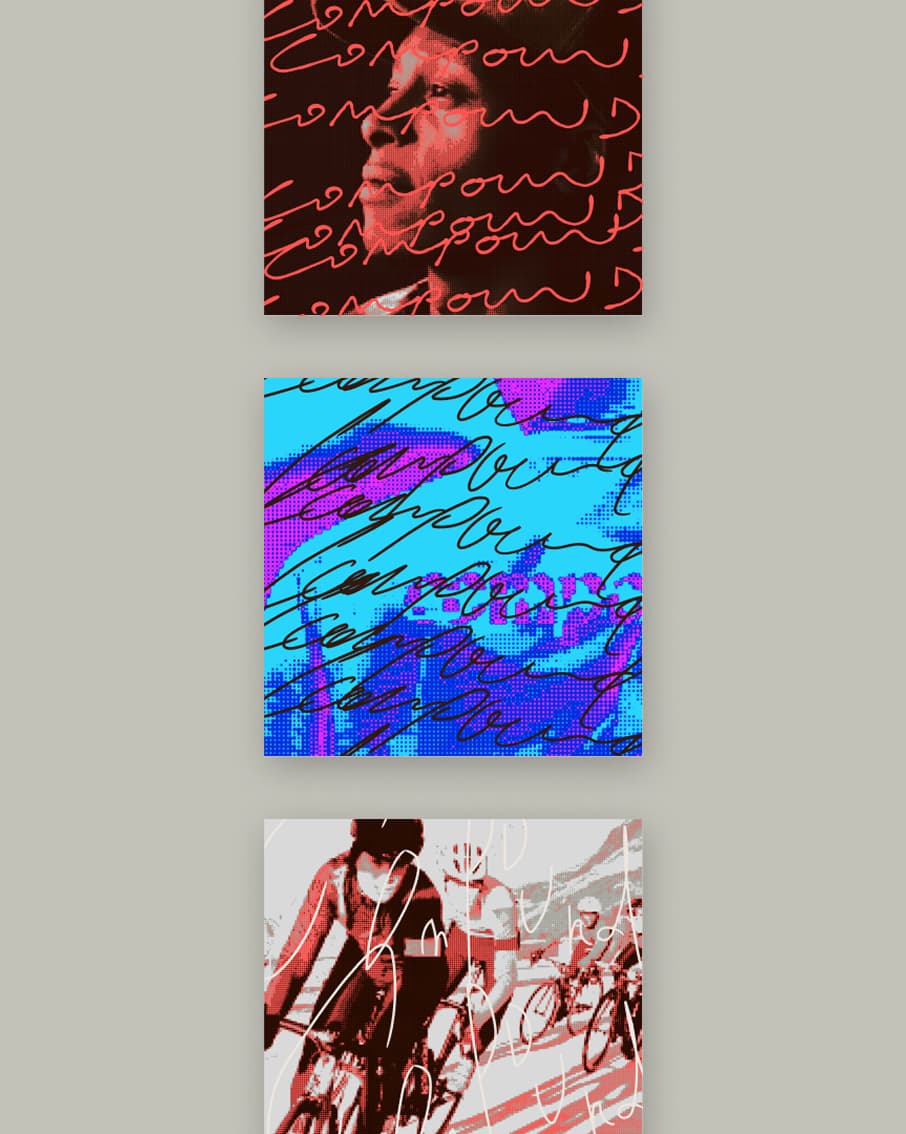
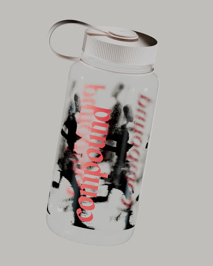
06Impact & proof
- 100%
- Waitlist capacity filled in private beta
- 50+
- Personalized biomarker protocols mapped
- 1 sprint
- Full naming, brand & app system delivery
Metrics published by Compound across early private beta clinic cohorts as of 2025.
Strategy
- Workshops and interviews
- Brand idea and values
- Positioning
Naming
- Name
- Tagline: to the power of
Identity
- Wordmark and icon
- Typography
- Dexa-inspired imagery
- 3D headshots
Applied
- App icon
- Podcast covers
- Signage
- Packaging