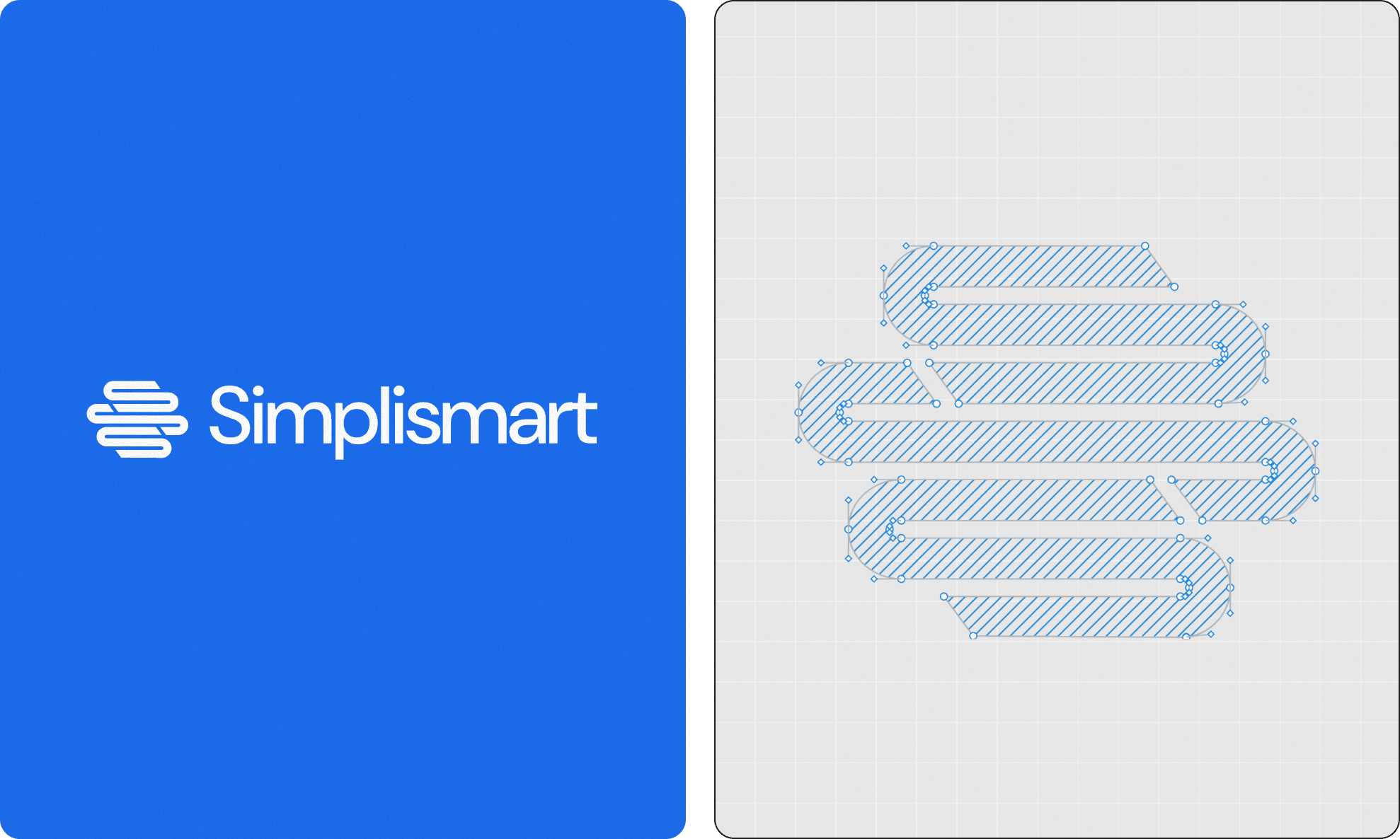
01The challenge
Most sales software feels like a Las Vegas casino: flashing badges, alert feeds, and pure anxiety. Docket was built to do the opposite.
The antidote to notification fatigue
Modern revenue teams are inundated by fragmented tools: CRM updates, dialer logs, Slack reminders, and generative AI copilot suggestions flashing on every screen. Instead of helping reps sell, the noise pulls them out of flow.
Docket was conceived with a singular philosophy: AI should harmonize with human workflows, making sales faster, smarter, and completely frictionless without adding cognitive burden. The identity had to embody this calm confidence.
The noisy sales stack
- Urgent red notification badges demanding constant clicks
- Sensory overload from multiple competing copilot popups
- Cluttered dashboards that require training manuals to navigate
- Aggressive tech aesthetics that increase user anxiety
The Docket philosophy
- Ambient intelligence that surfaces the right context quietly
- Zen-inspired minimalism governed by mathematical grid geometry
- Fluid, breathing motion that respects human attention
- Serene typography and generous whitespace for immediate clarity
02The 9×3 layout system
A mathematical framework for serene layouts
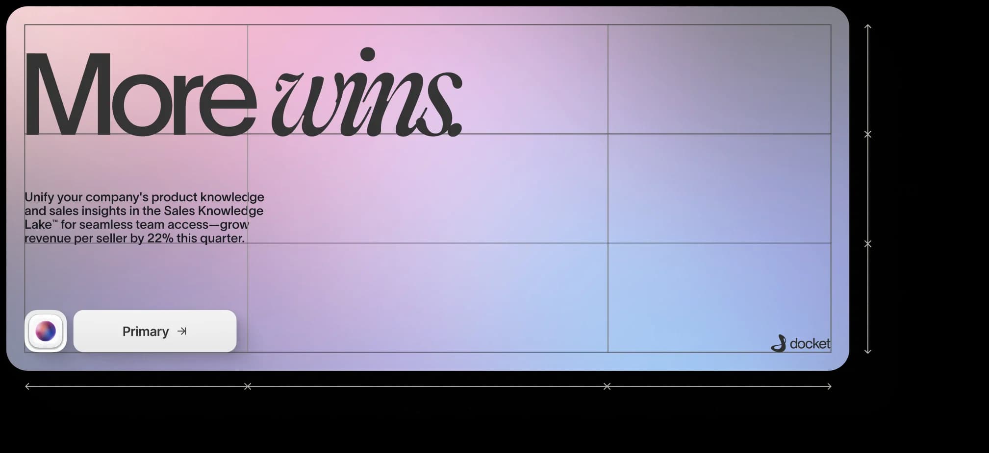
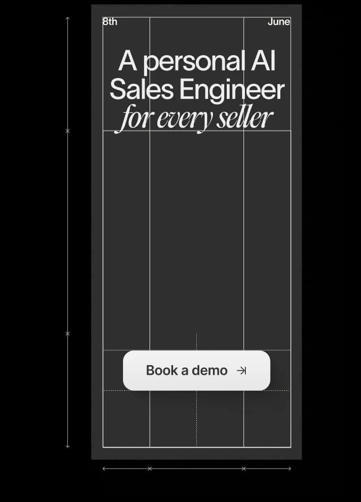
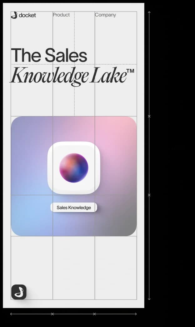
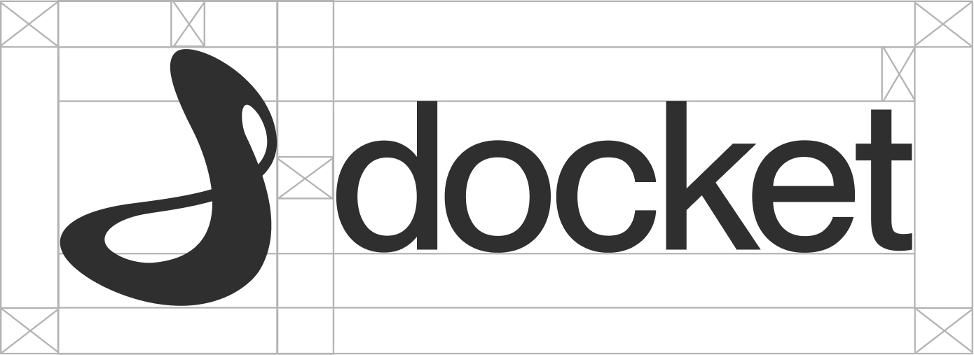
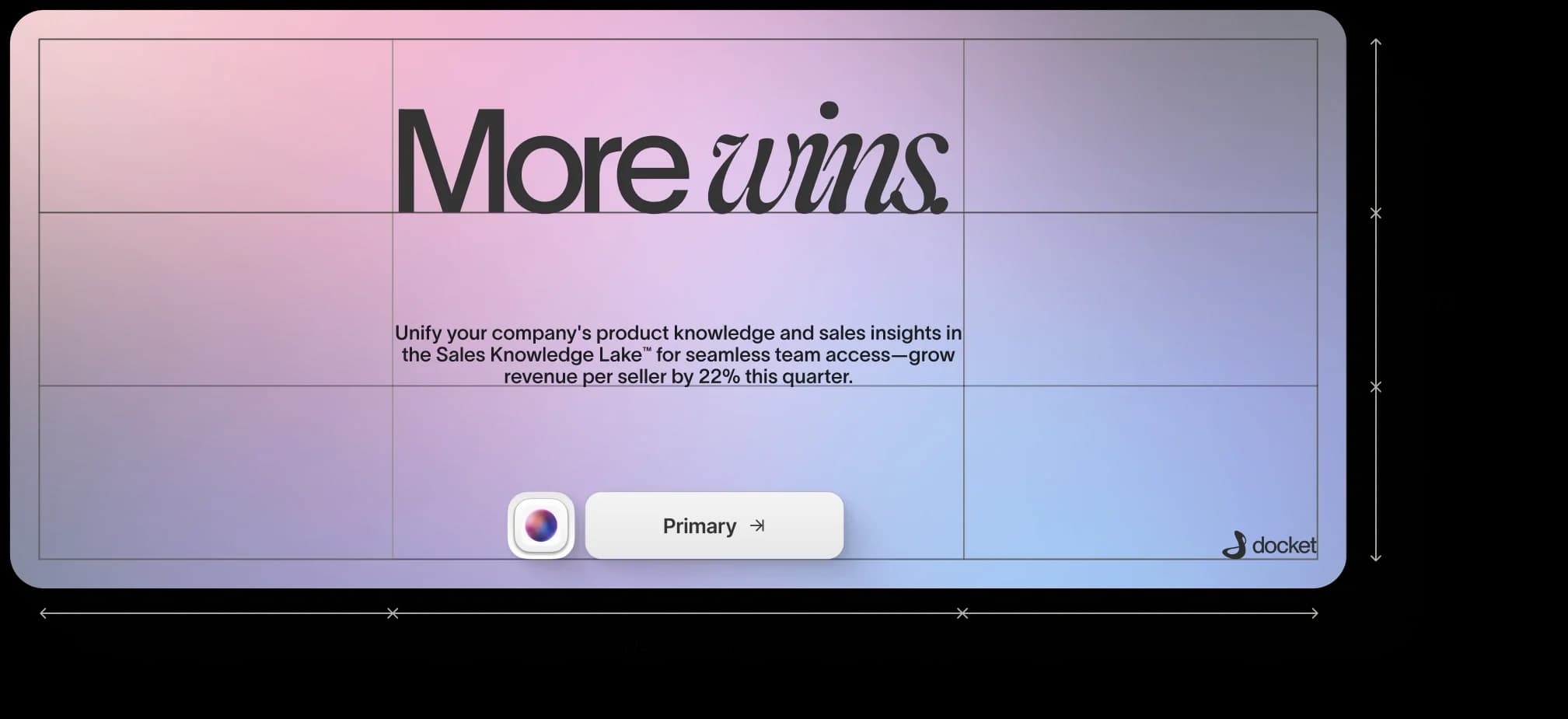
To prevent visual chaos across diverse marketing surfaces and product breakpoints, we created a modular 9×3 layout engine inspired by traditional Japanese architectural tatami mats.
The canvas is divided into three vertical zones and nine horizontal rhythm lines. Whether rendered on an ultra-wide desktop monitor, an iPhone screen, or a conference poster, the proportions remain perfectly balanced.
03Typography & interface flow
Typographic hierarchy that honors breathing room
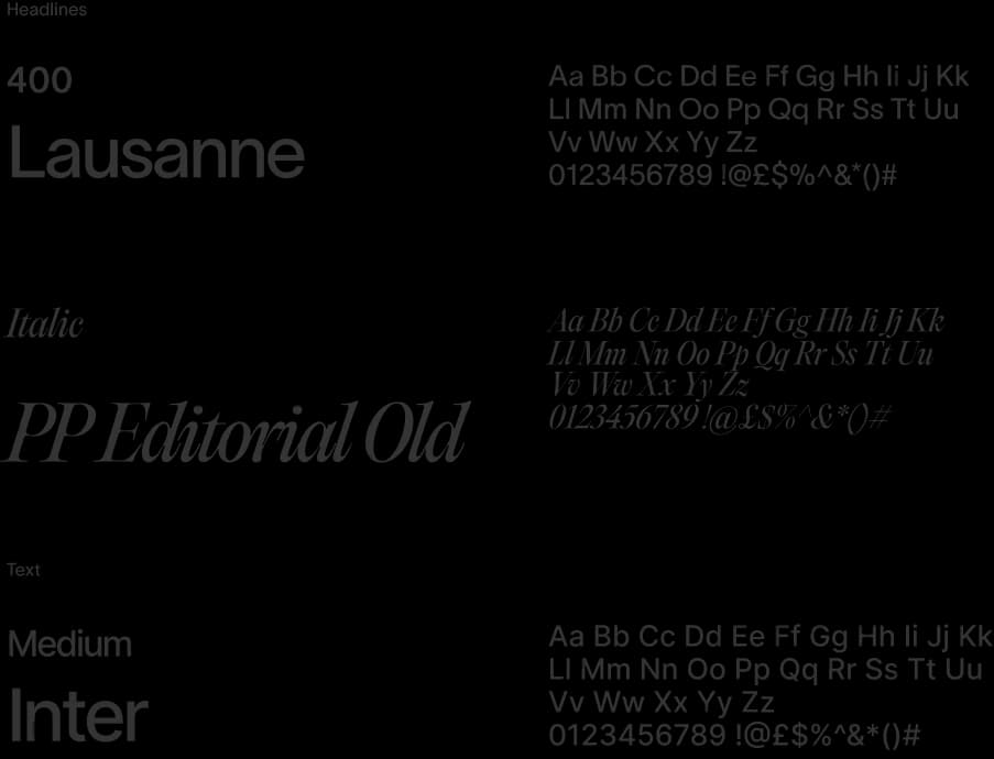
Docket's type system pairs a thoughtful, human-centered serif with a surgically crisp monospace. Headlines read like calm aphorisms; data values and CRM actions align neatly on tabular baselines.
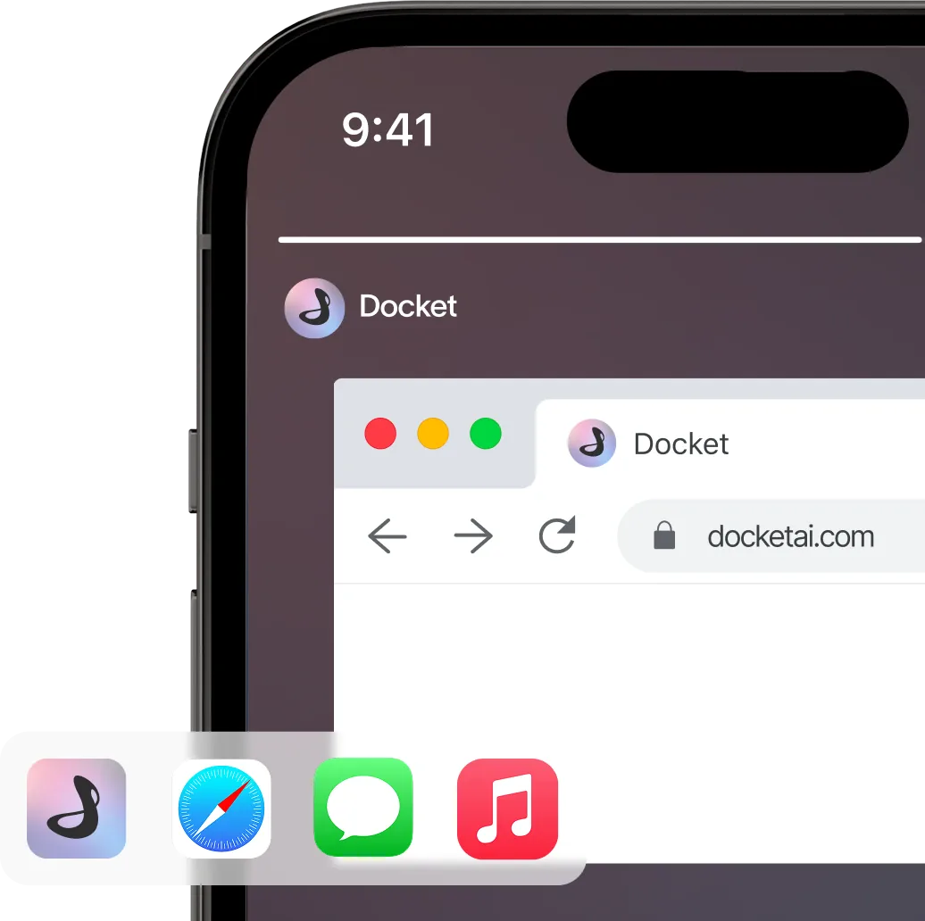
The mobile interface extends this serenity into the palm of the hand. Reps can review deal context before walking into a meeting, capture voice notes that Docket automatically structures, and approve next steps with a single thumb gesture.

04Motion that respects attention
Choreography that breathes rather than interrupts
Every video and animation in the Docket system was crafted to feel organic and unhurried. When new context is synthesized, the interface dissolves smoothly, gently drawing the eye to the key insight without sudden visual jerks.
05Impact & takeaway
- 3x
- Faster pre-meeting deal preparation
- 9×3
- Proportional layout engine across all touchpoints
- 0
- Auditory or red badge notification clutter
Qualitative feedback gathered from early revenue teams testing Docket's sales assistant.
Brand Strategy
- Zen sales philosophy
- Visual tone of voice
- Naming & brand essence
Visual Identity
- Fluid line emblem
- 9x3 tatami grid system
- Typographic scale
- Color science
Motion & Video
- 5 bespoke motion films
- UI transition choreography
- Ambient sound direction
Product
- Mobile app design
- Ambient widget controls
- Design token architecture