01The challenge
Fitness has a pressure problem. Embody was built as the antidote.
For the women traditional fitness overlooks
Embody is a compassionate wellness companion for women who feel overlooked by traditional fitness: busy mothers, women with a higher BMI and anyone looking for sustainable movement without shame. It is built around somatic movement, which is gentle, body-led and paced by the person doing it.
The challenge was to remove every bit of friction and guilt from the first minute. In wellness, the first screens decide whether someone stays, so the brand and the onboarding had to do the emotional work before the first workout.
02Strategy
Comfort, dignity and personal pace
We defined the complete identity and product experience around three promises: comfort, dignity and personal pace. The interface had to feel like a supportive friend, never a strict trainer, and every design choice was checked against that.
What fitness apps usually do
- Extreme routines and aggressive discipline
- Intimidating, high-contrast aesthetics
- Streaks and guilt when you miss a day
What Embody does instead
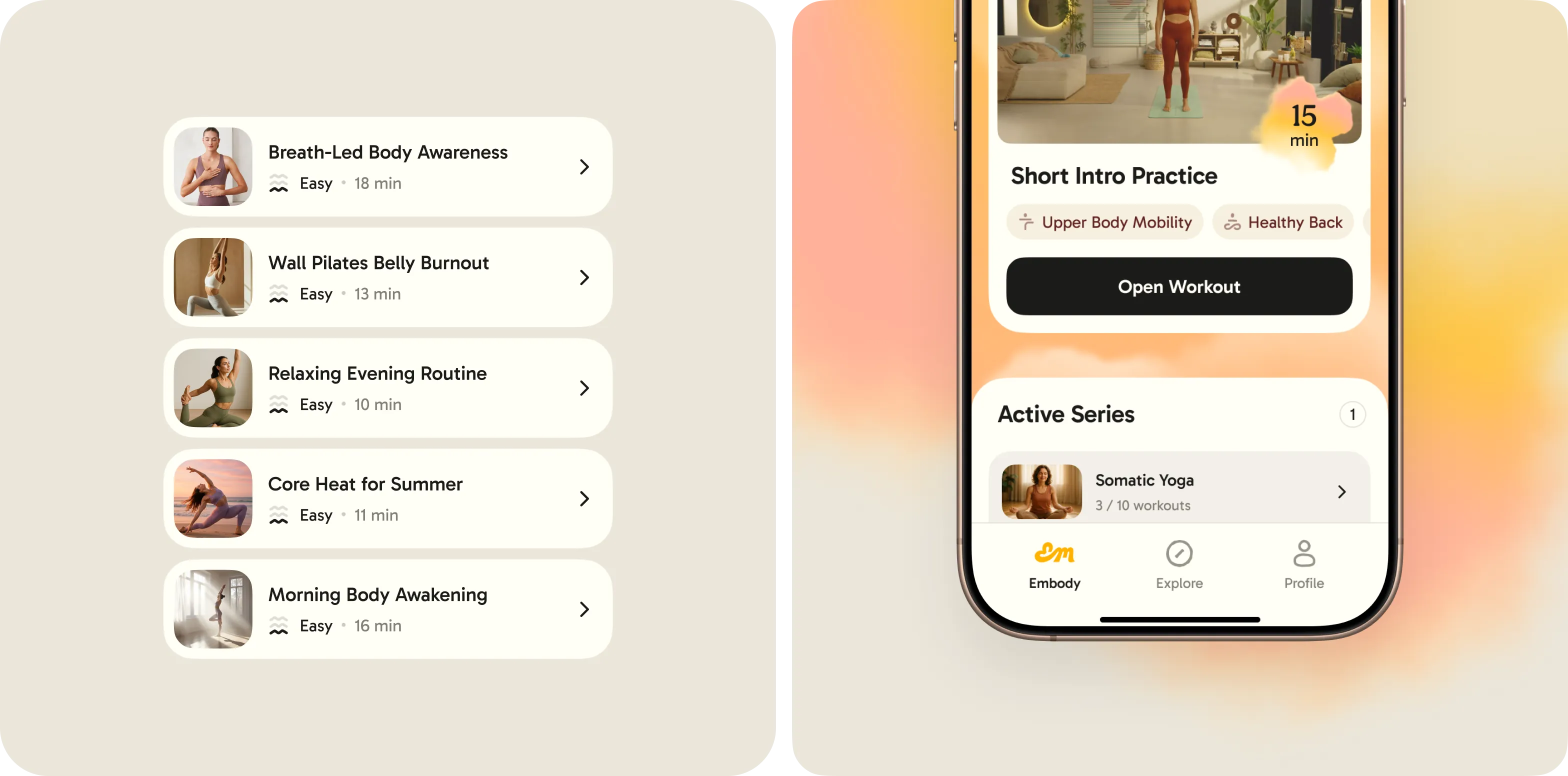
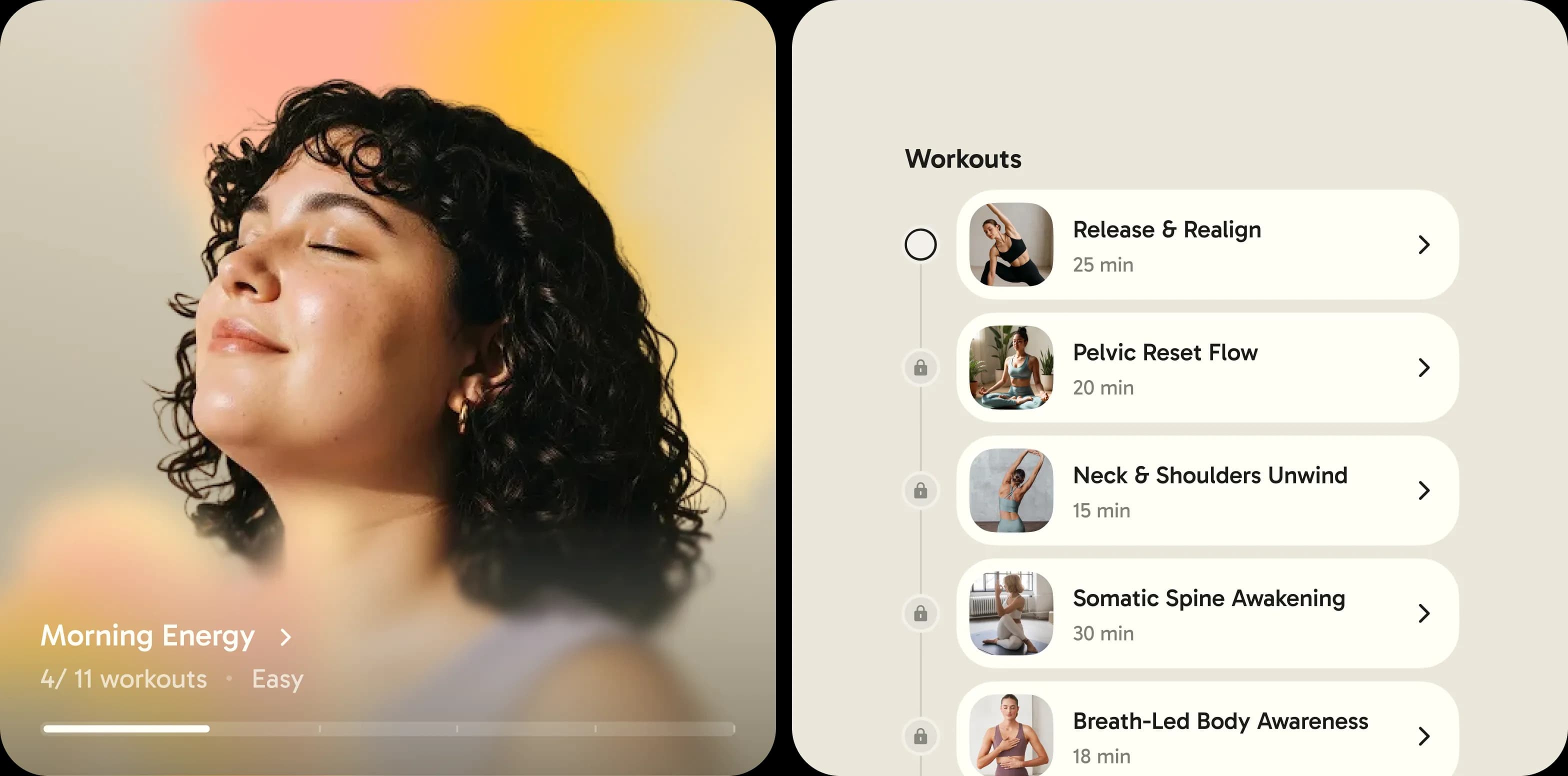
- Gentle somatic movement matched to your energy
- Soft, warm, human visuals
- A friendly voice that meets you where you are
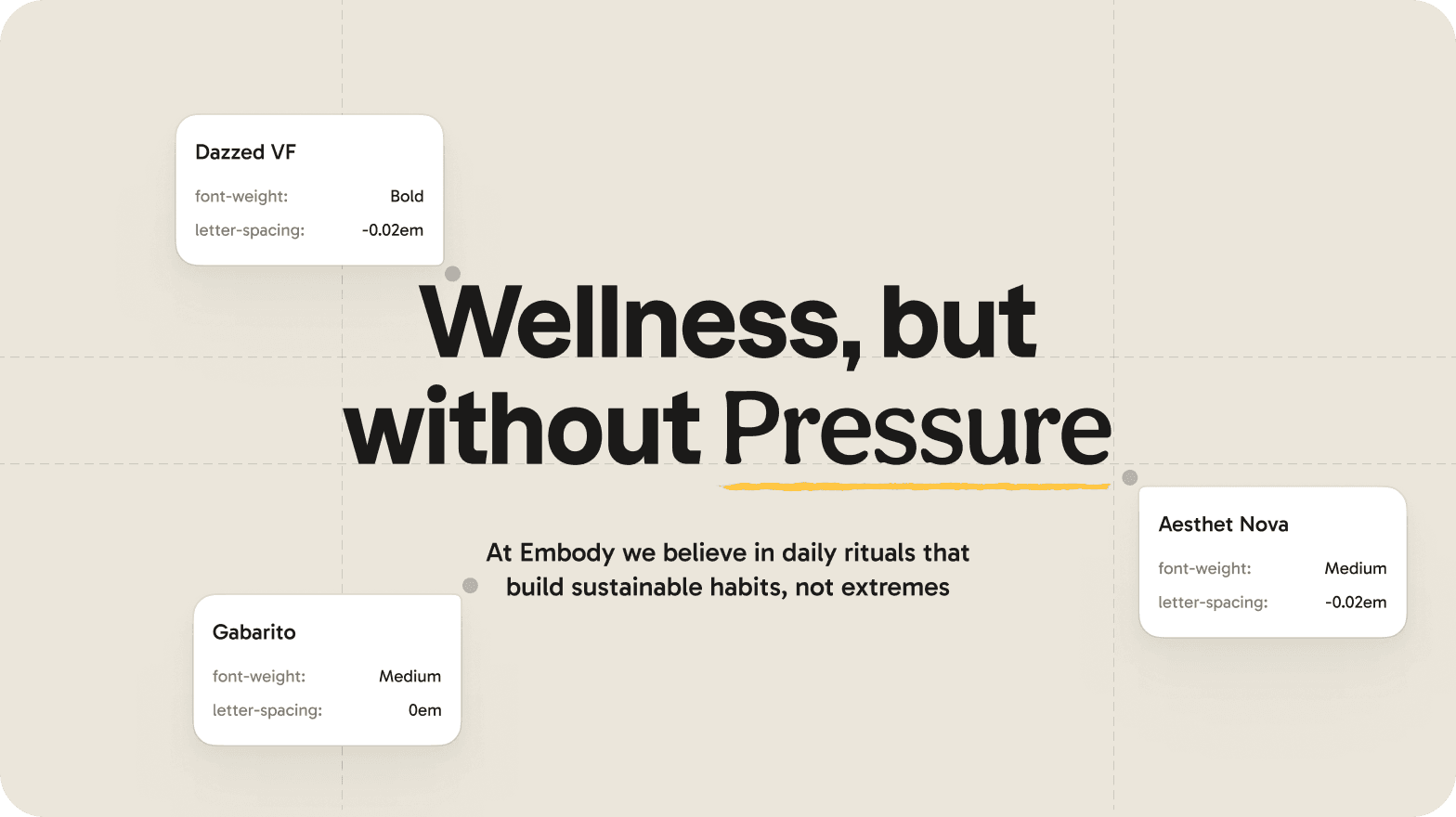
Wellness, but without pressure.
03Identity
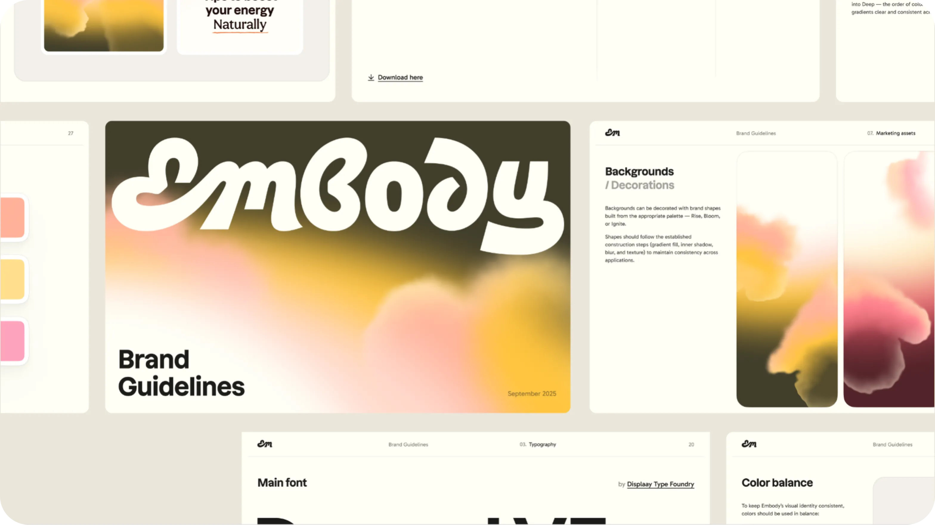
A soft, warm visual universe
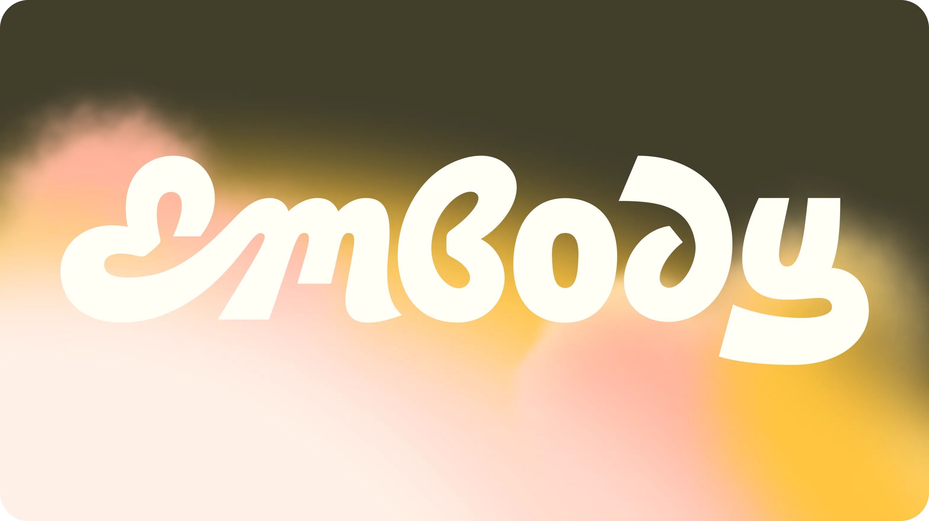
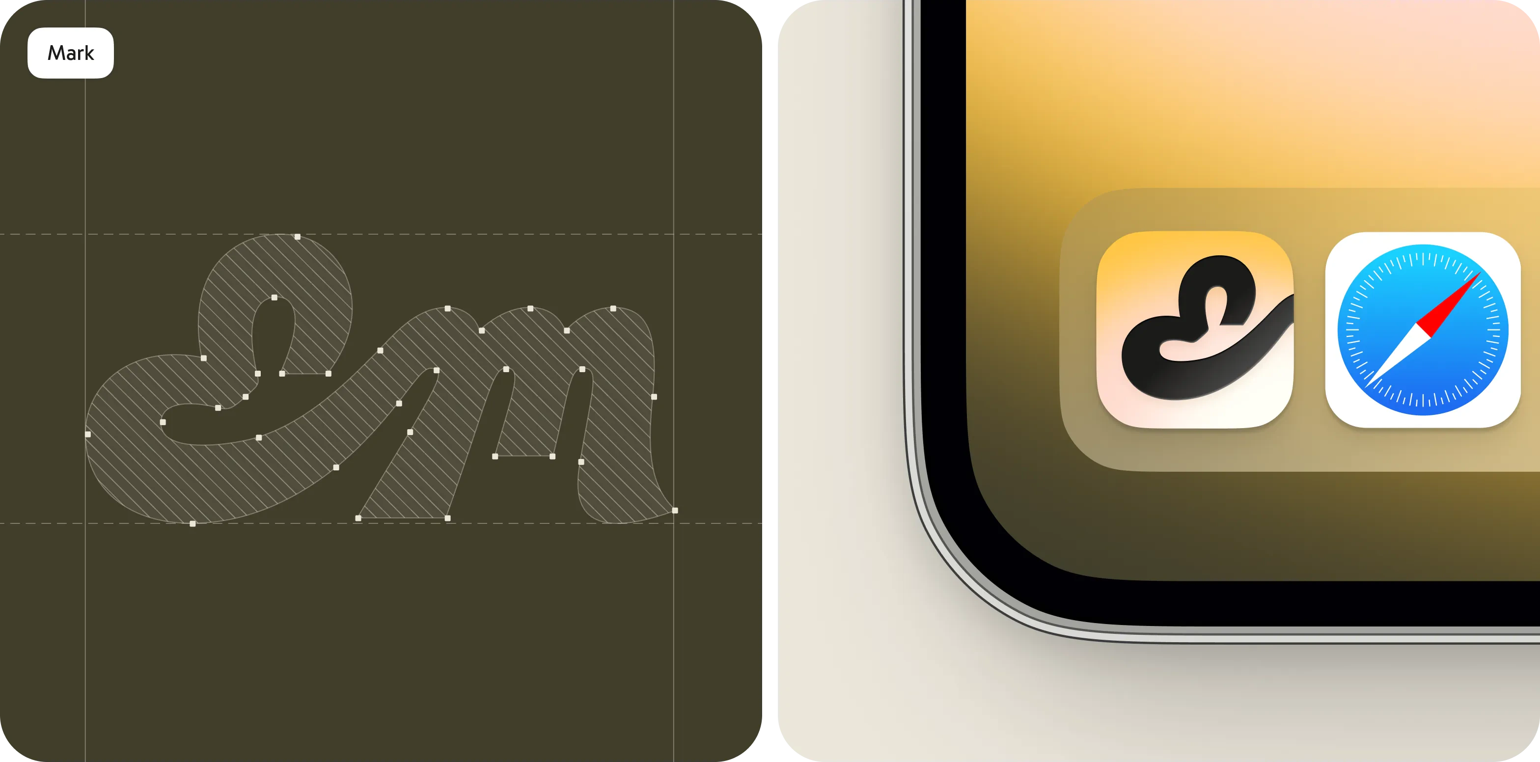
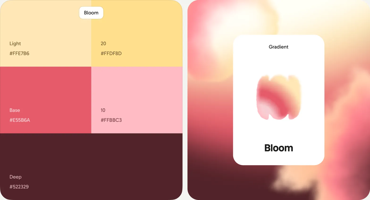
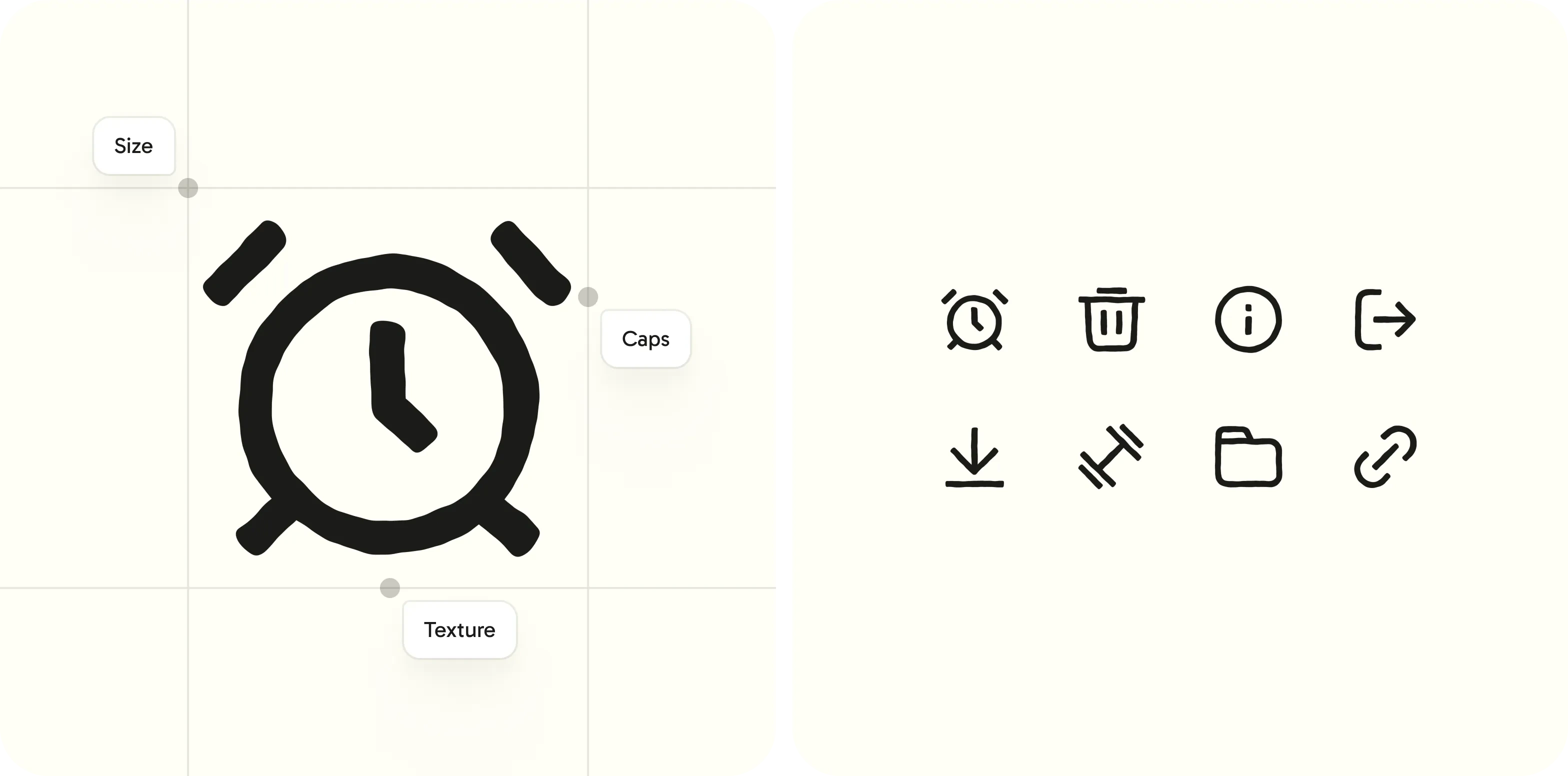
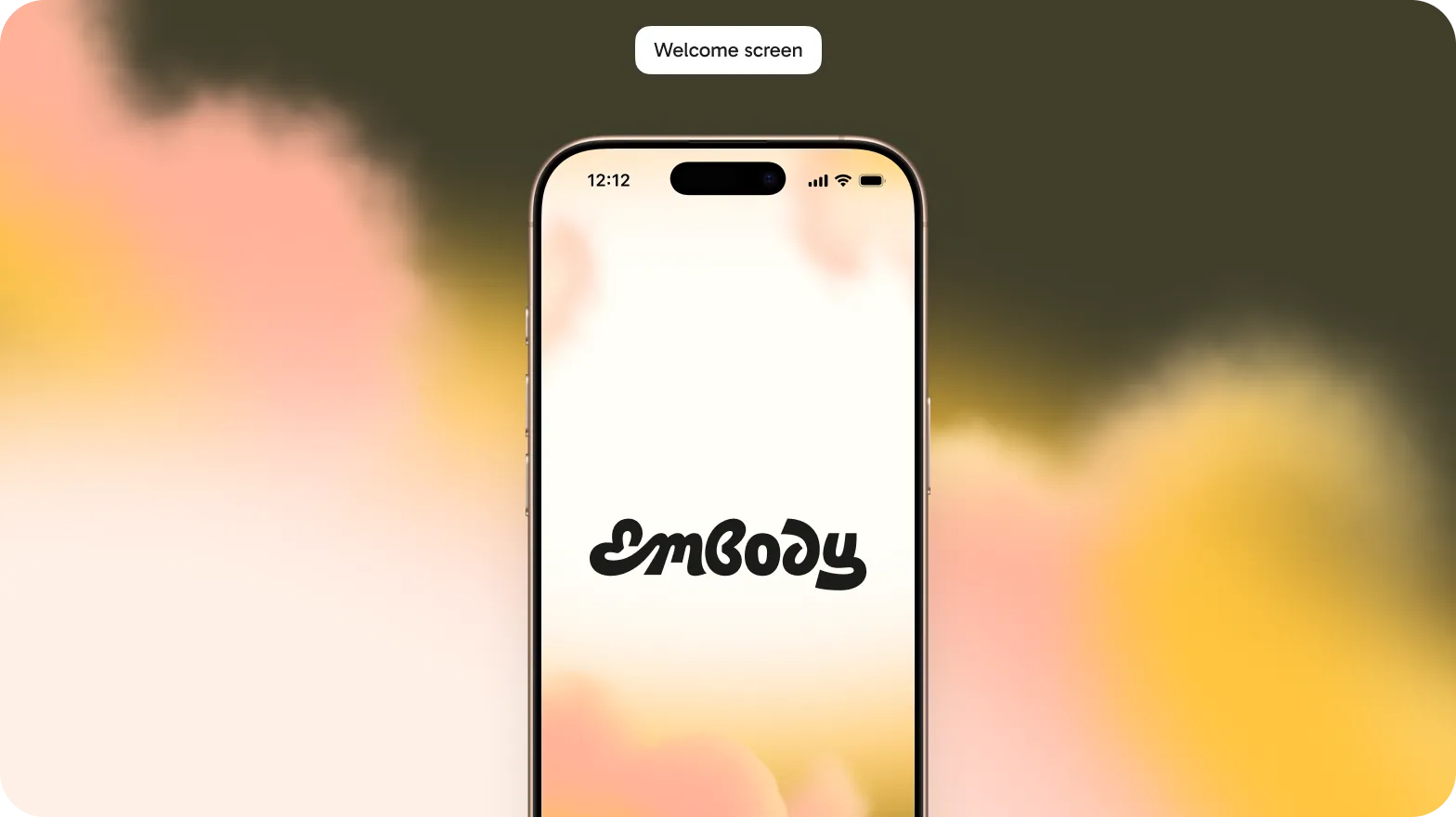
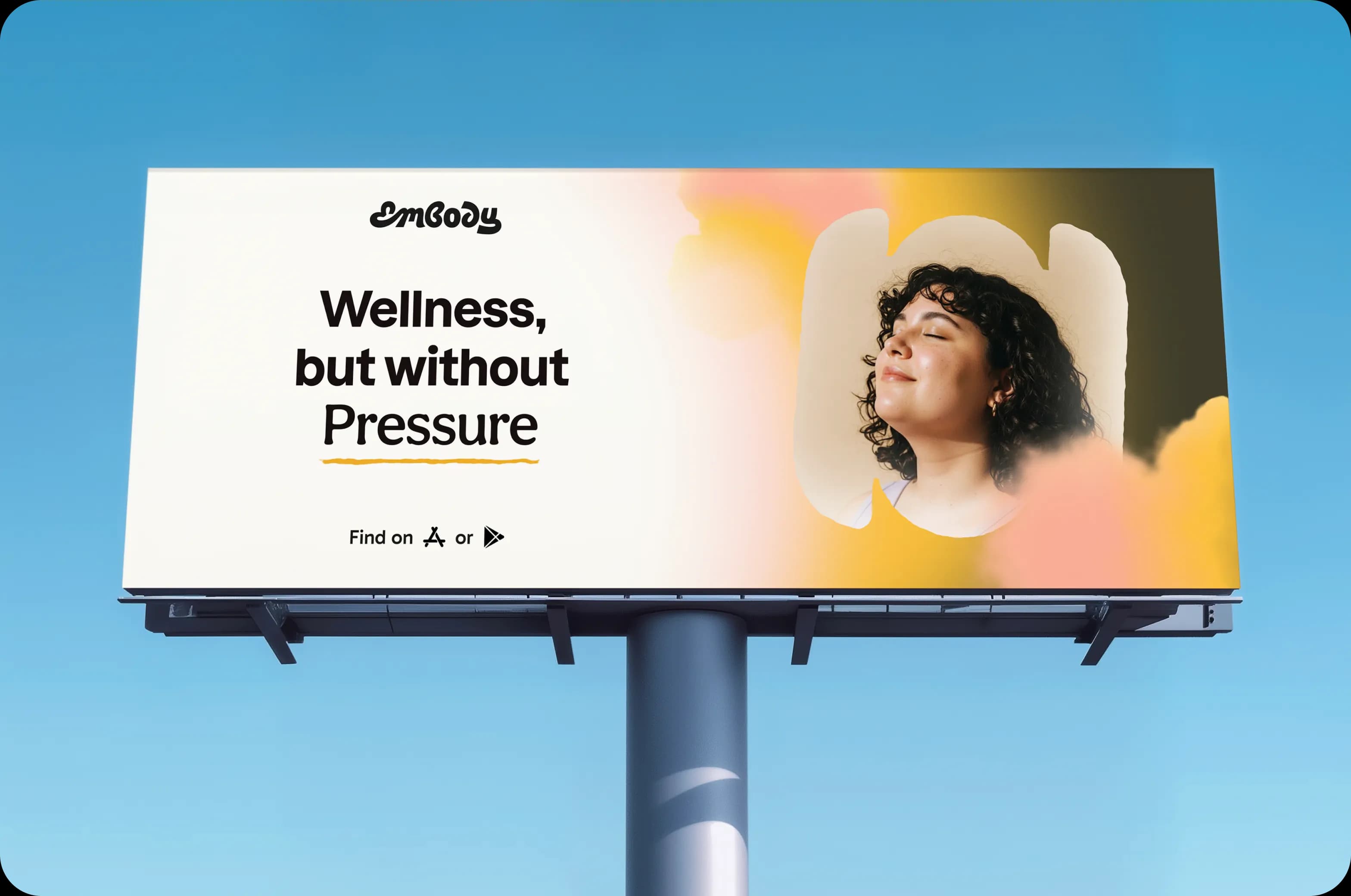
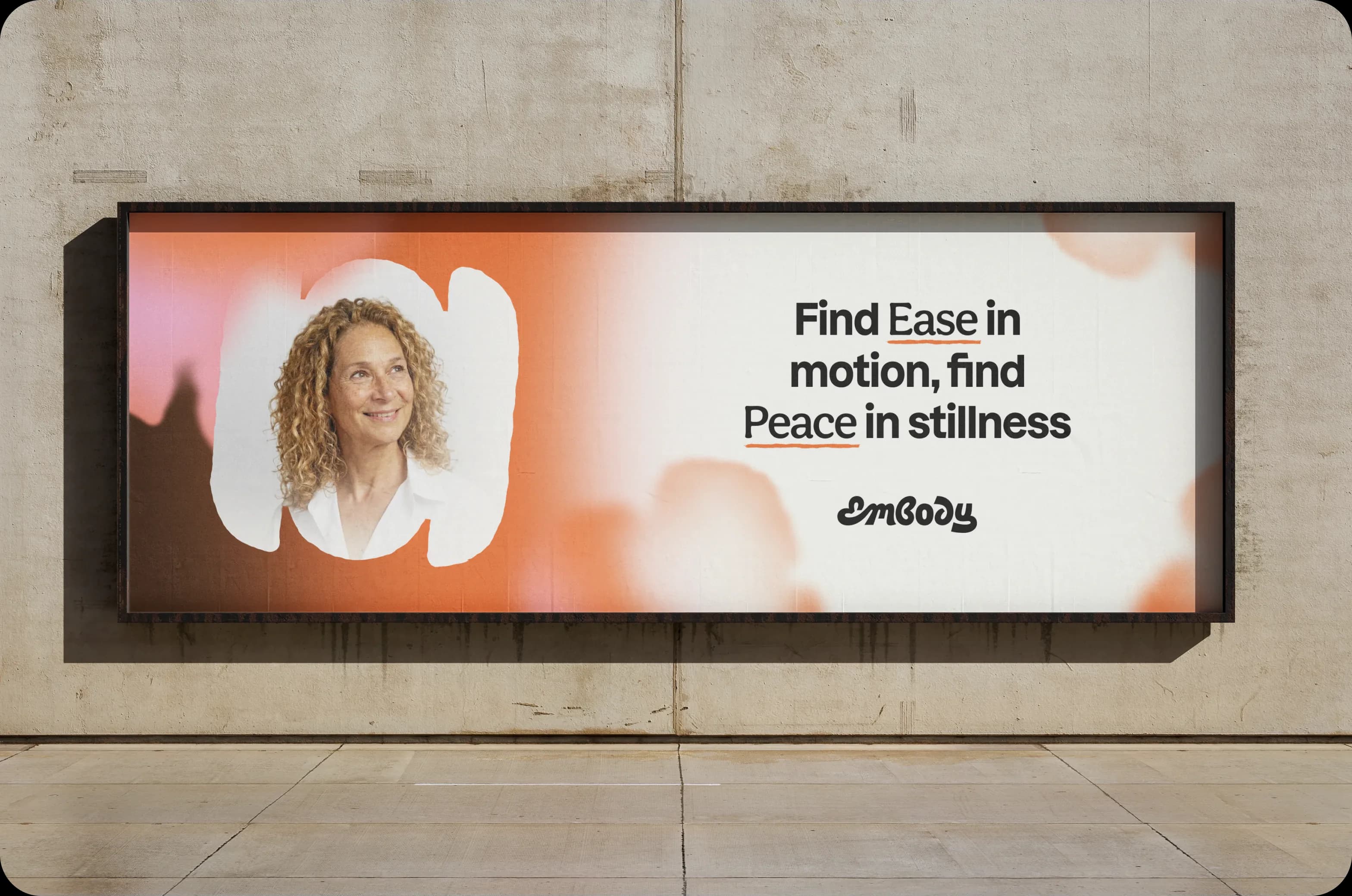
The name sits in a looping, hand-drawn script, set over gradients of butter yellow, apricot and rose against deep olive and cream. Forms are fluid and illustrated, so the brand feels held rather than polished. Nothing in it is sharp, loud or urgent, which is the opposite of the category.
04Product
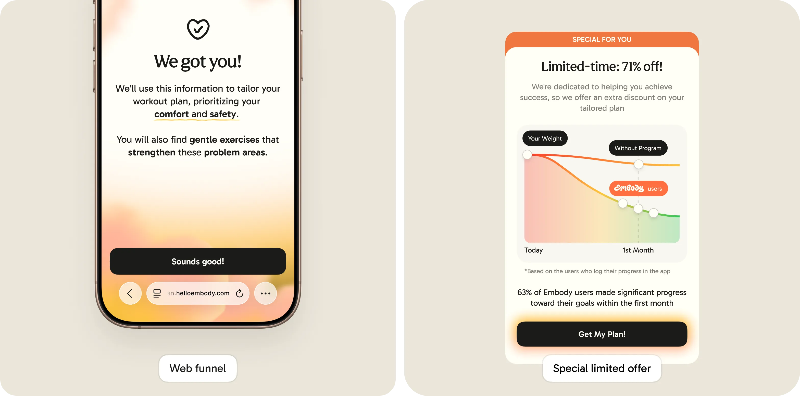
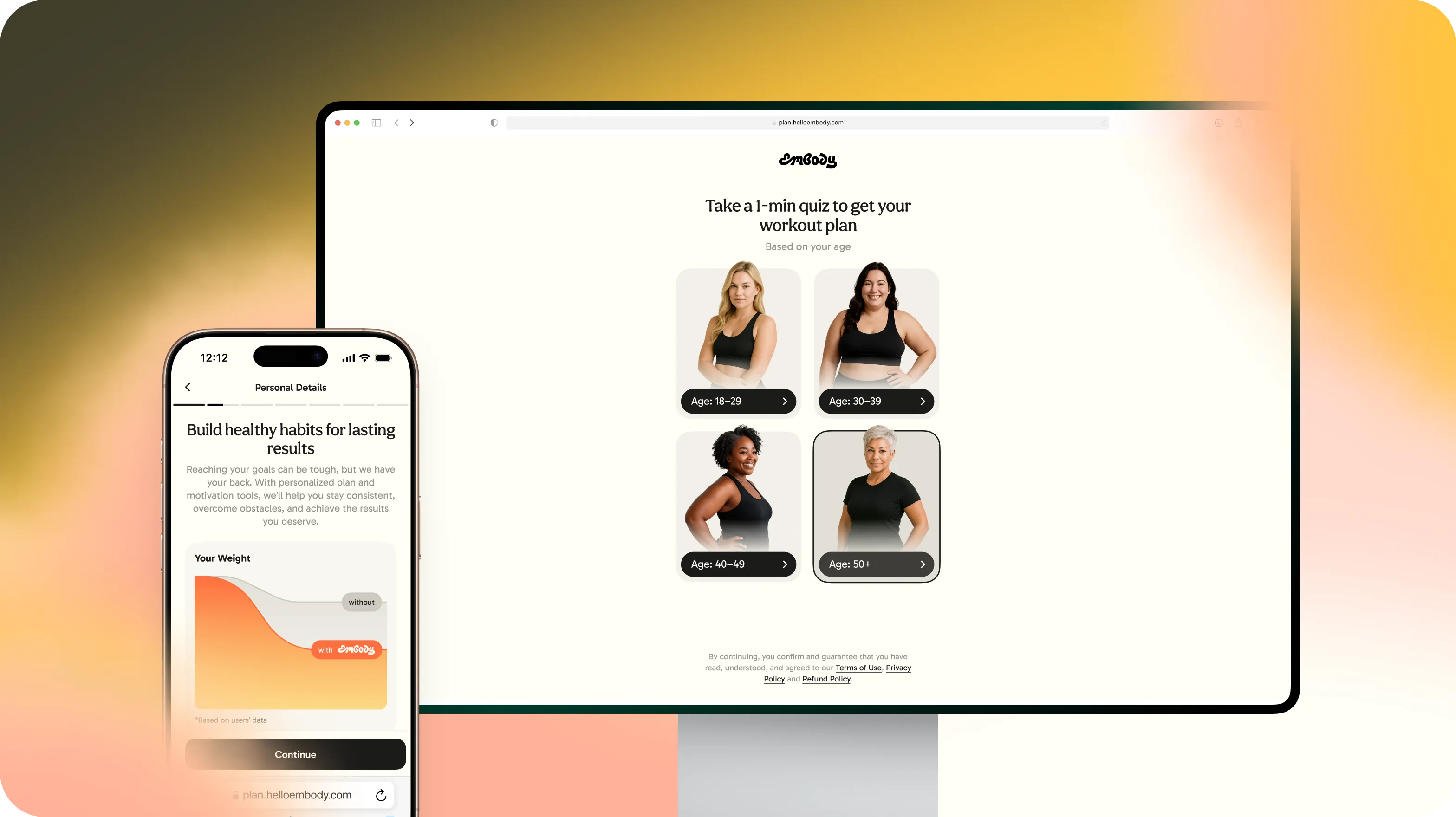
An onboarding that listens first
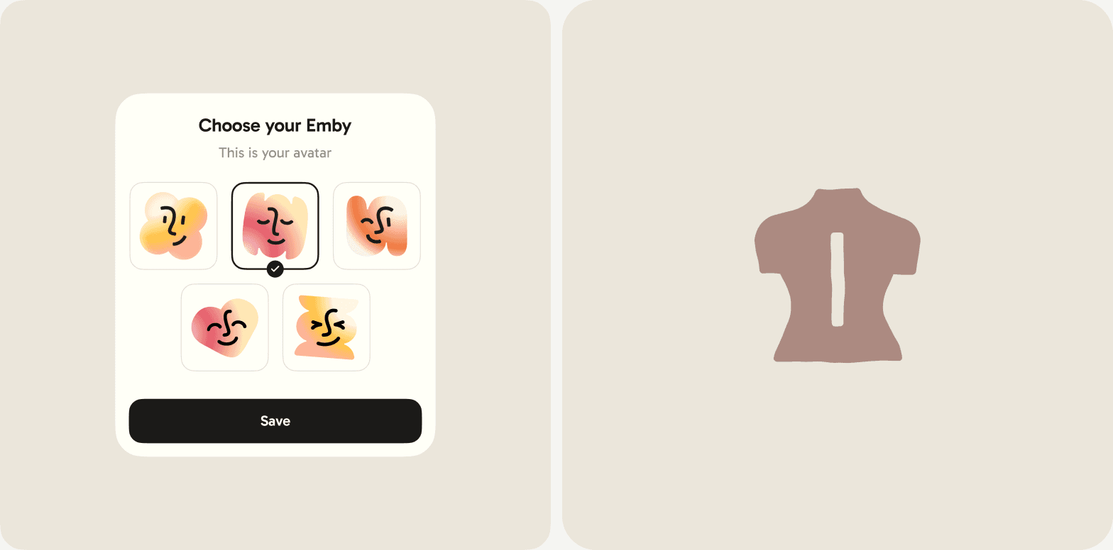
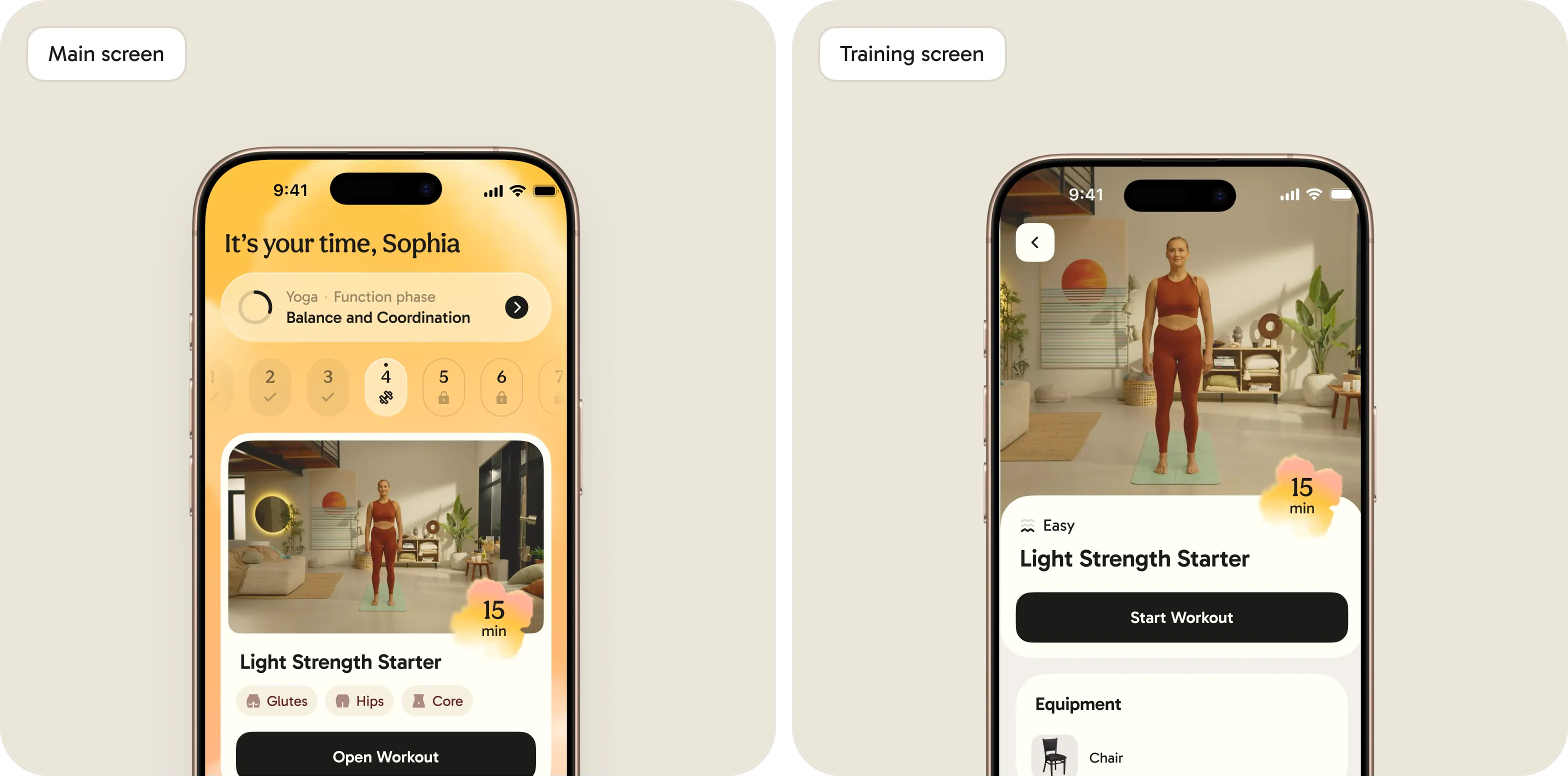
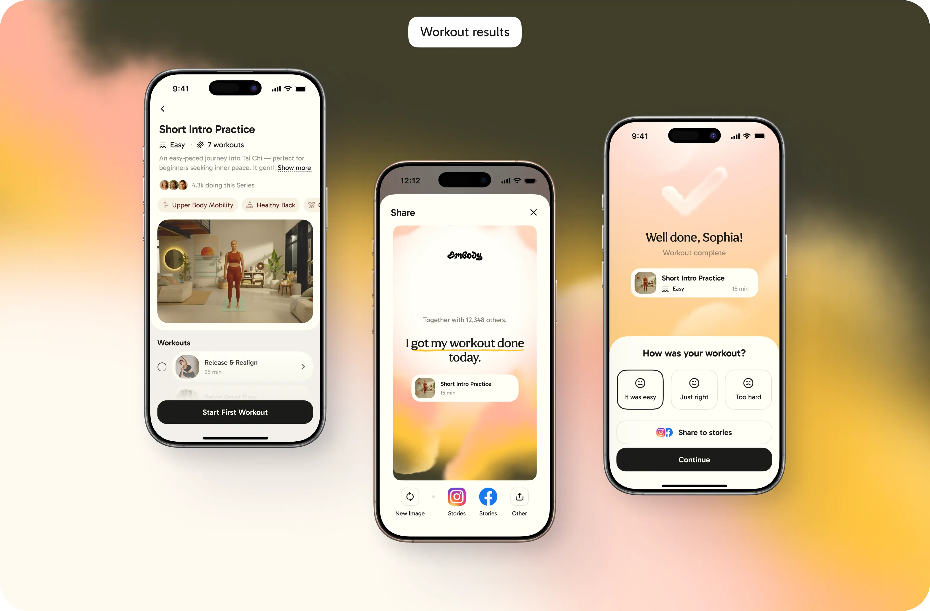
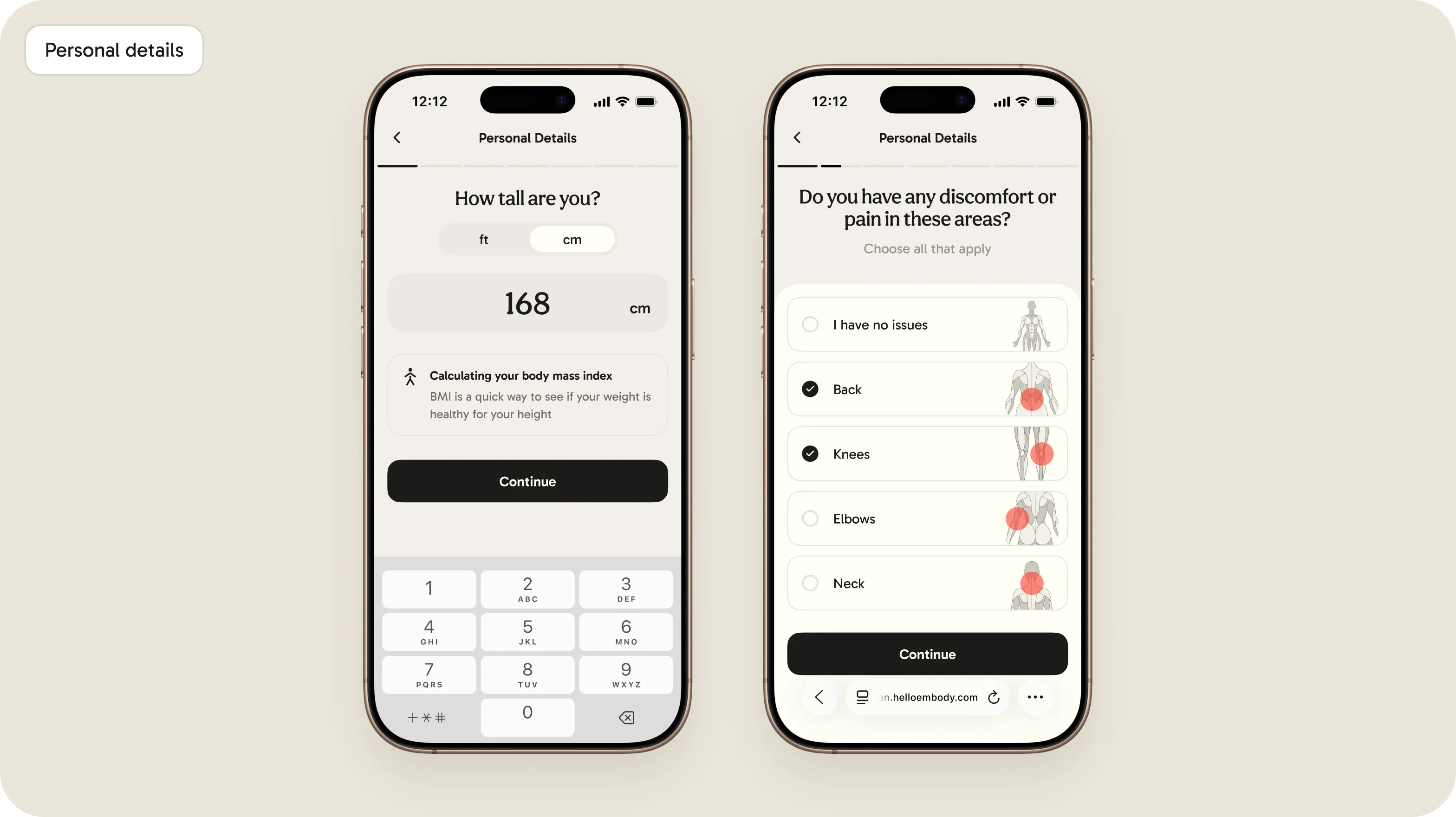
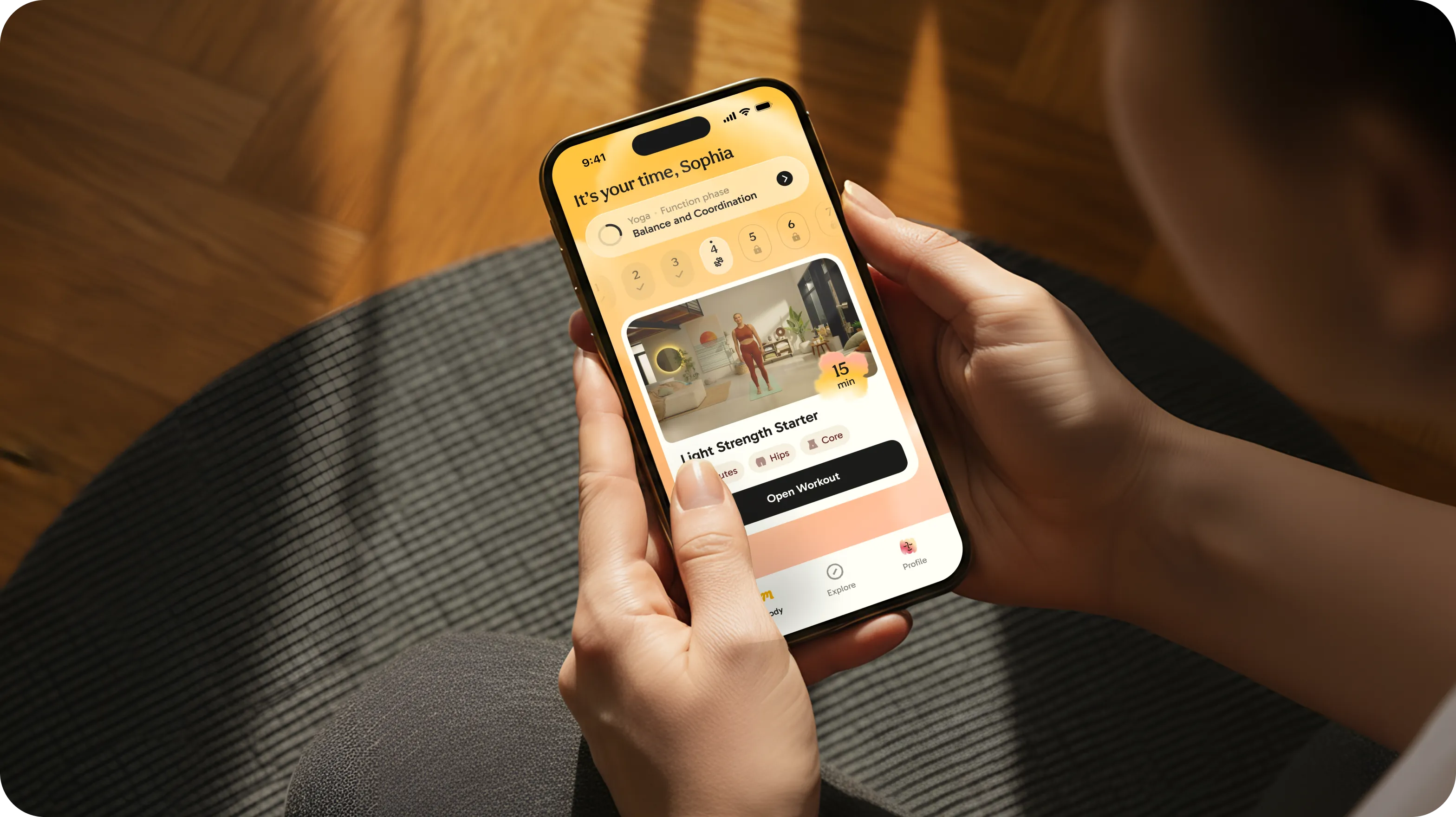
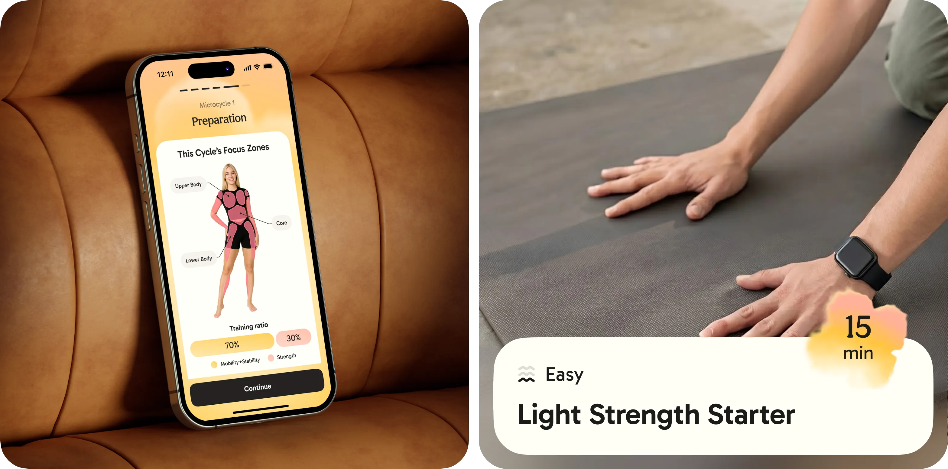
Customised onboarding questions tailor gentle somatic workouts to each person's energy level, so the first screens feel like a conversation instead of a form. Users choose their own 'Emby', a small character that stays with them, and the plan that follows meets them where they are today, not where a programme says they should be.
05In the world
The same gentleness, outside the app
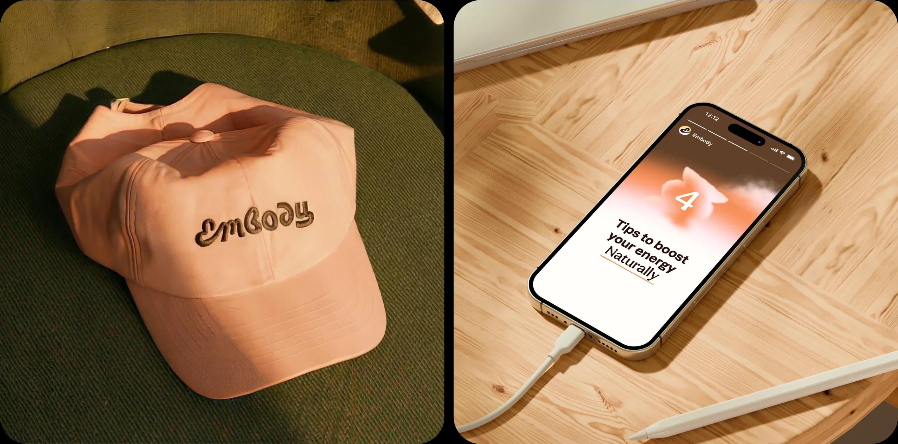
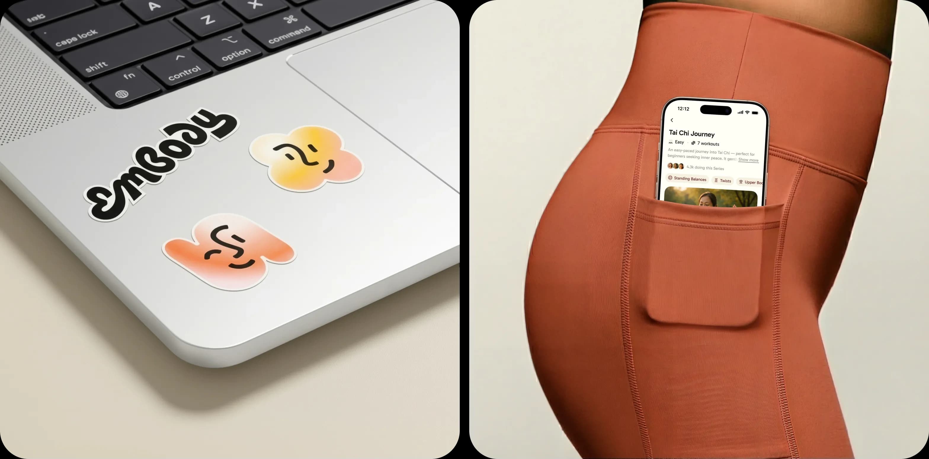
Campaign and brand moments use real women, real light and the same soft gradients: outdoor boards, merchandise and film. Headlines such as 'Find ease in motion, find peace in stillness' keep the same unhurried voice as the app.
06Impact & proof
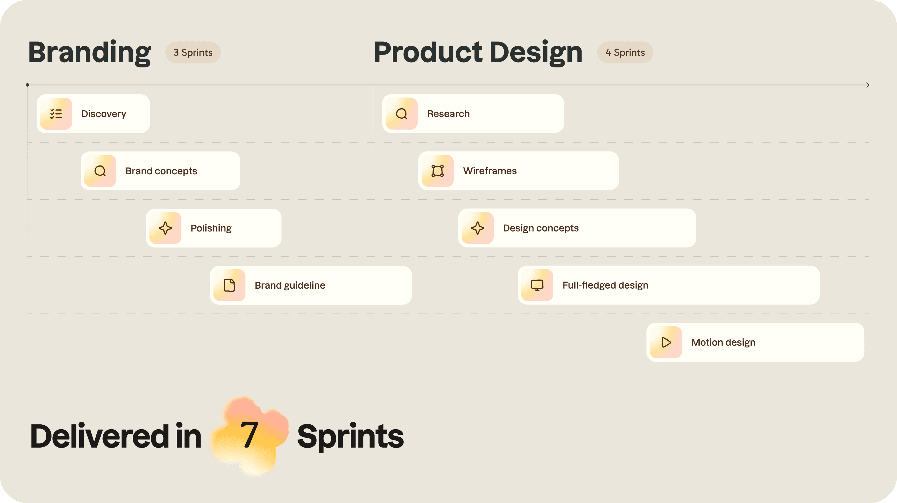
- 7 sprints
- Full brand, naming and mobile app delivery
- 100+
- Somatic movement screens and flows
- 85%
- Onboarding completion rate in beta
Metrics published by Embody as of 2025 across early app test cohorts.
Strategy
- Naming
- Positioning
- Voice
Identity
- Wordmark and monogram
- Colour and gradients
- Icons and type
- Brand guidelines
Product
- Mobile app UX and UI
- Onboarding questionnaire
- Workouts and results
Motion
- Logo and brand motion
- Onboarding flow
- Campaign film