01The challenge
The ask wasn't just a rebrand. It was a reinvention of how an entire company shows up in the world.
A platform for teams of AI engineers
Ona is a platform for running teams of AI software engineers in the cloud. It sits in a field that changes by the month, and it sells to engineering leaders who are sceptical of hype and fluent in tools.
That meant three jobs at once: a name and identity that could stand apart in a crowded category, a product experience consistent enough to trust, and a public launch big enough to be noticed.
- 6 months
- From renaming to rollout
- 2 cities
- New York Times Square and San Francisco
Timeline and launch campaign scope documented across Ona's public rollout as of 2025.
02Strategy
The hard part happens underneath
The visible work was significant: a new identity, a design system and a large-scale rollout. But the more demanding work happened underneath: design systems, documentation, internal tooling and alignment across teams and stakeholders. It is where a vision either becomes reality or quietly falls apart, and it rarely appears in a proposal.
Getting a company to move in sync, across creative direction, business alignment and internal decisions, is its own discipline. We treated it as part of the brief, not a side effect of it.
Human-first, AI-native
- 01
Human first
Painted landscapes, warm light and people, so the brand reads as human before it reads as AI.
- 02
AI native
A product that starts its own environments and runs agents, shown calmly and clearly instead of as a wall of jargon.
- 03
Built to hold
A system, documentation and tooling that keep the brand consistent as teams and products grow.
03Identity
A name and a mark built to hold
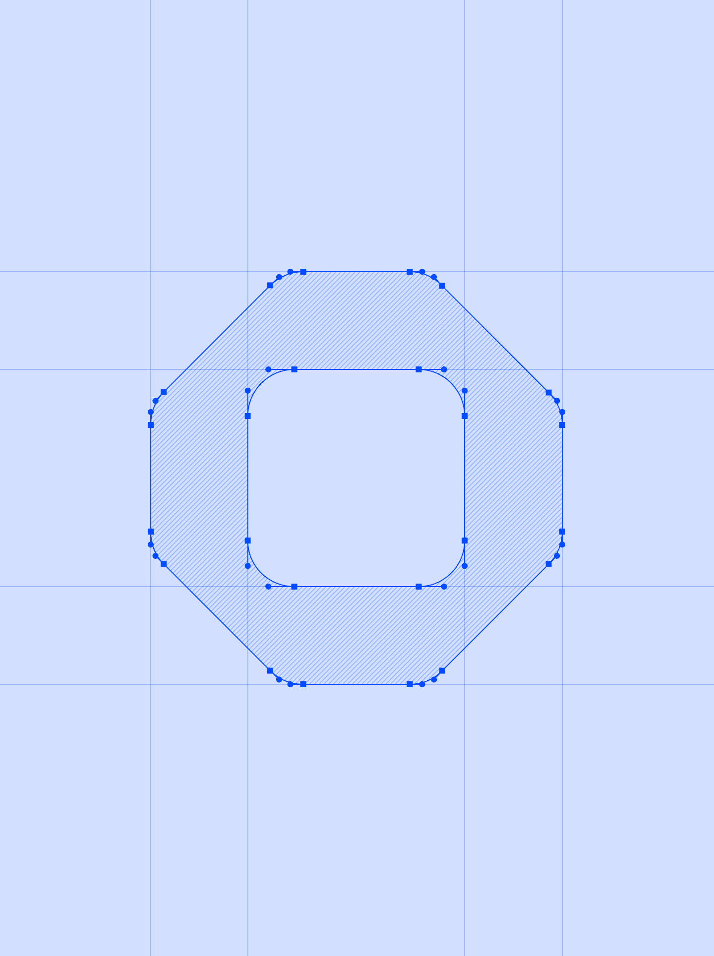
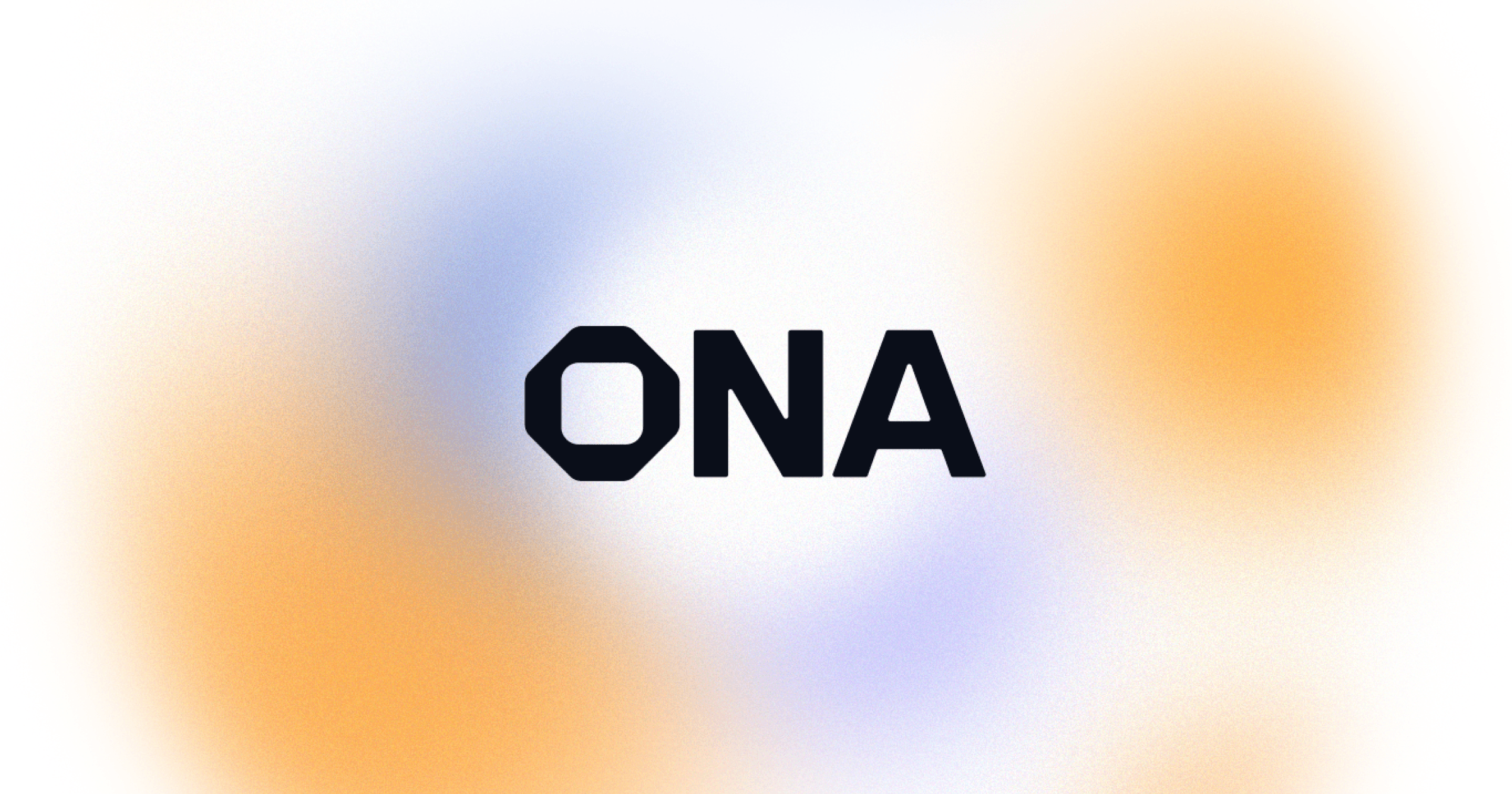
A new name needed a mark with the same clarity: a chamfered, squared-off ONA, constructed on a grid so it stays crisp from a favicon to a billboard. Three letters, drawn with enough character to be recognised and enough restraint to sit beside a product interface.
04Campaign
Painted landscapes, not circuit boards
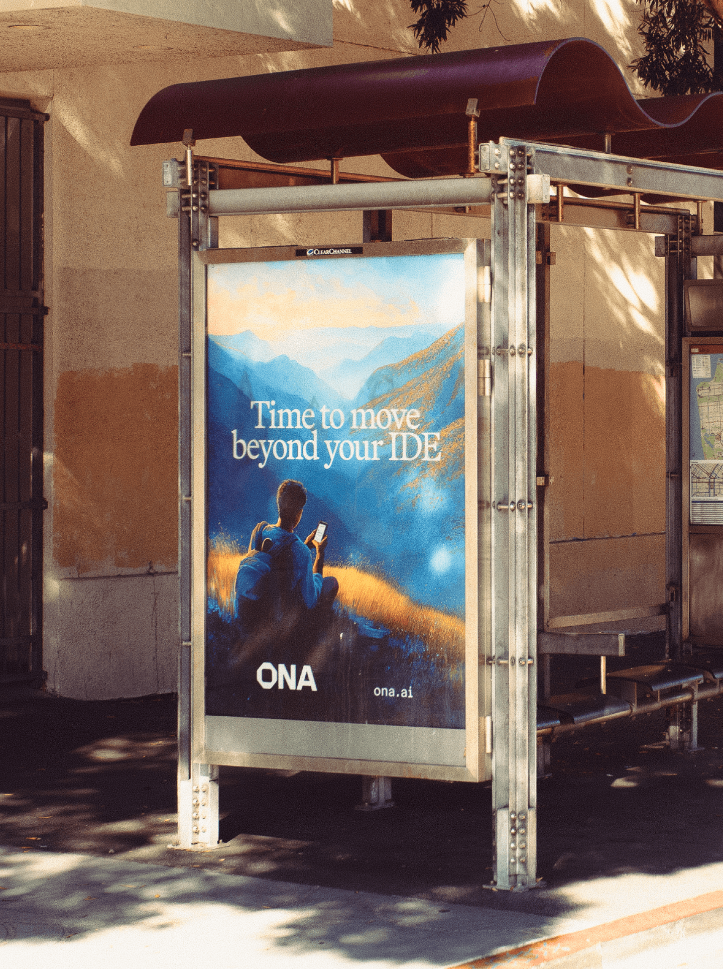
Developer tools usually look like their own terminals. Ona went the other way: painted mountains, warm light and people. The landscapes give an abstract product a place to be, and they stand out against every dark-mode screenshot in the category.
From a phone screen to Times Square
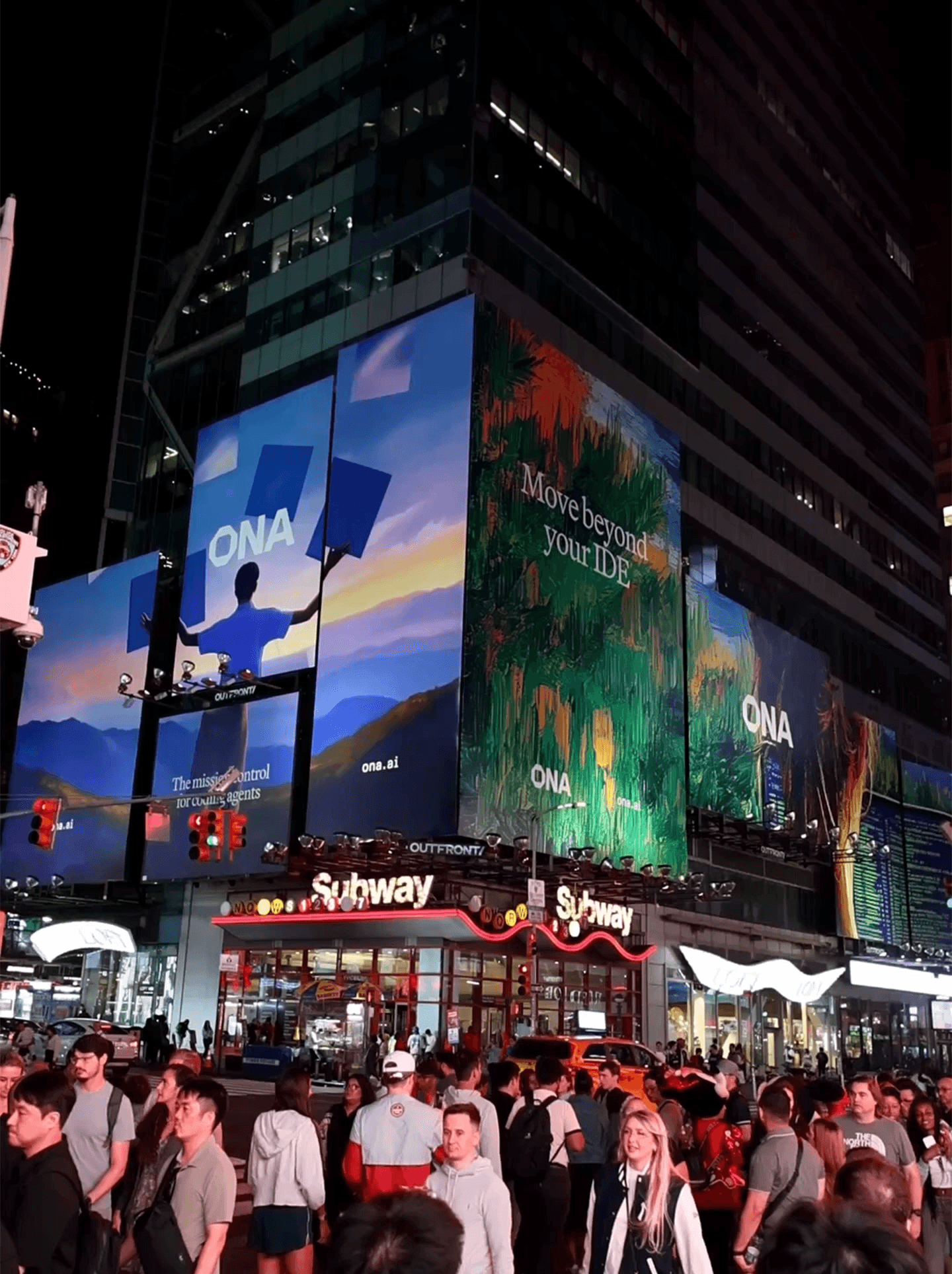
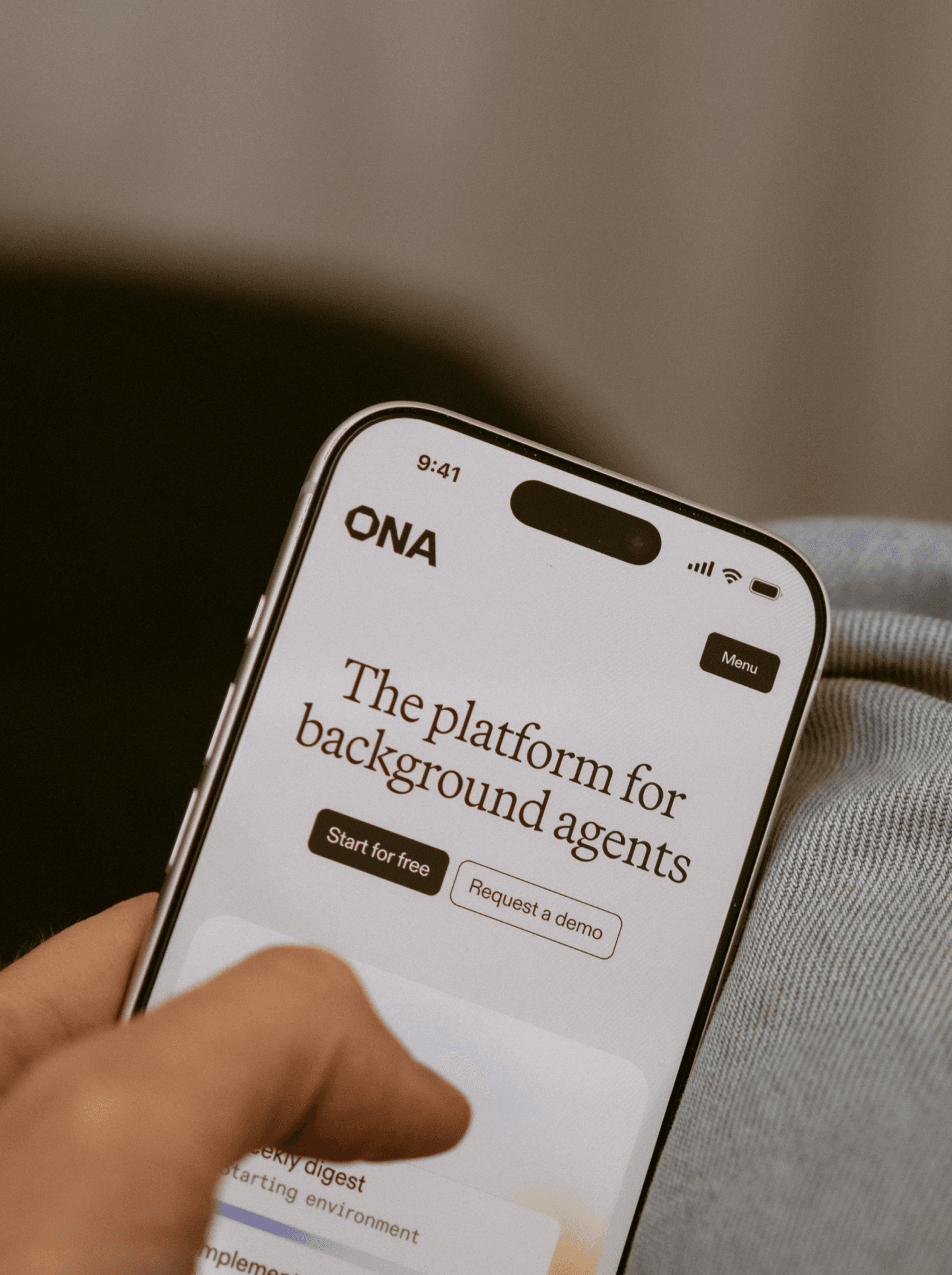
The rollout took the same system to the street. Billboards lit up Times Square, posters went into bus shelters and the message stayed plain: it is time to move beyond your IDE.


05Product
The product, in the same calm world
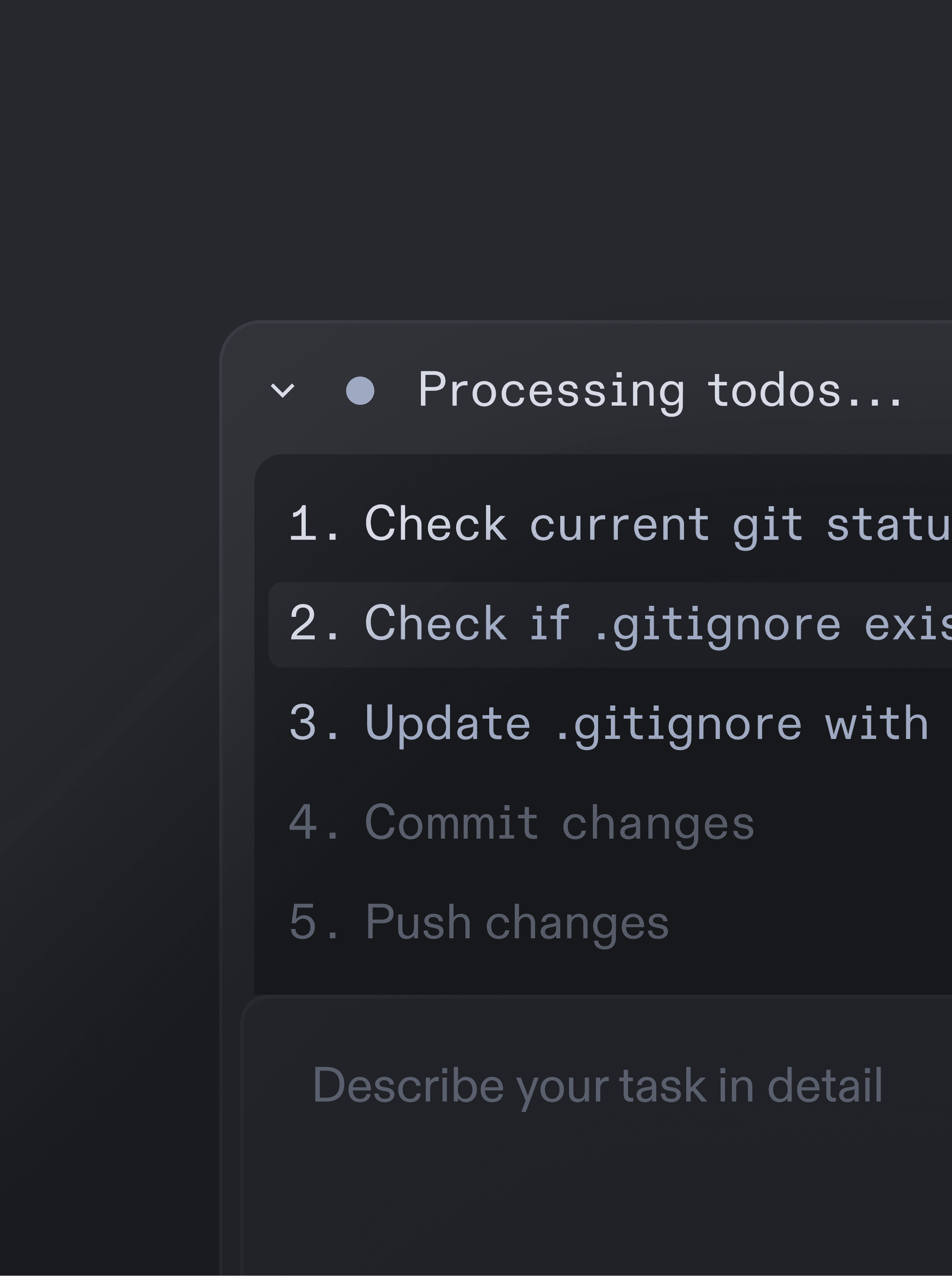
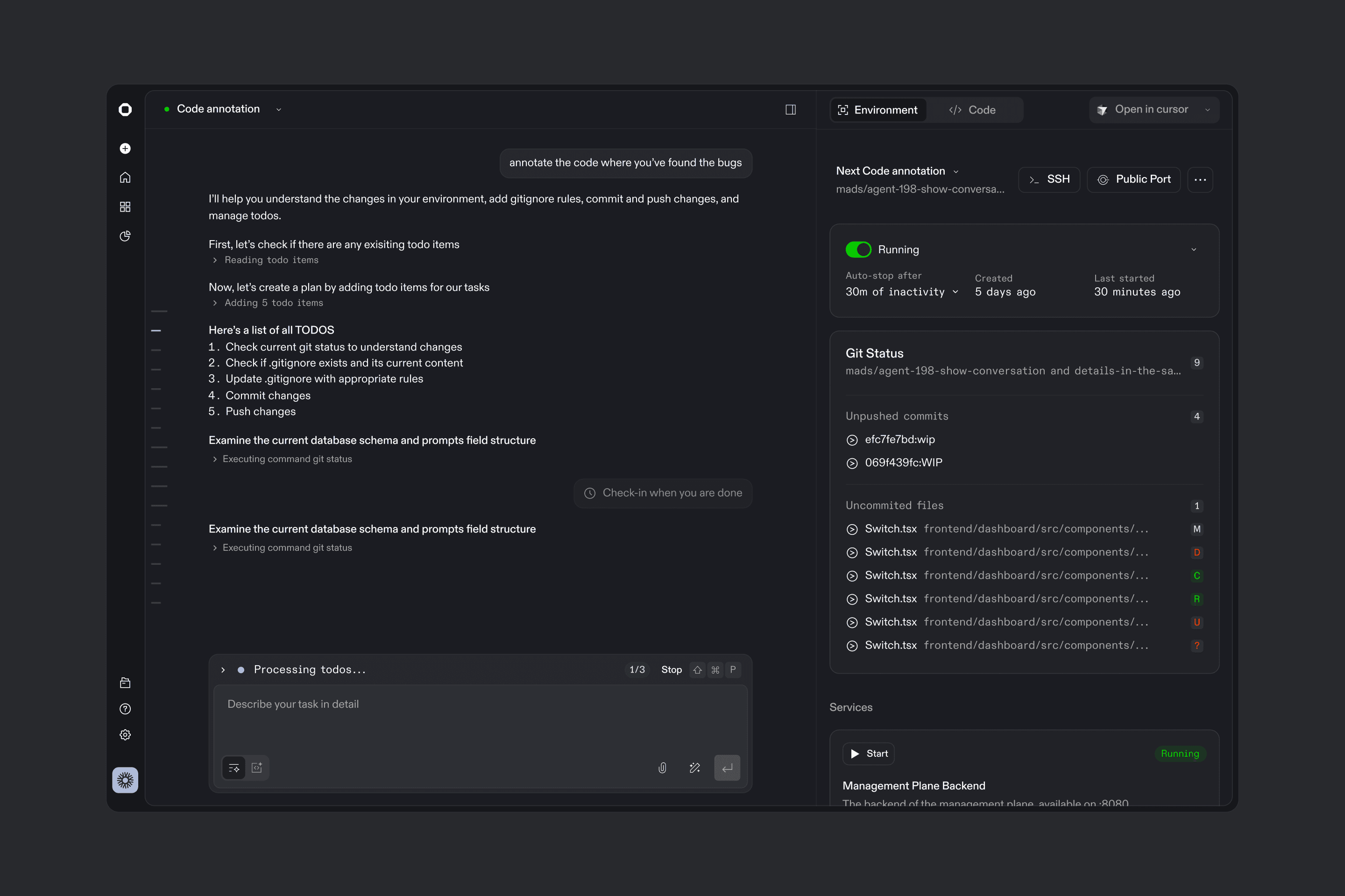
The product carries the brand inside it: a dark, quiet workspace for running agents, where each task starts up its own environment, and where chat, git changes and running services sit side by side. The design system and documentation underneath keep it consistent as the team and the product grow.
06Deliverables
Strategy
- Renaming
- Positioning
- Stakeholder alignment
Brand
- Identity and wordmark
- Illustration direction
- Photography direction
Product
- Product design
- Design system
- Documentation and internal tooling
Motion and rollout
- Motion
- Times Square and San Francisco campaign
- Social