01The full site
The OpenCoreOS website, top to bottom
Recorded in the browser: the whole site in one scroll, from the first headline to the last, exactly as a CIO meets it.
02The challenge
The world's biggest banks run on core systems that were never designed for real-time banking, and the people who choose their replacement are the hardest audience in technology to impress.
A bold product, a very cautious buyer
A bank's core is the system everything else depends on: accounts, balances, payments, the ledger. Replacing it is a decision a CIO makes once in a career, and the cost of getting it wrong is public. That is why so many tier 1 banks have watched fintechs move faster while staying on legacy infrastructure.
OpenCoreOS is built to change that: an AI-first core banking platform designed for the scale of the largest institutions. Its founders bring C-suite experience from HSBC and McKinsey, and a seat on BIAN's board. The product was ready. The brief was to make a brand that could carry that credibility into the room, and make an ambitious claim feel safe to back.
What core banking brands usually do
- The same corporate blue as every other platform in the category
- Grids and boxes that contain every message
- Safe, symmetrical geometry that signals caution, not ambition
What OpenCoreOS does instead
- Organic forms that suggest expansion, flow and growth
- Light, space and air, with nothing boxed in
- One vivid orange, saved for the moments a user acts
03Strategy
Speak to the head and the heart of a CIO
A CIO at a tier 1 bank needs two things at once: proof that the platform will not fail, and a reason to believe the future is worth the risk. Most brands in this category answer only the first. We built the strategy to answer both, in a confident tone of voice that shows decades of industry experience and speaks the CIO's own language.
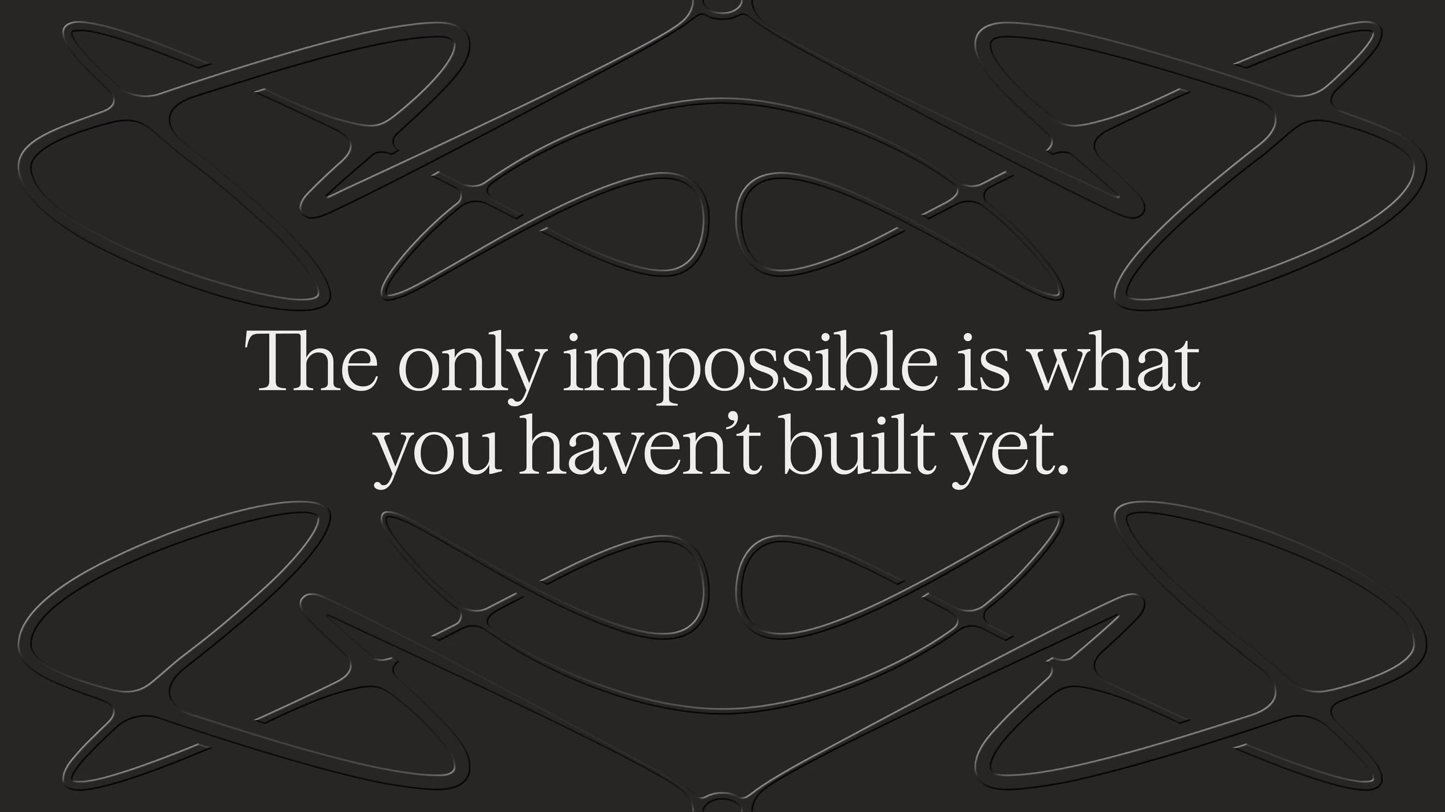
Unthinkable. Unbreakable.
For CIOs at tier 1 banks, OpenCoreOS is the AI-first core that turns legacy from a burden inherited into the defining thing they build next.
- 01
Unthinkable
An invitation to build what the industry thought impossible, and to reclaim what legacy can mean.
- 02
Unbreakable
Reassurance on resilience and reliability, so ambition never reads as risk.
- 03
Their language
A tone built on real experience, plain and precise, never hype.
04Identity
An identity drawn from growth, not from the category
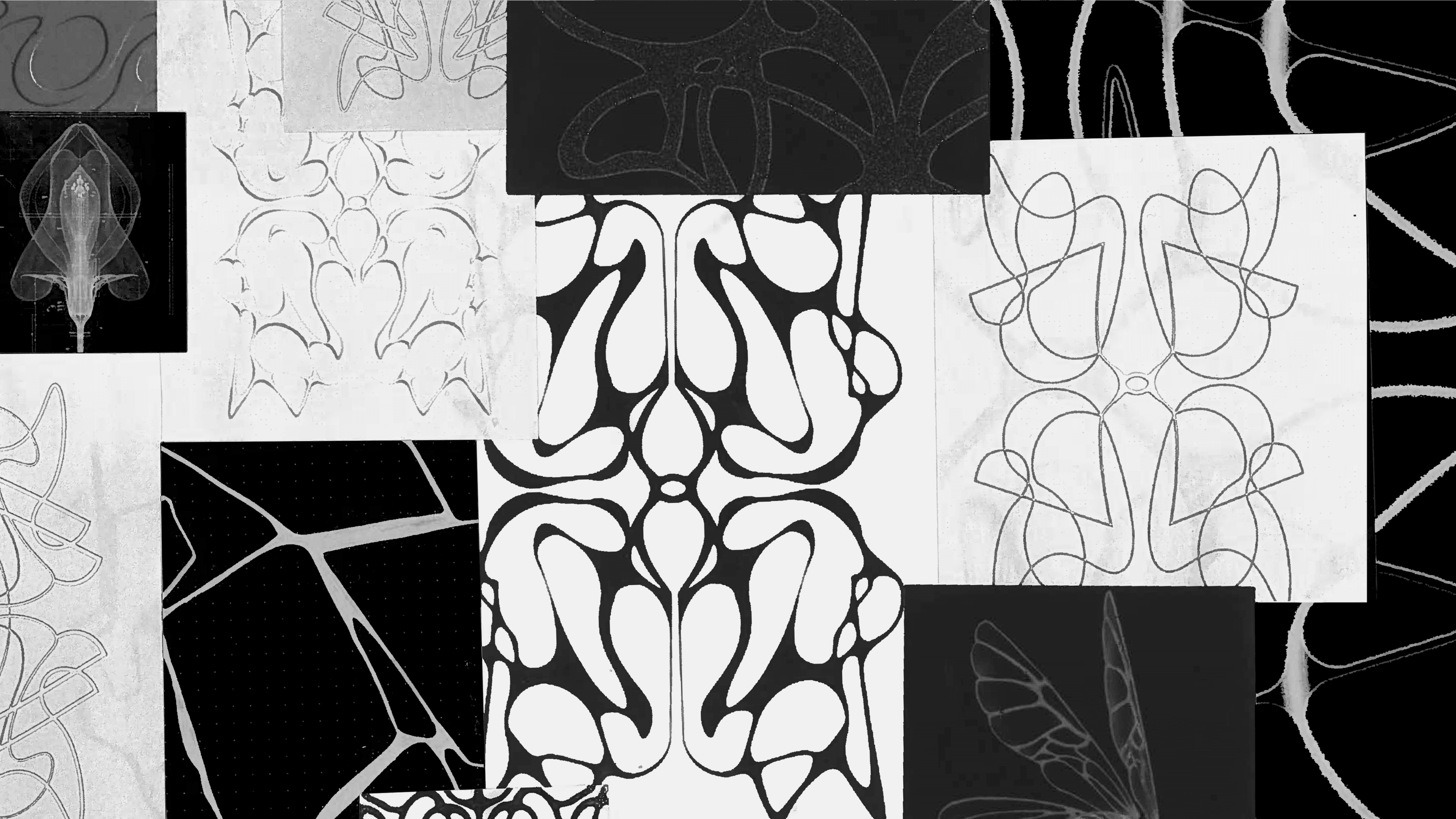
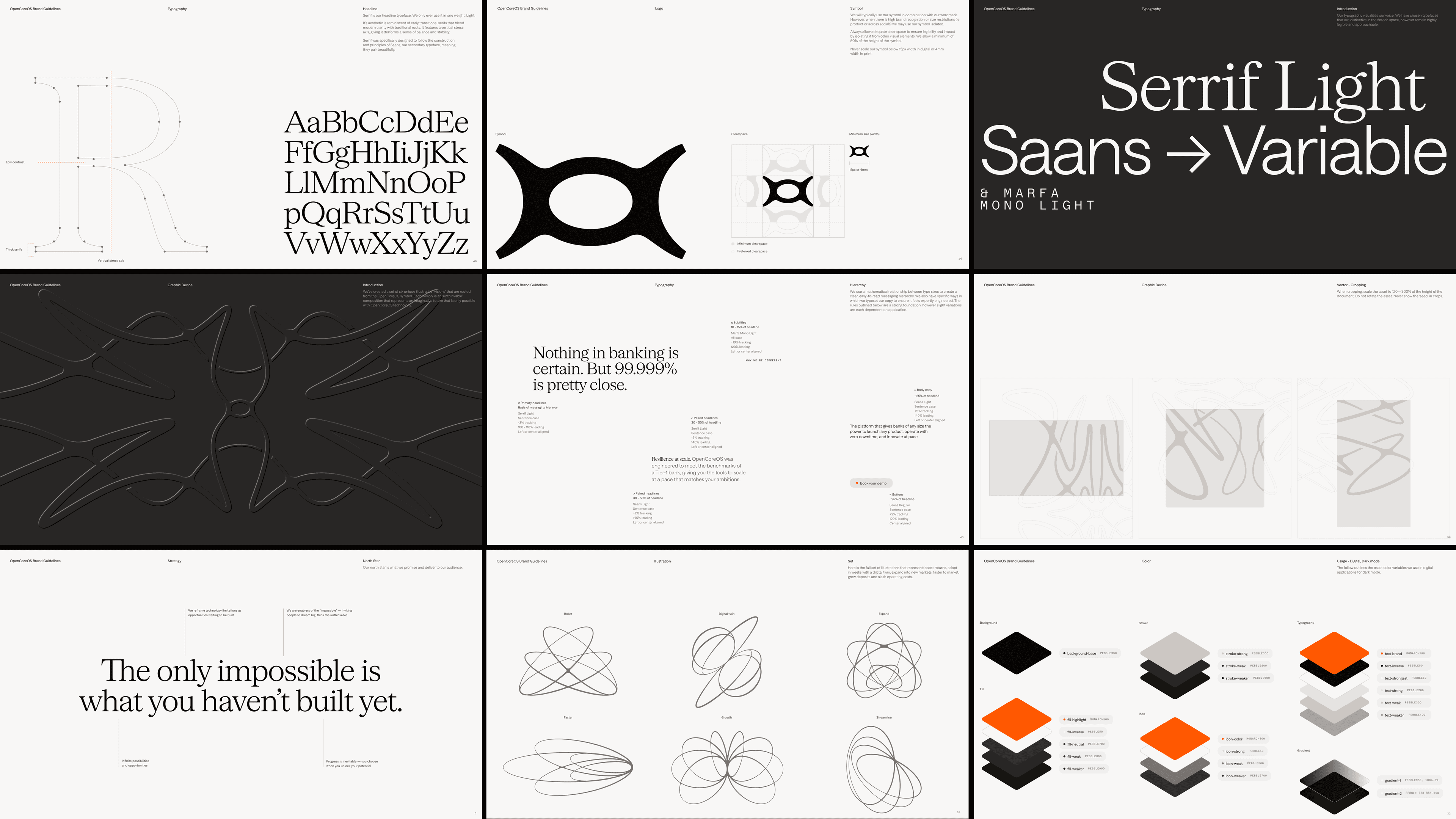
If every competitor looks like a bank, the way to look like the future is to stop looking like a bank. We started with ink, marble and fine line sketches of organic, symmetrical forms: shapes that suggest expansion and flow, a fitting picture of infrastructure that frees complex institutions to move at pace.
The Visions
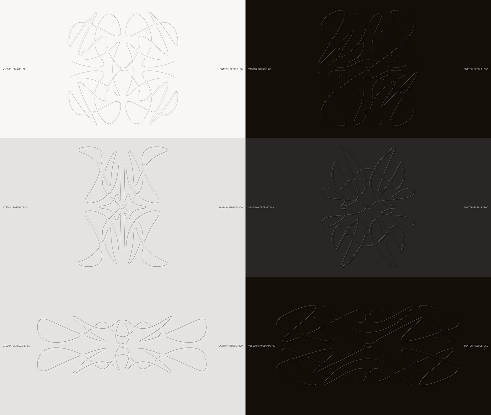
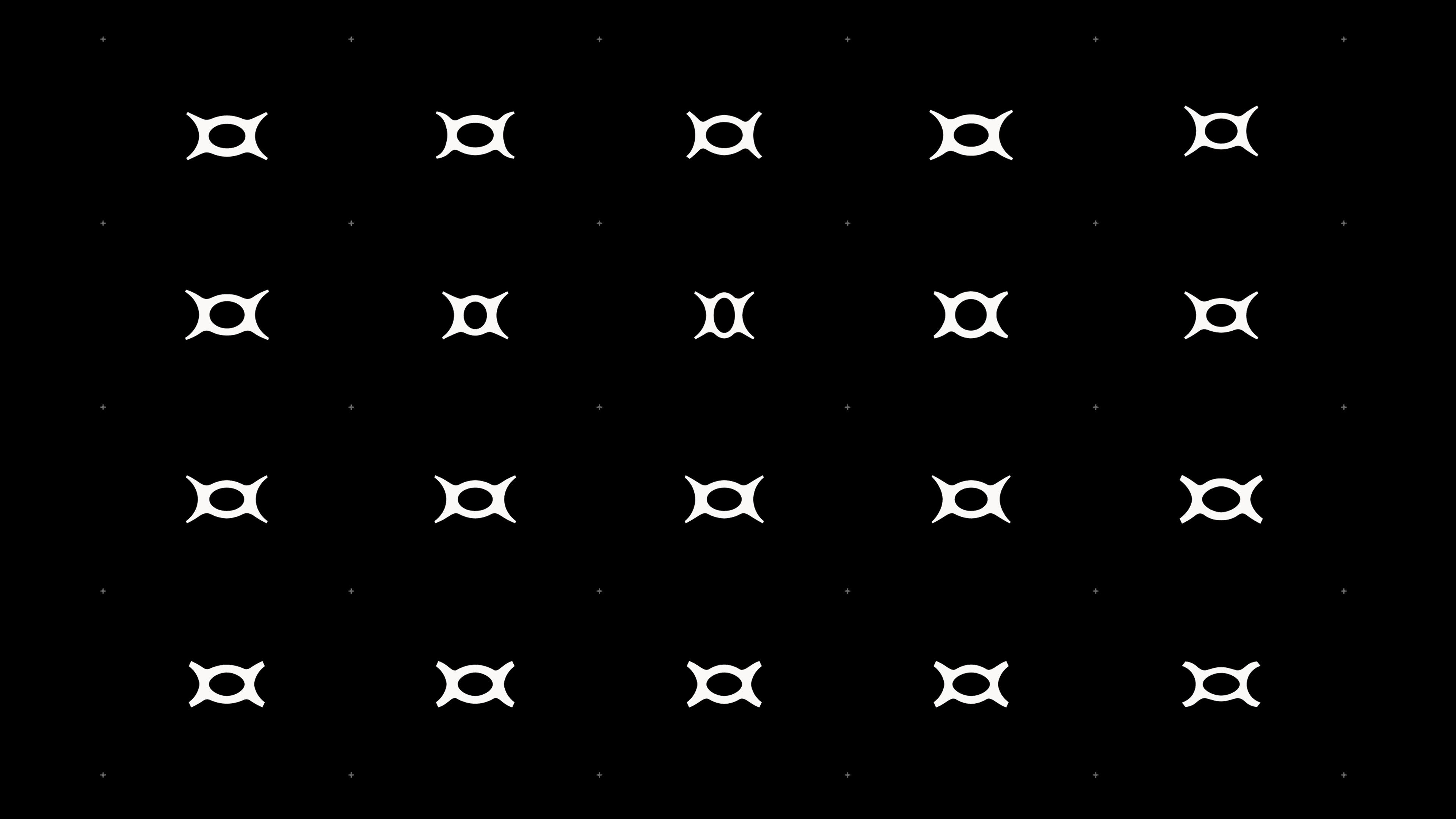
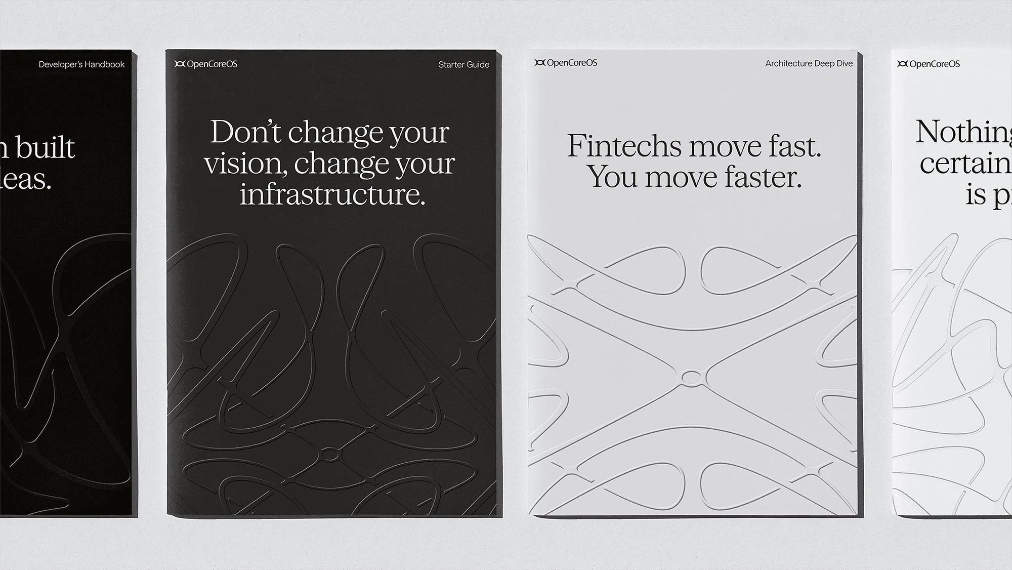
Those forms grew into a family of patterns we call the Visions. They give the brand its movement and texture, from embossed print to the website.
A symbol that holds its ground
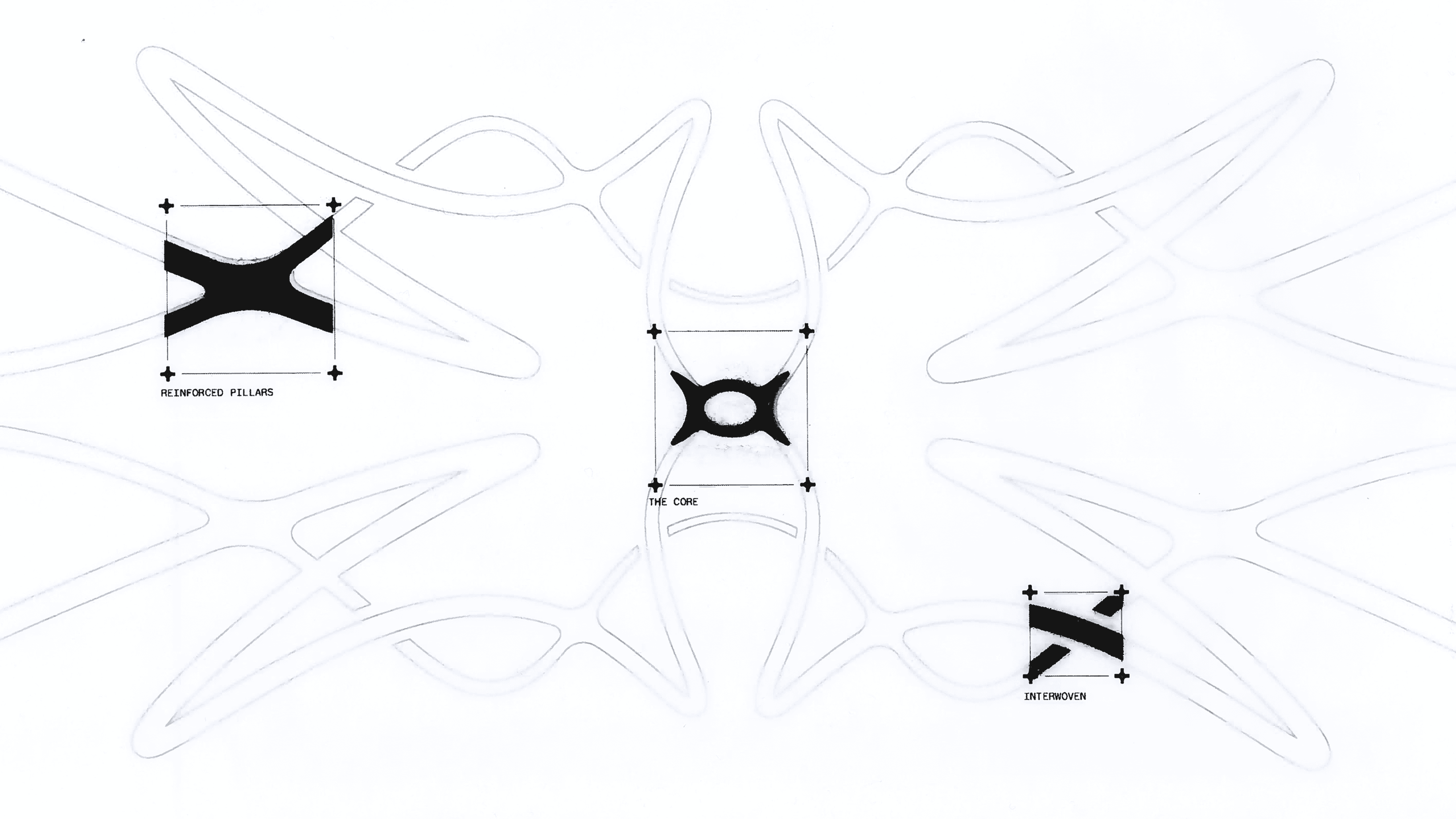
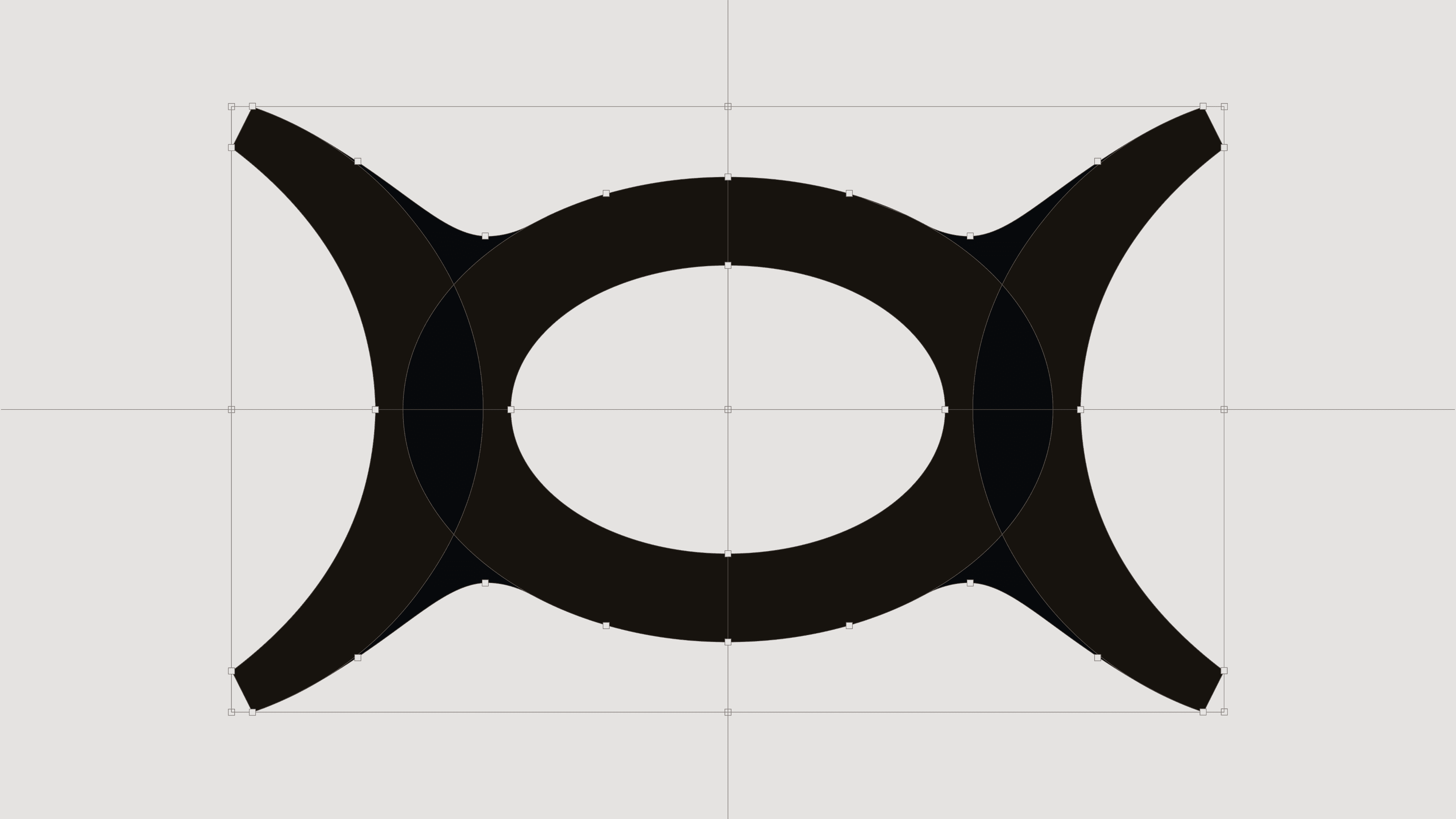
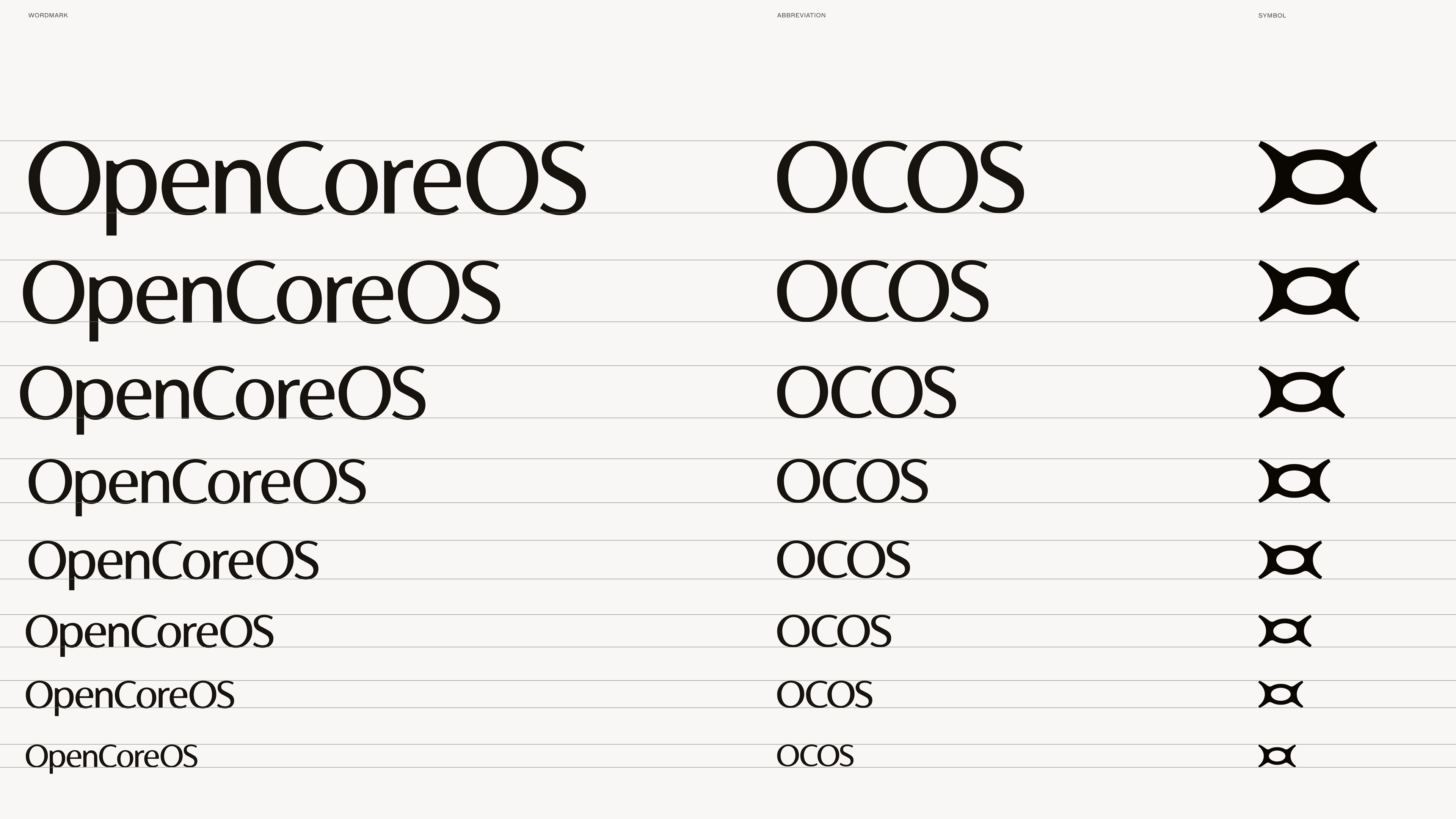
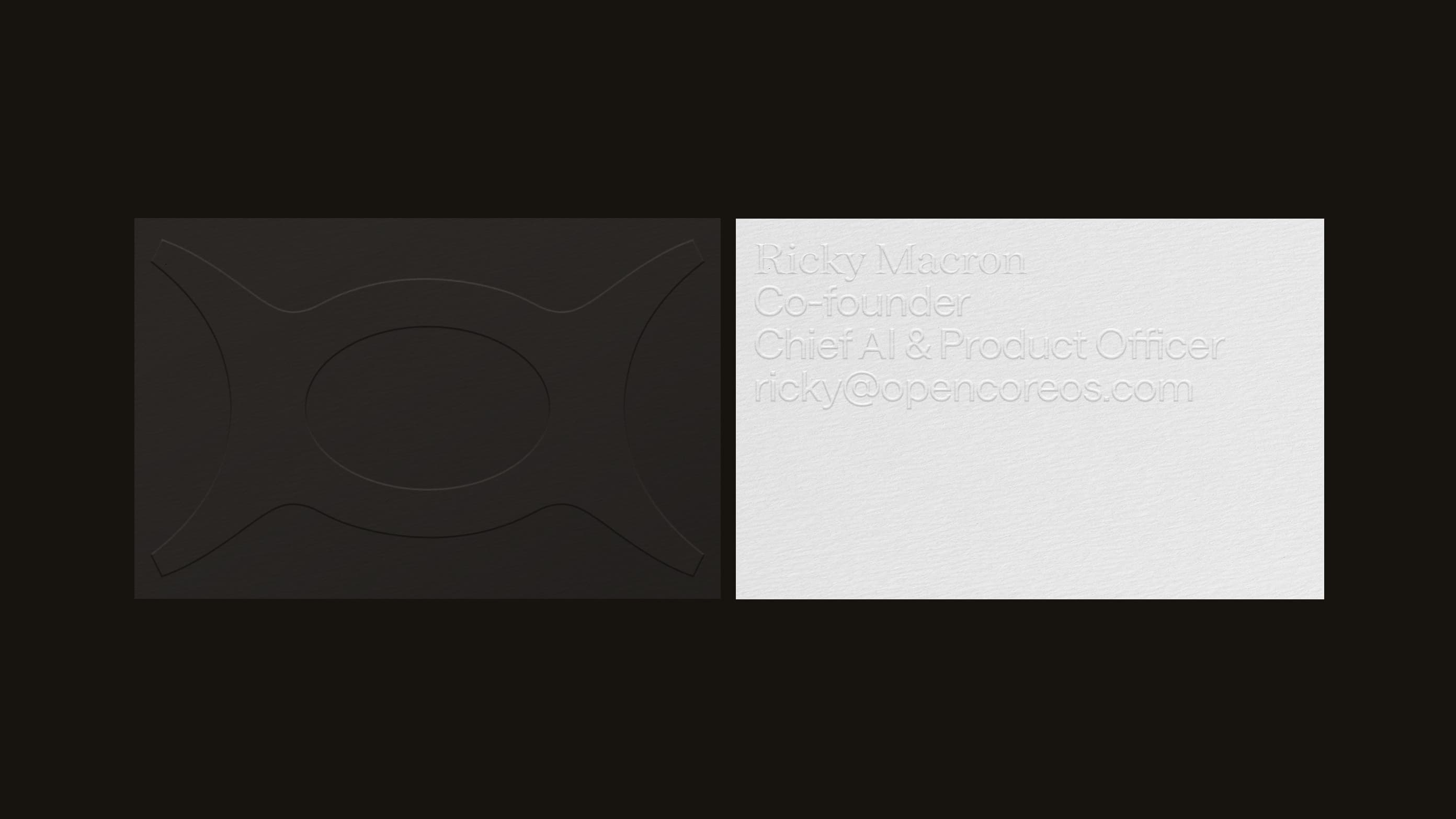
At the centre of the identity is the mark: the O and C of OpenCoreOS fused into one quietly commanding symbol. A solid core, and the origin point of something new. We drew it on a construction grid and tested dozens of curve variations until it was resolute at a billboard's scale and still legible at a favicon's.
05Brand system
Stripped back, with orange where it counts
The system is built on restraint. Layouts stay open so content can breathe, and the whole brand carries a sense of lightness that enterprise software rarely allows itself.
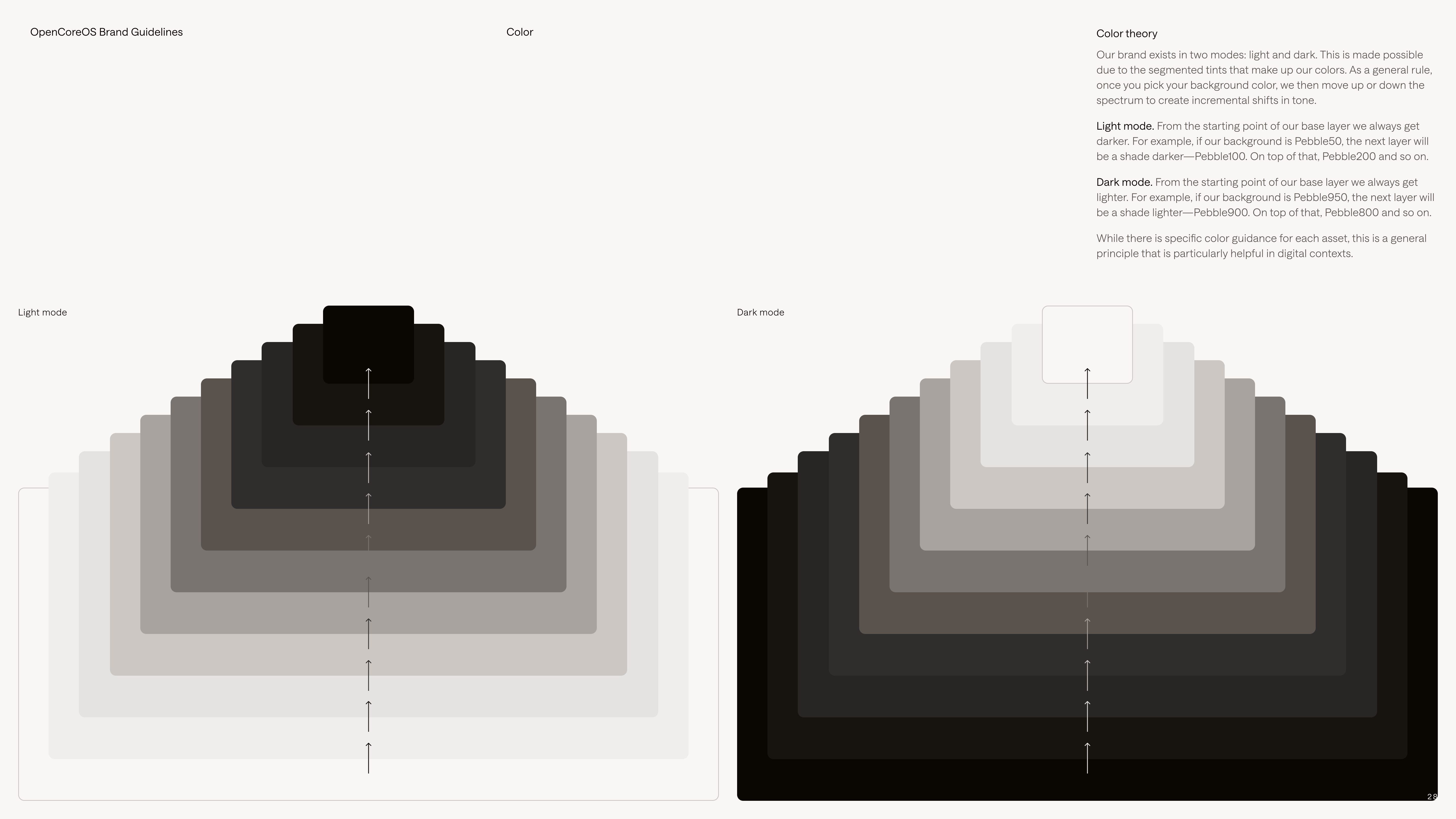
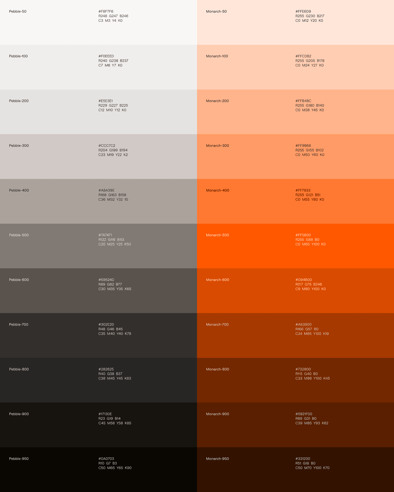
Colour comes in two scales of eleven steps: Pebble, a range of warm greys from near-white to near-black, and Monarch, a single vivid orange. The orange is deliberately rare. It appears only at the moments a user acts, so it works as a signal, not decoration. Type follows the same logic: a light serif for statements, a variable sans for reading and a light mono for technical detail.
Diagrams that explain, in brand
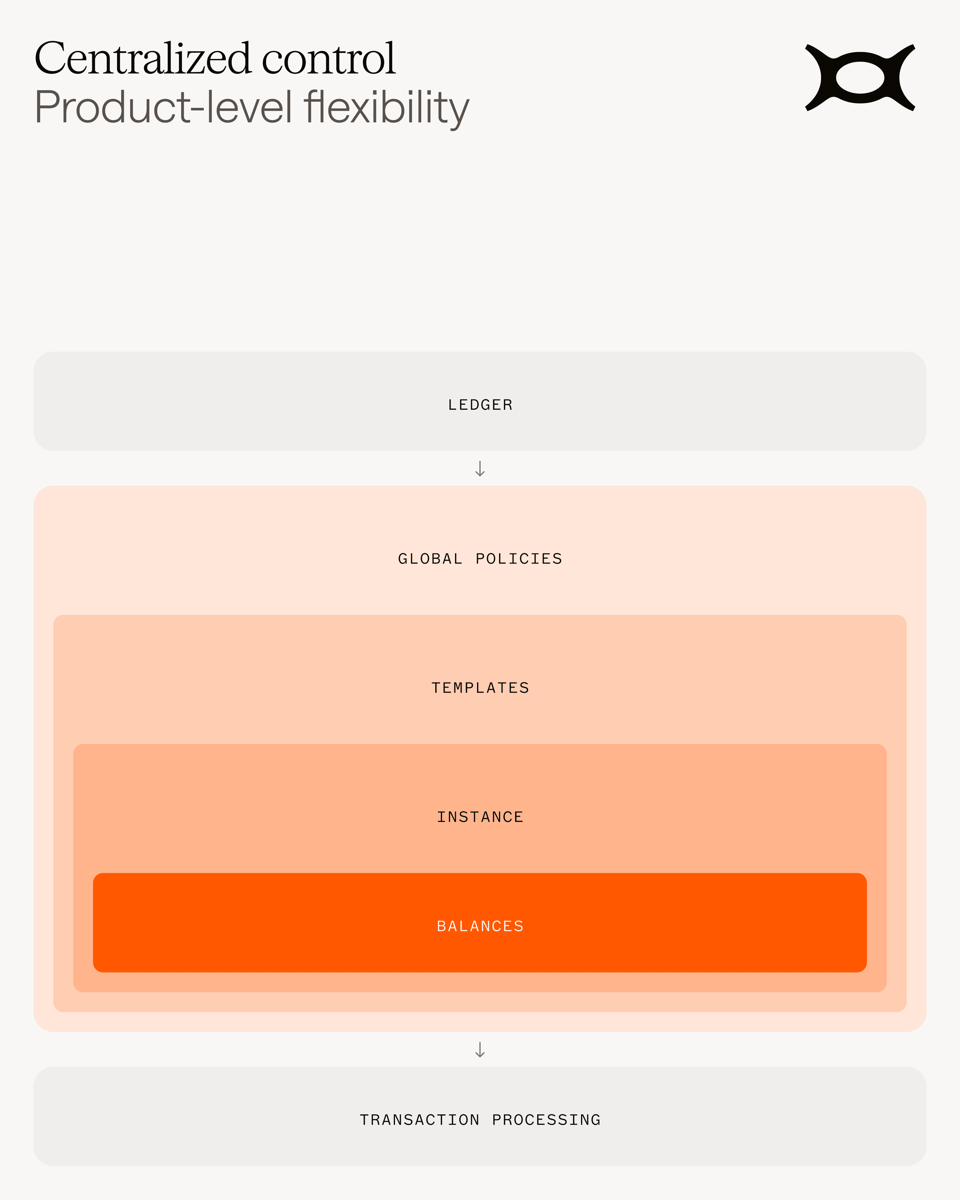
Complex architecture is part of what OpenCoreOS sells, so the system includes a diagram language. Nested tints of Monarch turn layers like ledger, policies, templates and balances into something a CIO can read at a glance.
06Website
A website with light and shade, and nothing boxed in
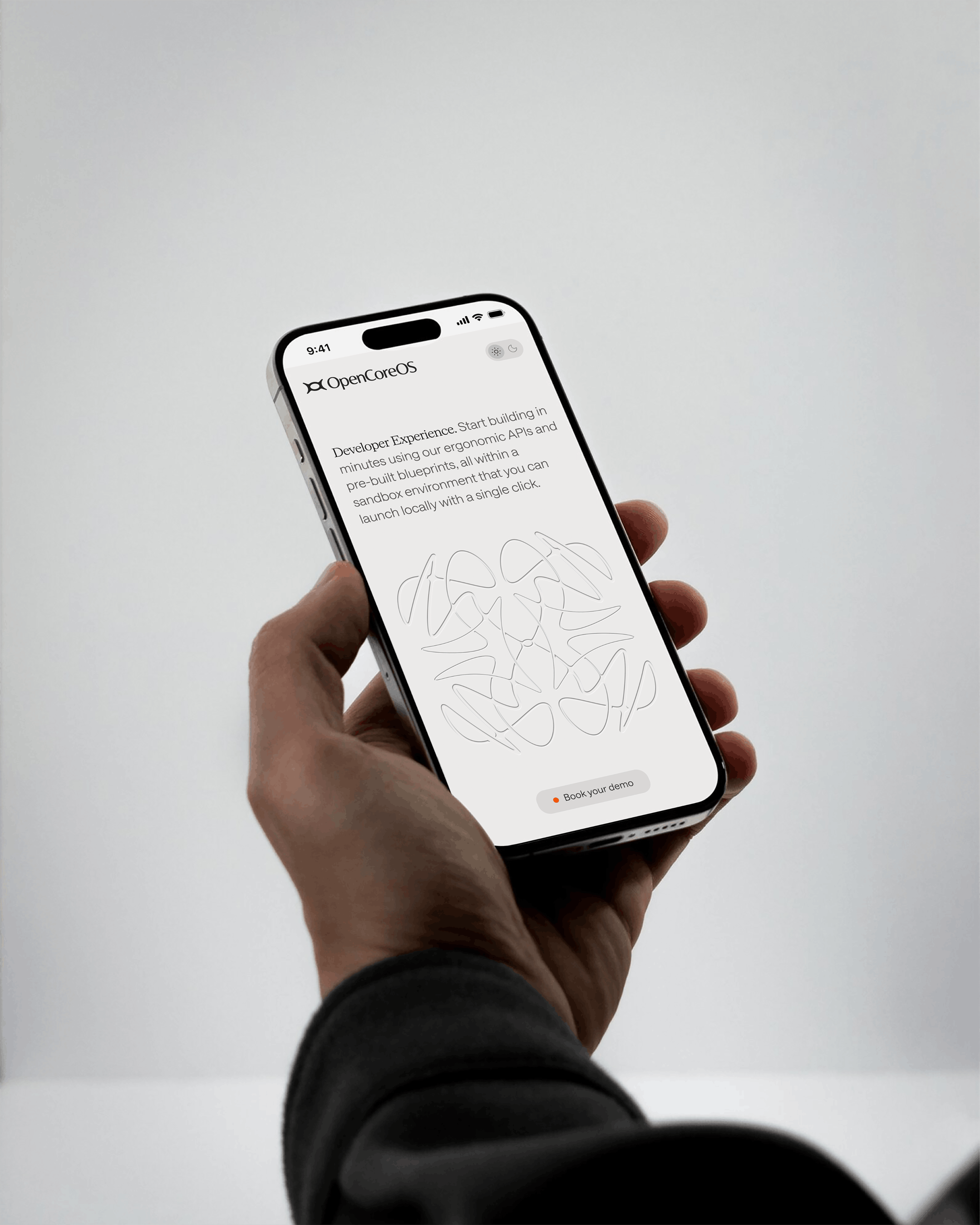
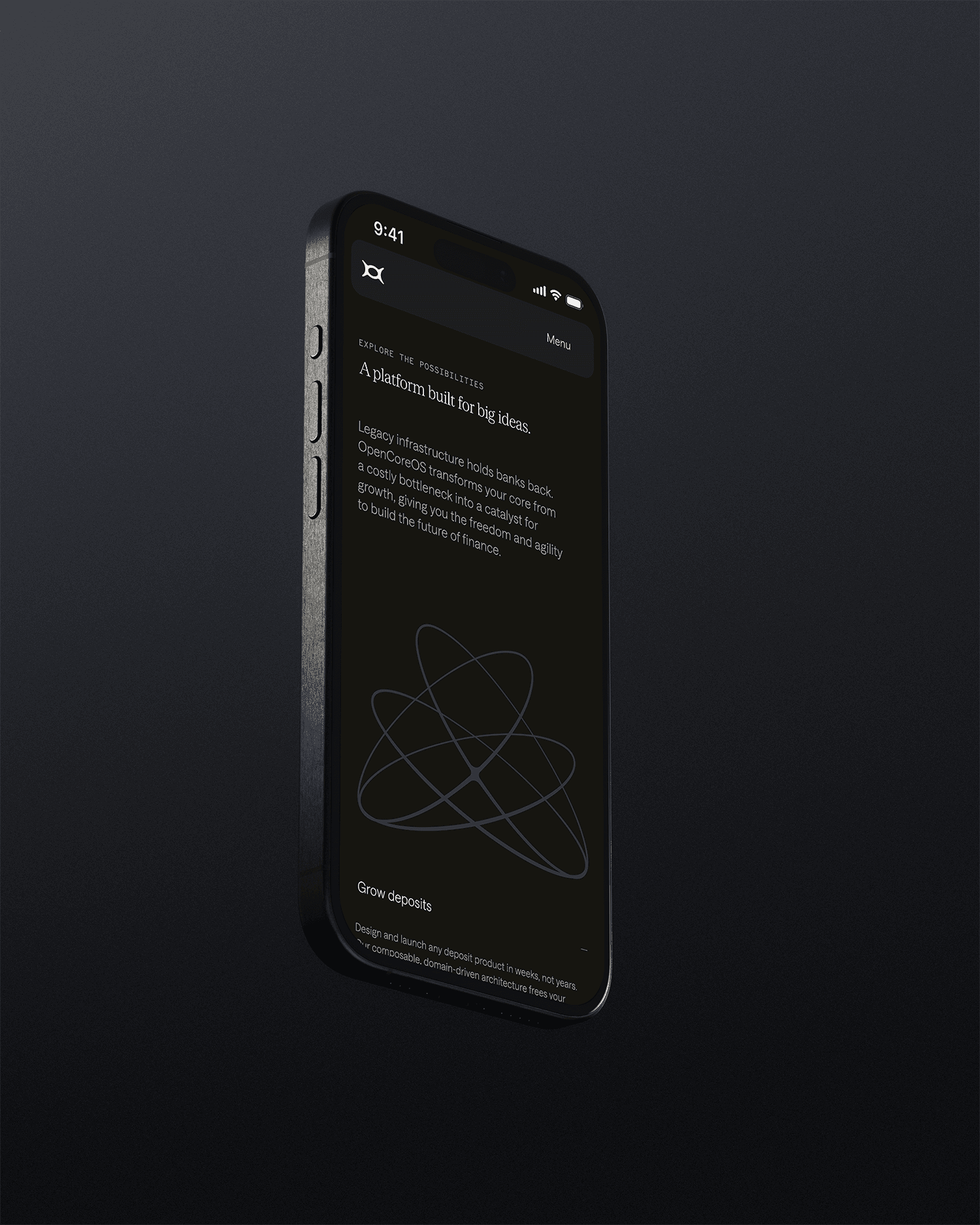
The website is the first place a CIO meets the brand, so it carries the whole idea. It uses light and shade instead of cards and borders, and its bright, airy minimalism feels freer than anything else in the sector. The page reads as a story, not a spec sheet: free-flowing, intuitive and easy to follow for readers who are short on time.
Motion does quiet work. The navigation settles into a compact pill with a clear route to book a demo, and the headline types itself out in the light serif before the page opens up.

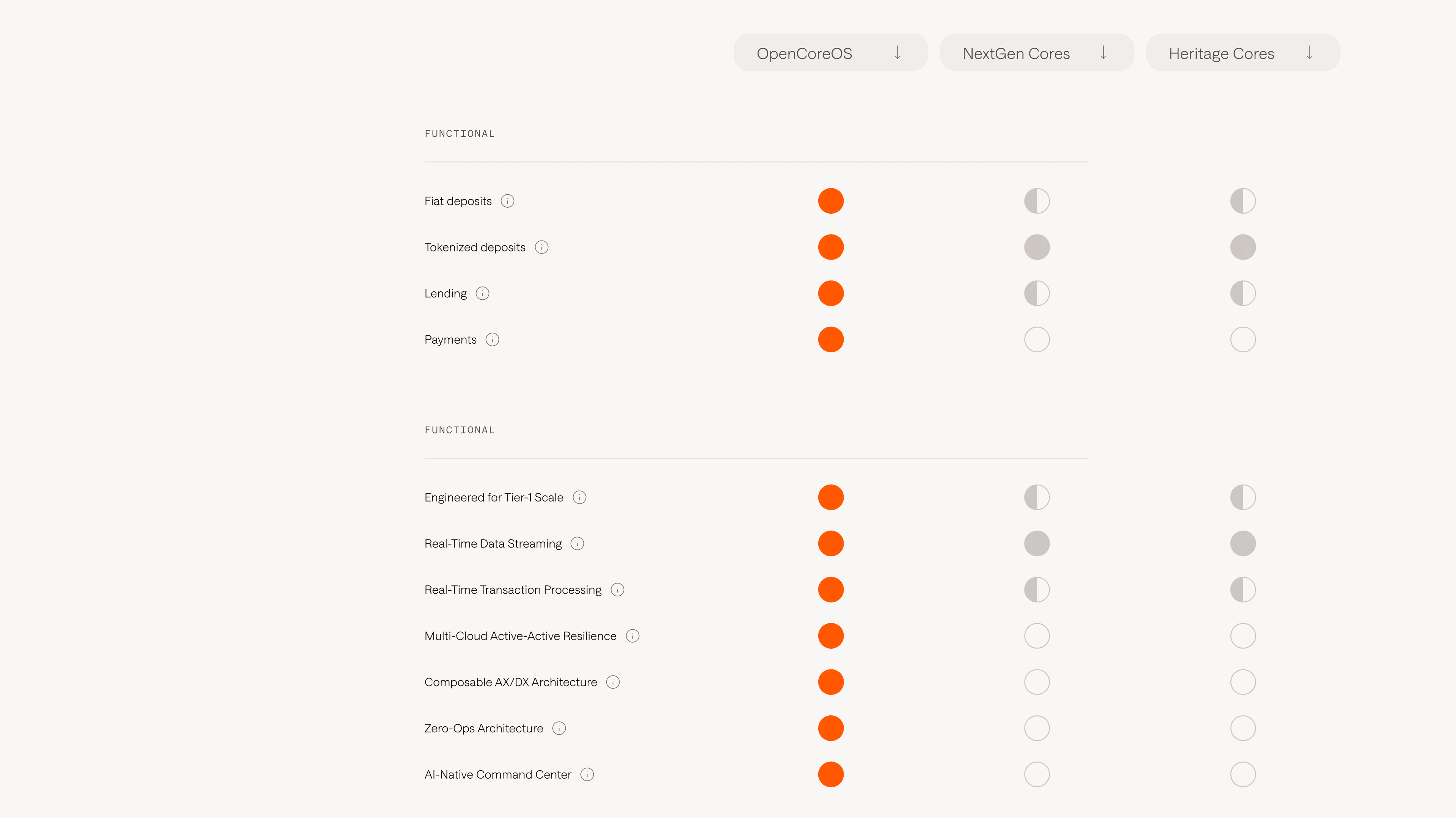
Making a technical comparison easy to read
Banks compare cores feature by feature, so the site does too. A clear comparison sets OpenCoreOS against NextGen and heritage cores across payments, lending, real-time processing and multi-cloud resilience, using the brand orange to mark where OpenCoreOS leads.
07In the world
From the conference stage to a keycard
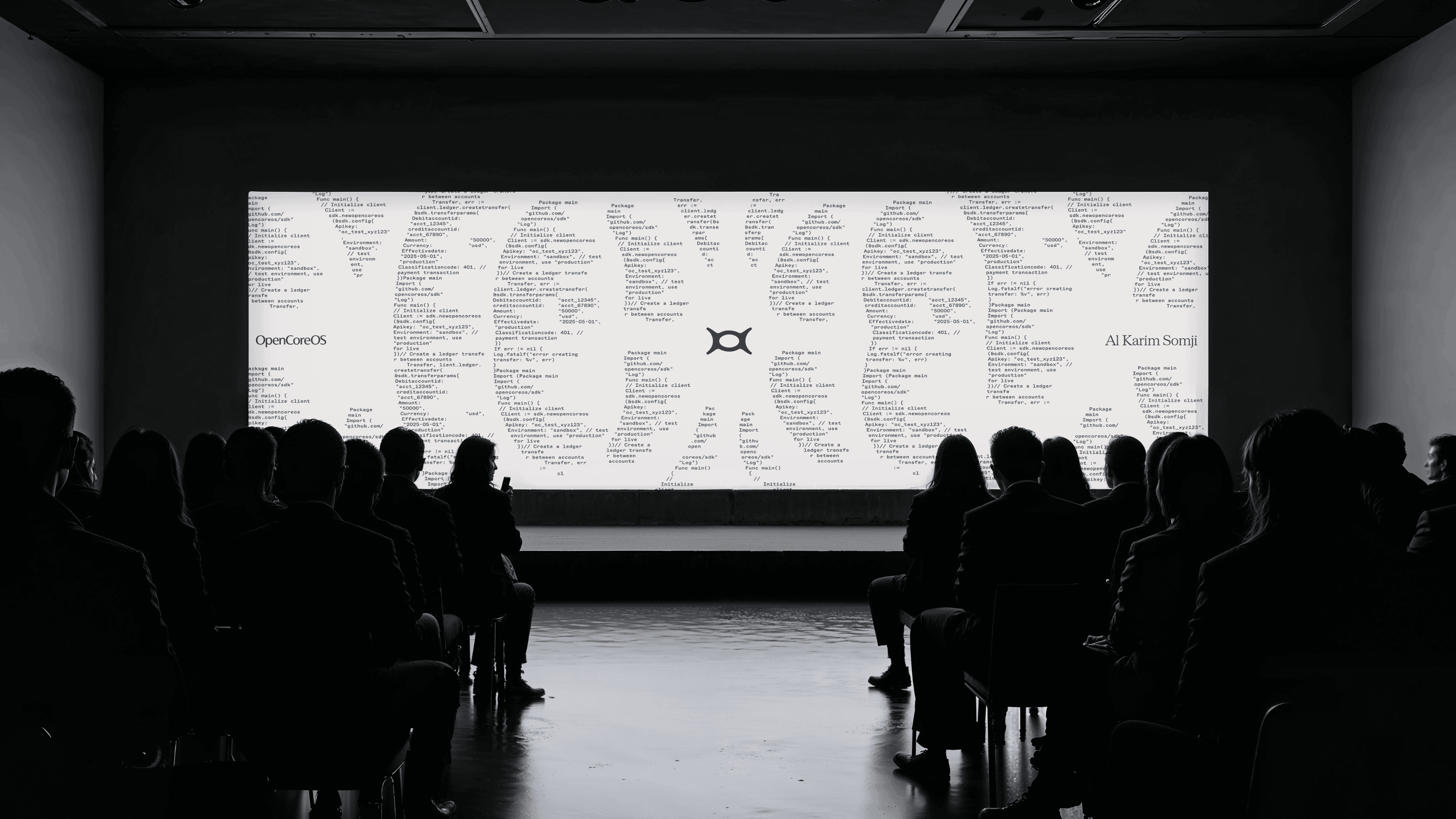
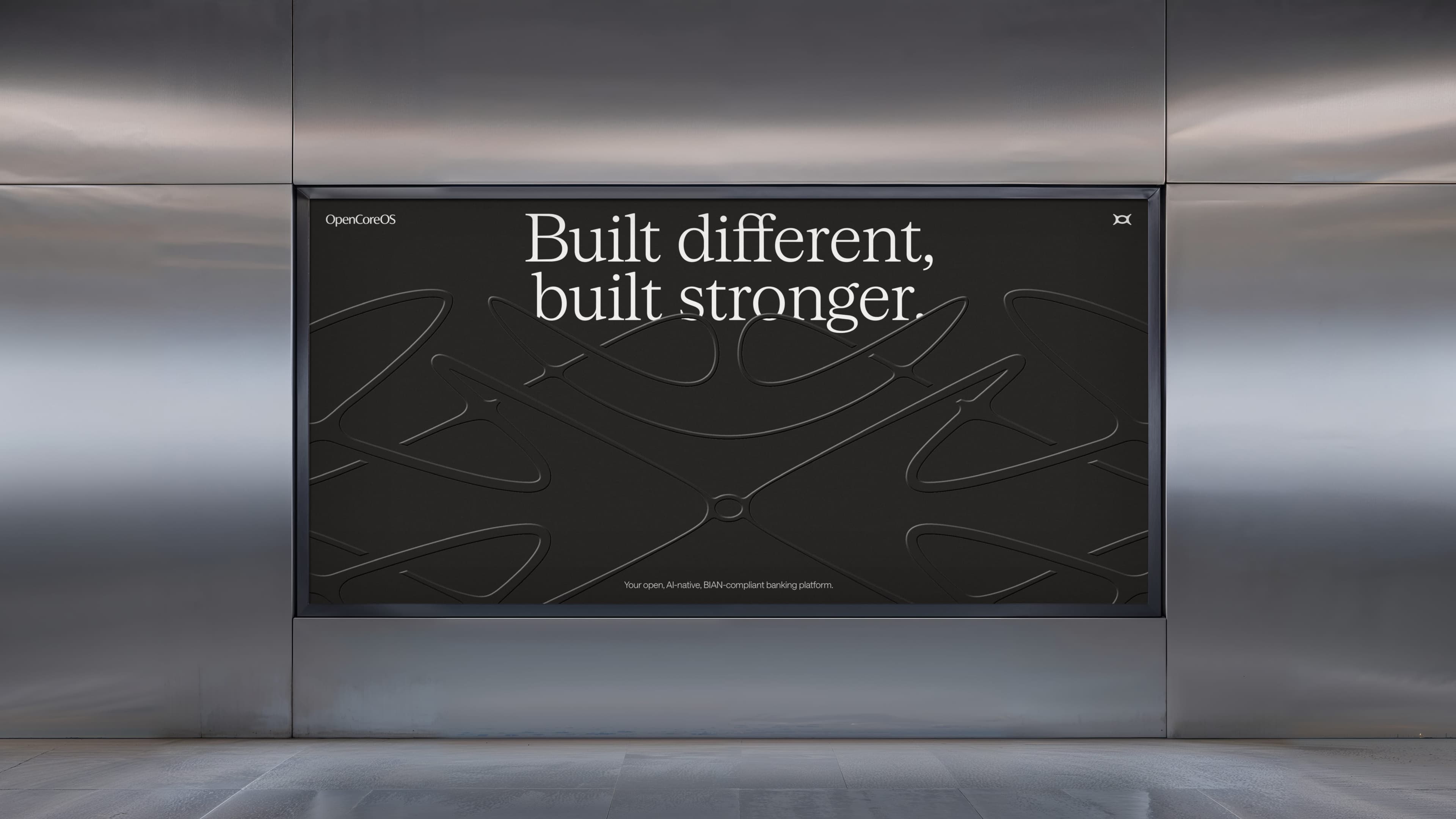
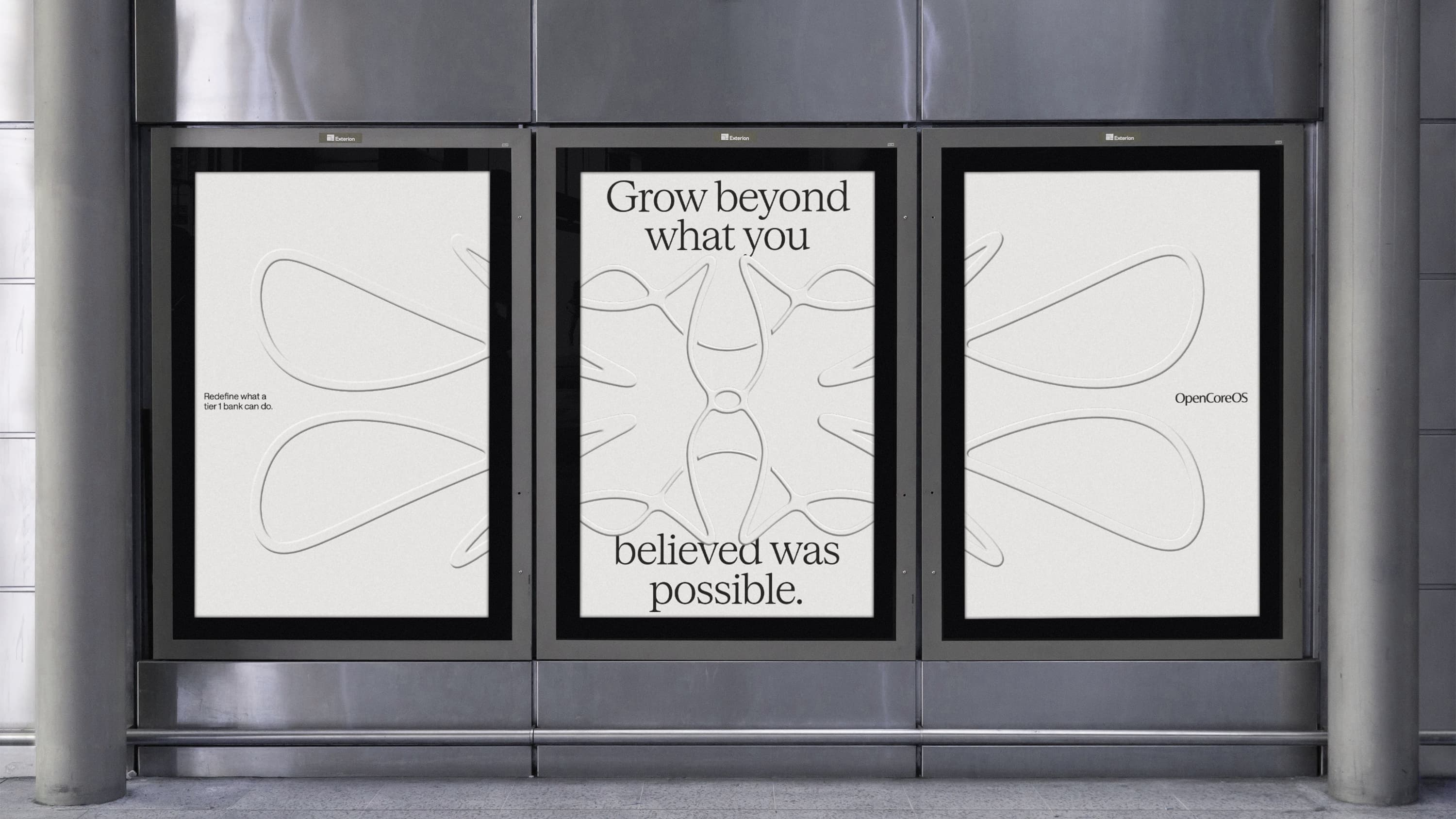
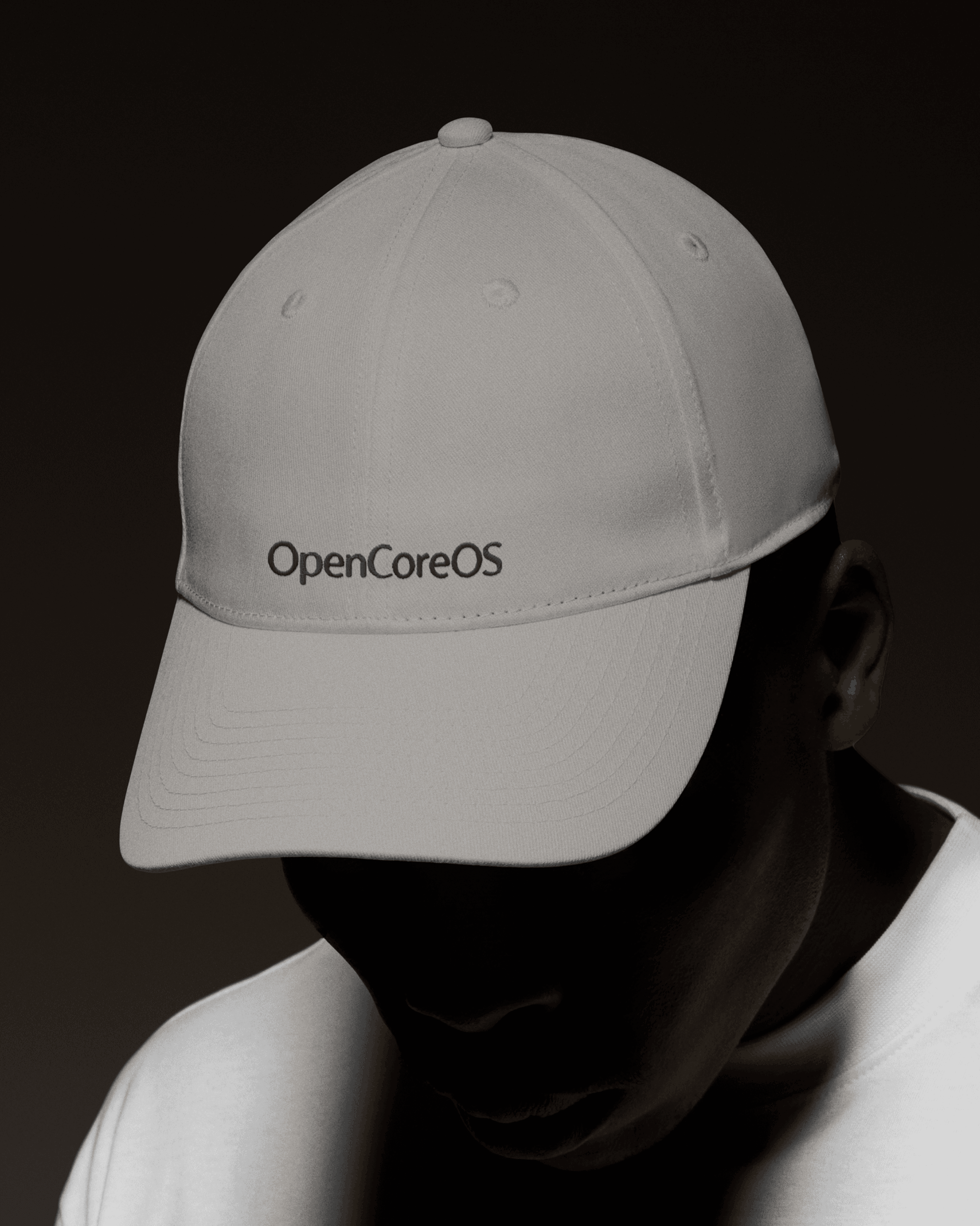
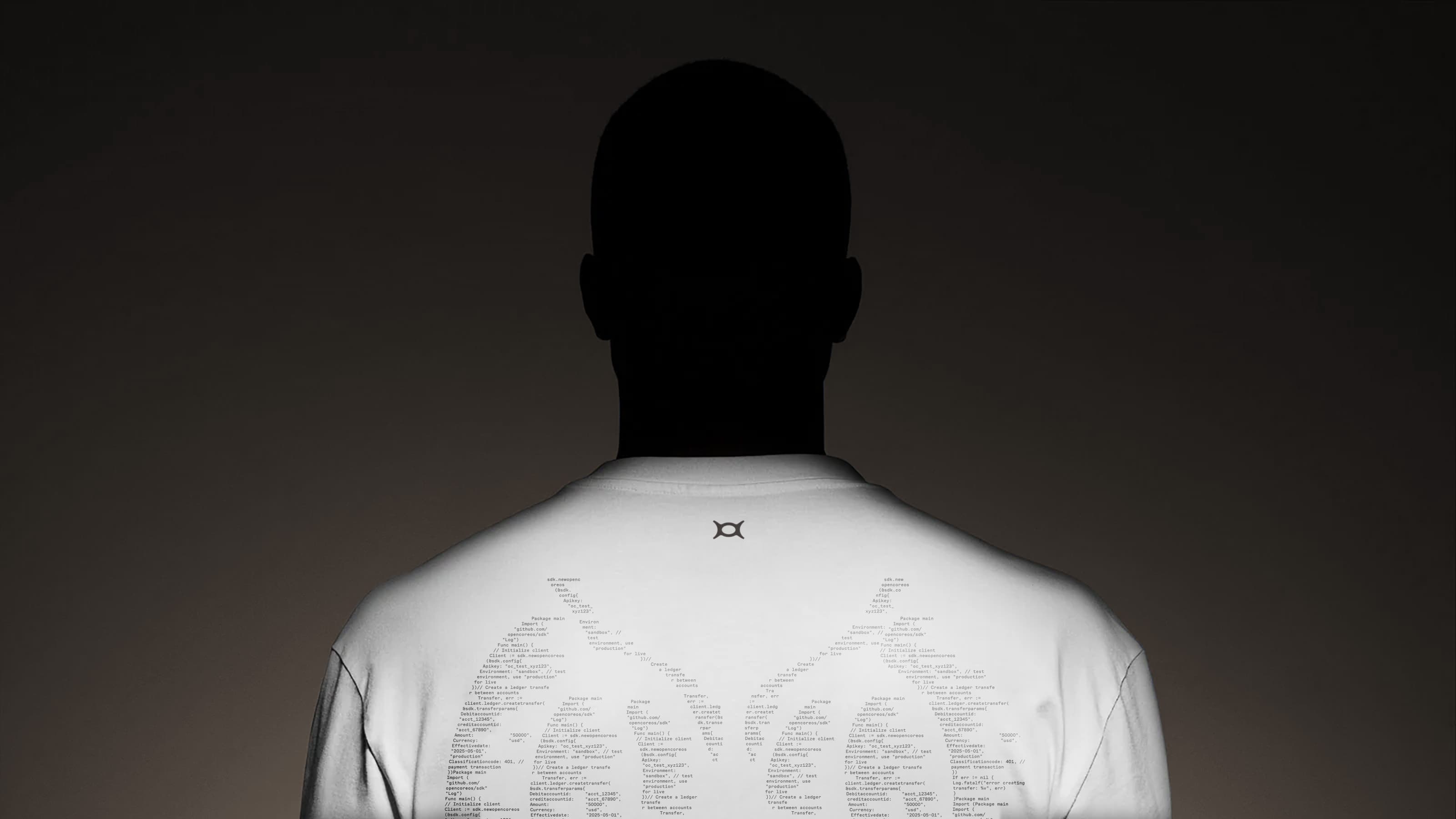
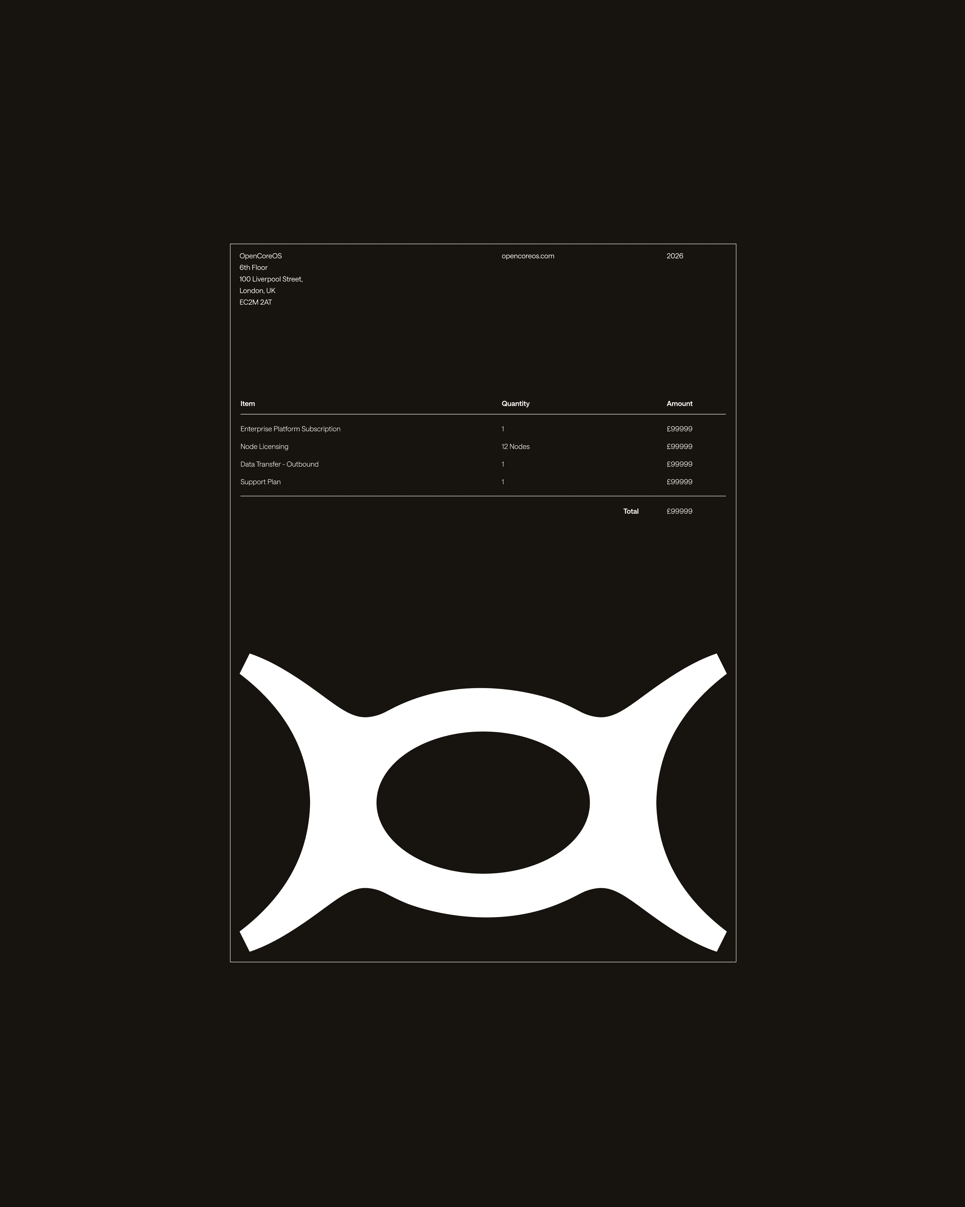
A brand for this audience lives in rooms as much as on screens. We built the toolkit to hold up wherever people meet OpenCoreOS: on stage, on the street, on paper and on what they wear. The same symbol, pattern and palette carry the message each time, with campaign lines that put the brand idea in a CIO's own terms.

08Impact & proof
- 72M
- Core banking platform tier-1 institutional backing
- 99.999%
- Platform uptime for mission-critical core ledger
- <5ms
- Real-time ledger transaction latency
Metrics published by OpenCoreOS as of 2025 across active banking deployments.
Strategy
- Audience and positioning
- 'Unthinkable. Unbreakable.' concept
- Tone of voice
Identity
- Symbol and wordmark
- The Visions pattern family
- Brand guidelines
System
- Pebble and Monarch colour scales
- Typography and layout principles
- Diagrams and iconography
Digital and print
- Website design
- Product and module screens
- Campaign, print, signage and merchandise
