01The challenge
Treasury teams don't buy a cryptocurrency story. They buy confidence.
Fiat and digital currency, side by side
Orbital is a cross-border payments platform that helps multinational enterprises manage currencies, accounts and digital assets together. It unites traditional rails (SWIFT, SEPA, ACH) with enterprise blockchain settlement for instant liquidity worldwide.
As Orbital moved into new enterprise verticals, its brand and website had to explain a hybrid fiat and stablecoin workflow to a sceptical audience, with regulatory confidence and technical authority, and without any of the speculation tropes that crypto brands rely on.
02Strategy
What crypto payments often look like
- Neon tokens and speculation tropes
- Hype instead of how it works
- Little sign of regulation or controls
What Orbital does instead
- Architectural, deep-emerald identity
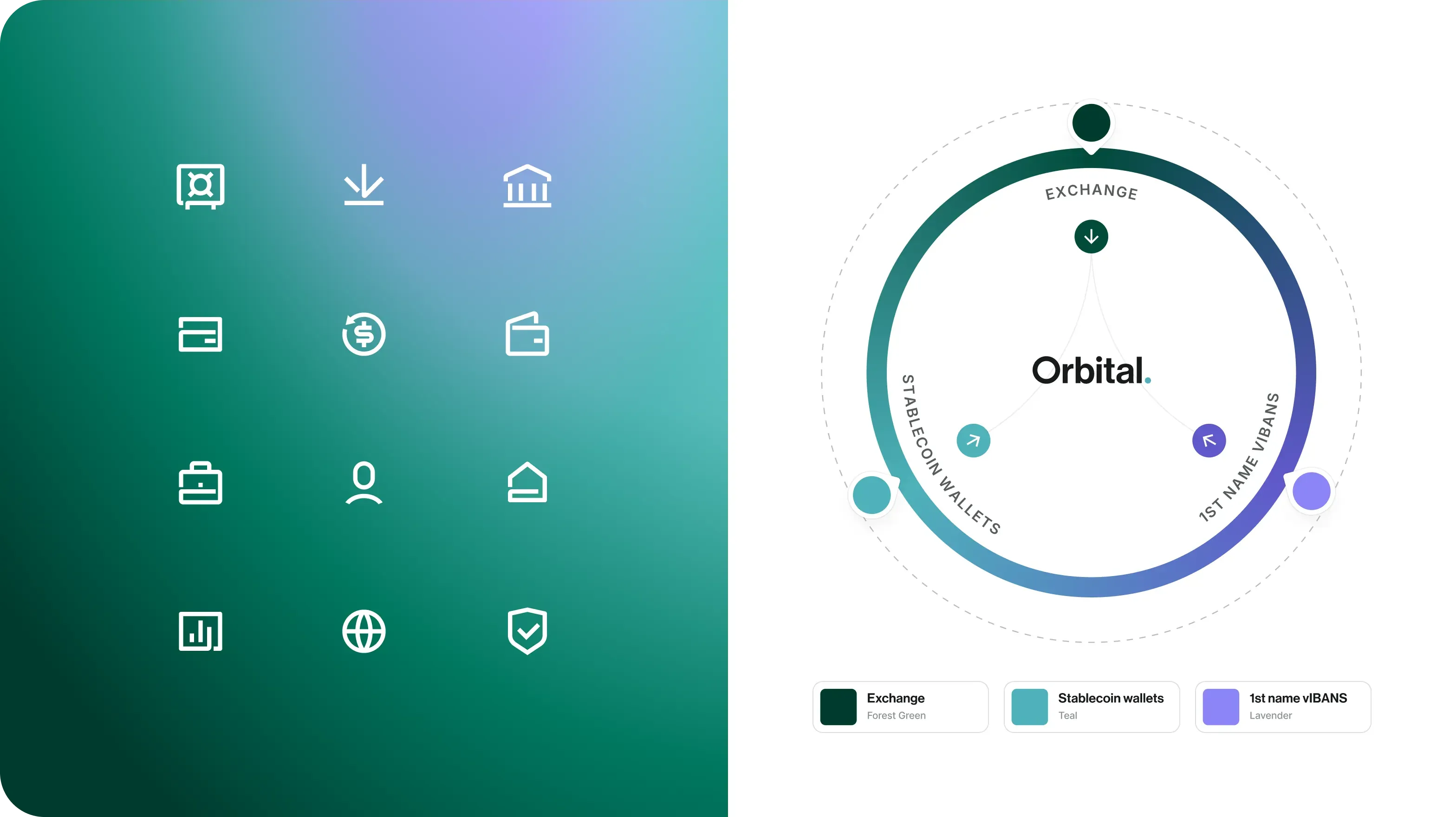
- Diagrams that show how the money moves
- A calm, bank-grade tone
Move money smarter.
The audience is a CFO or treasurer who has to defend the decision internally. Every screen had to give them something they could forward.
03Identity
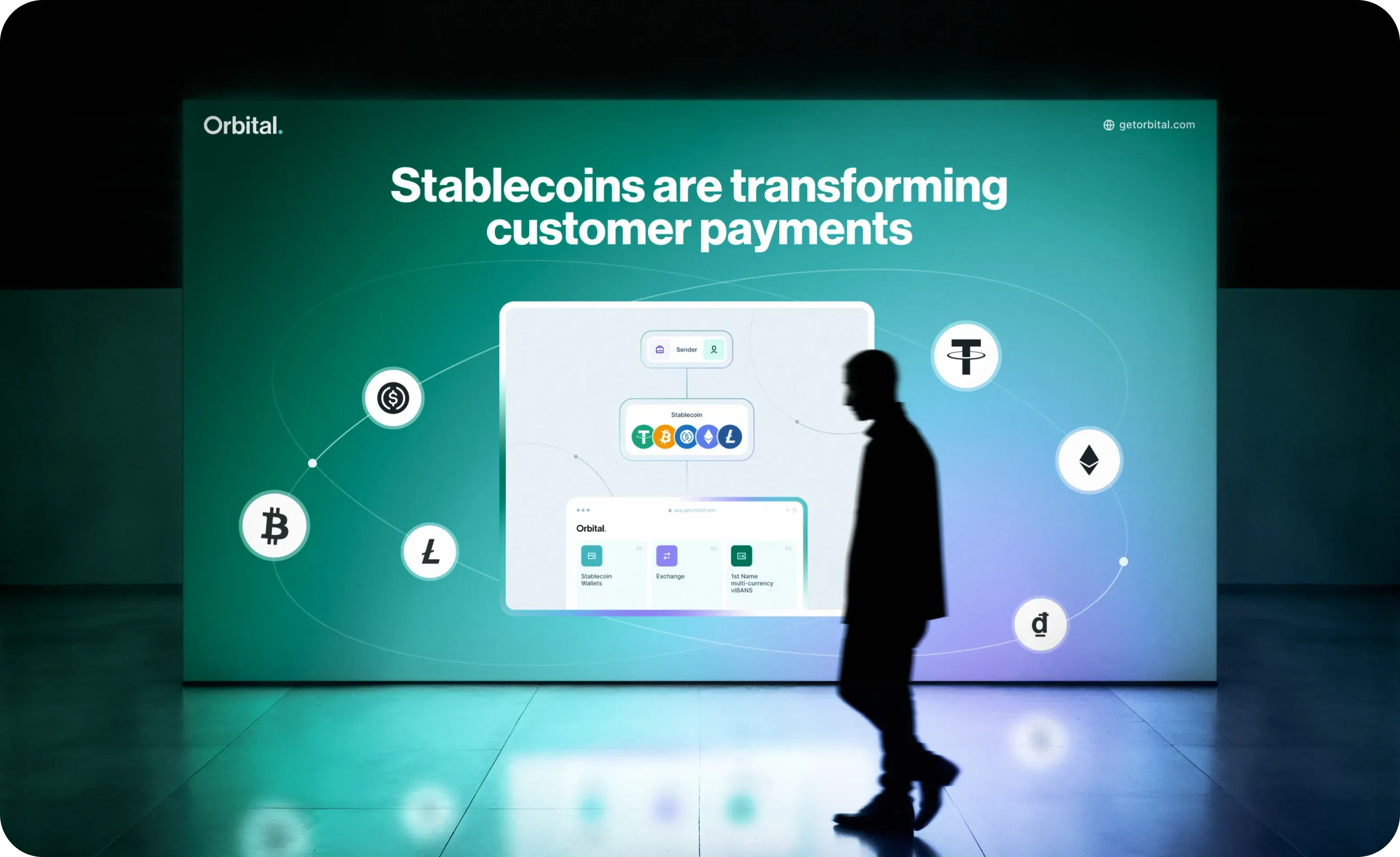
Deep emerald, a luminous edge and an orbit
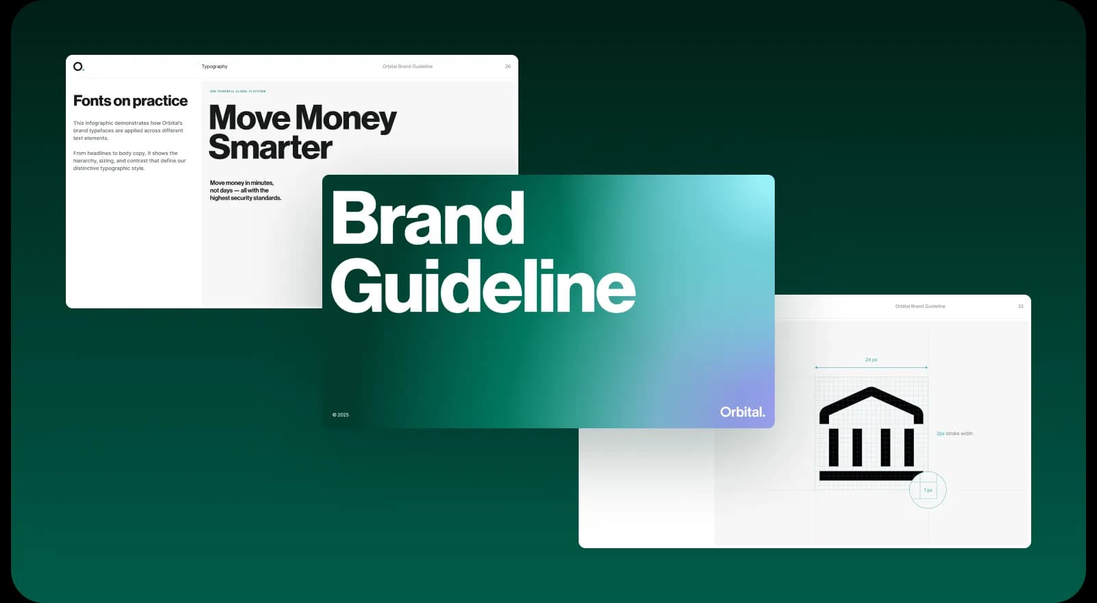
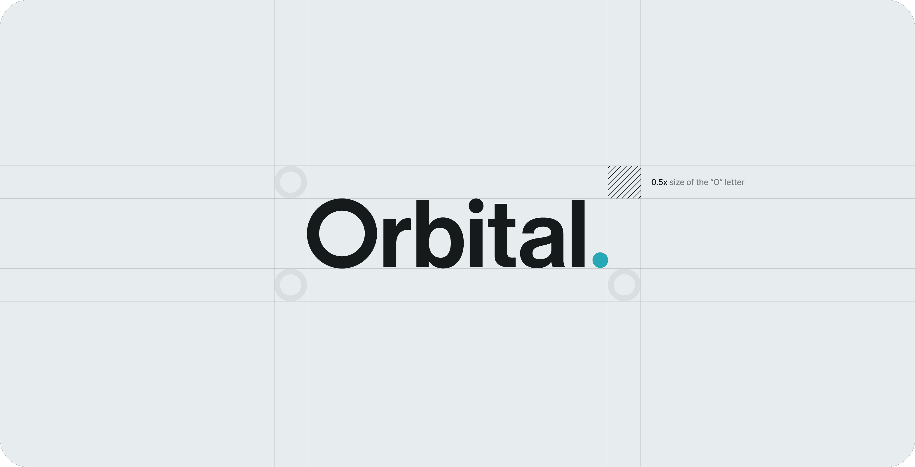
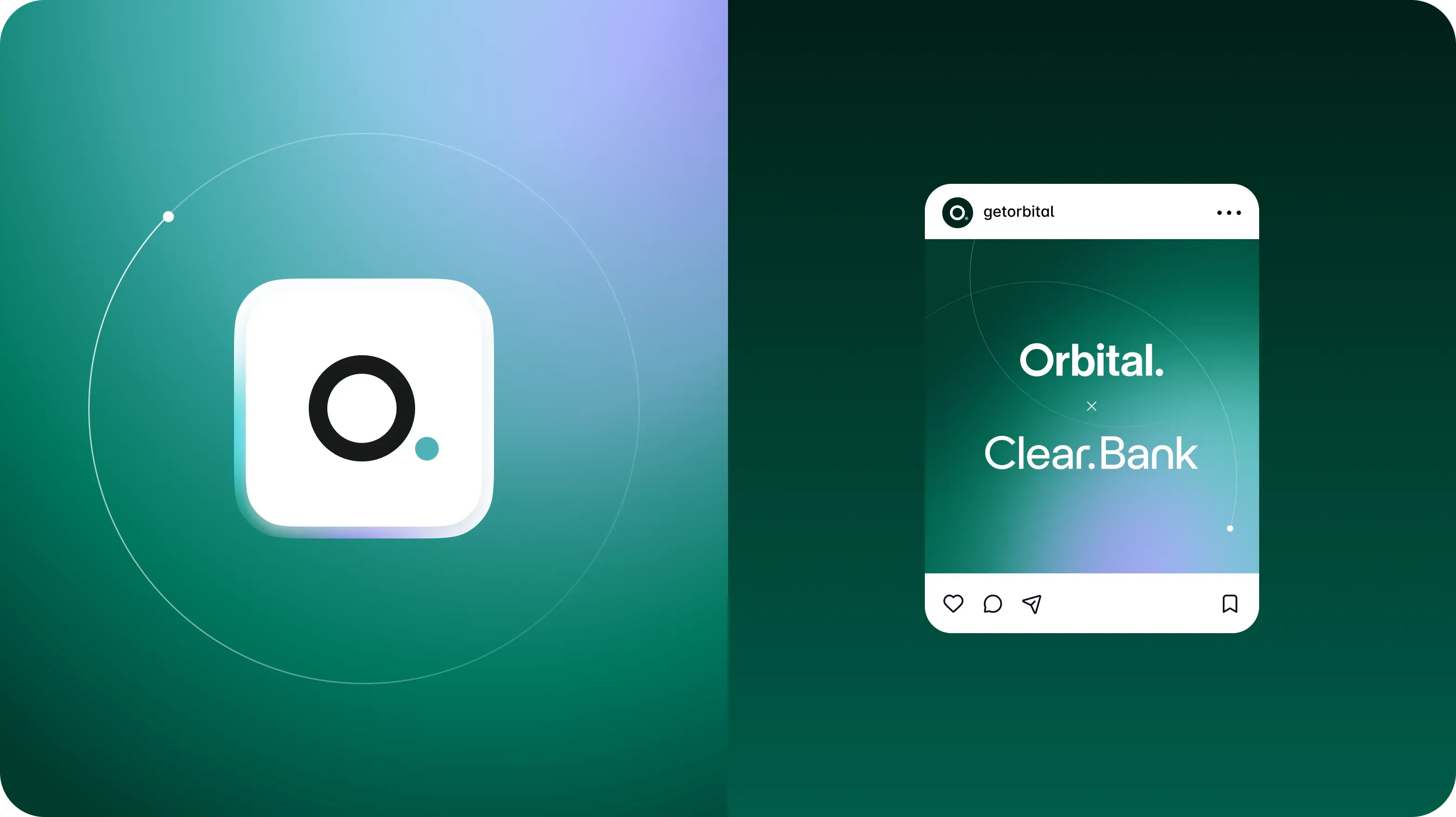
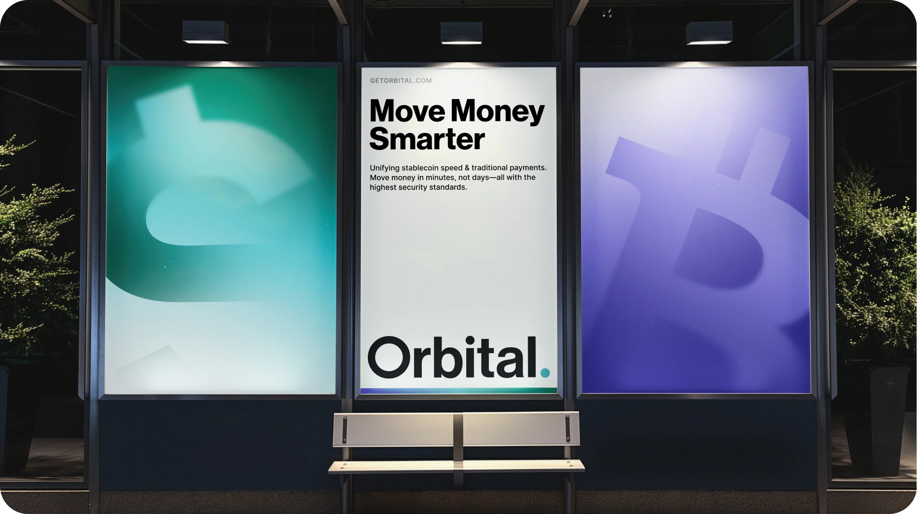
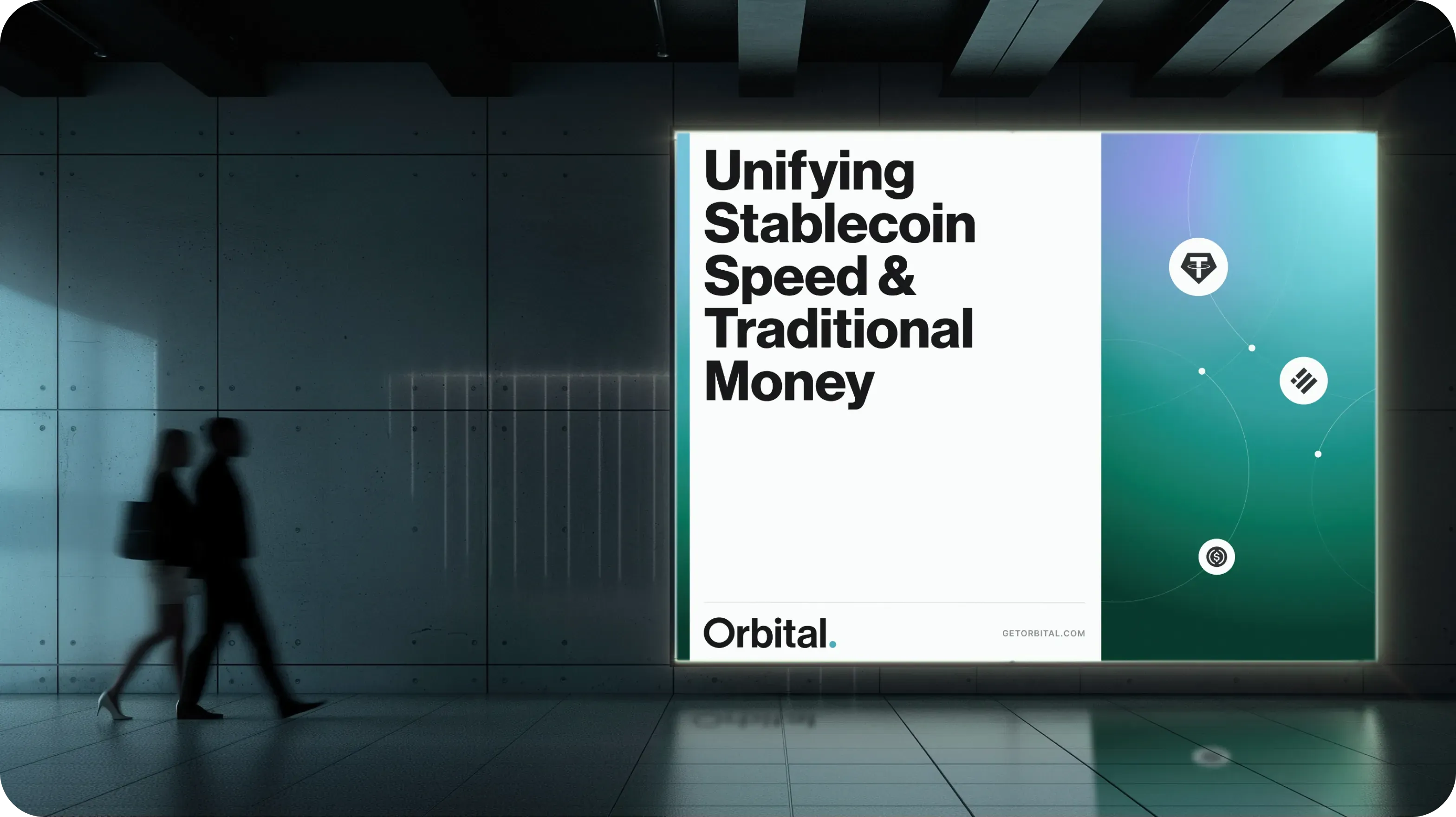
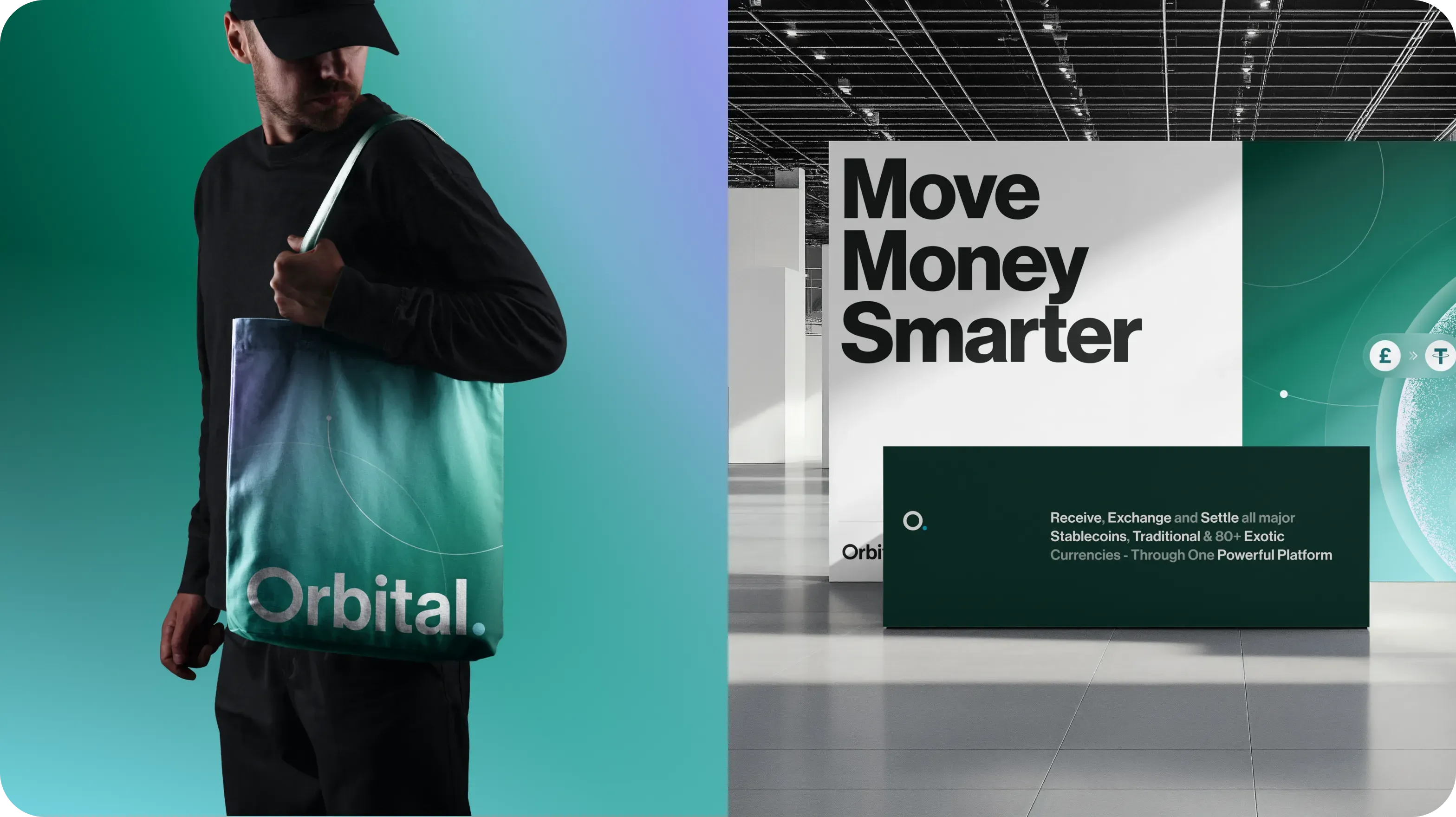
The refreshed identity uses deep emerald tones, a lavender glow and the orbit as its organising shape: accounts and currencies circling one platform. A clean wordmark and app mark keep it legible at every size, and the dark, architectural palette reads as serious infrastructure, not a token launch.
04Website
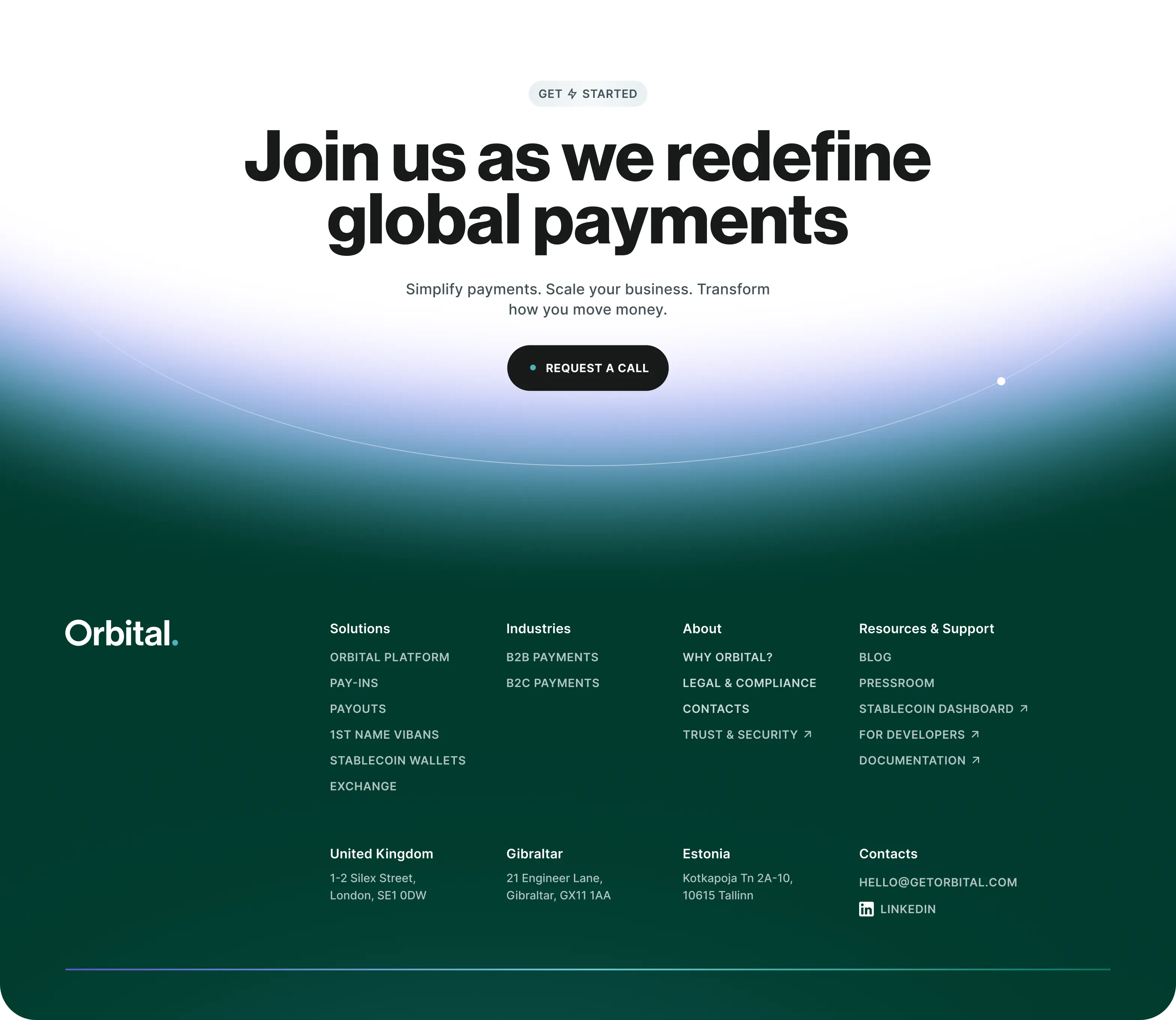
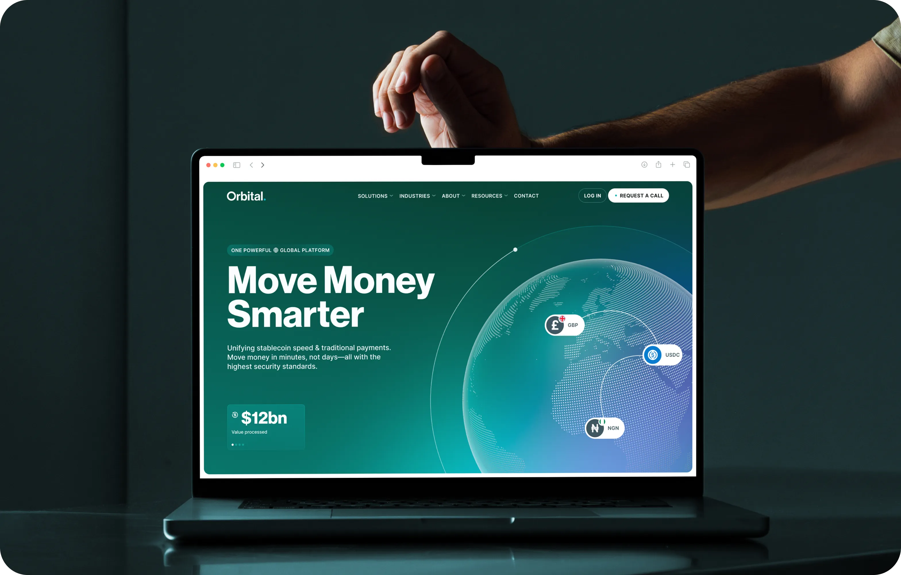
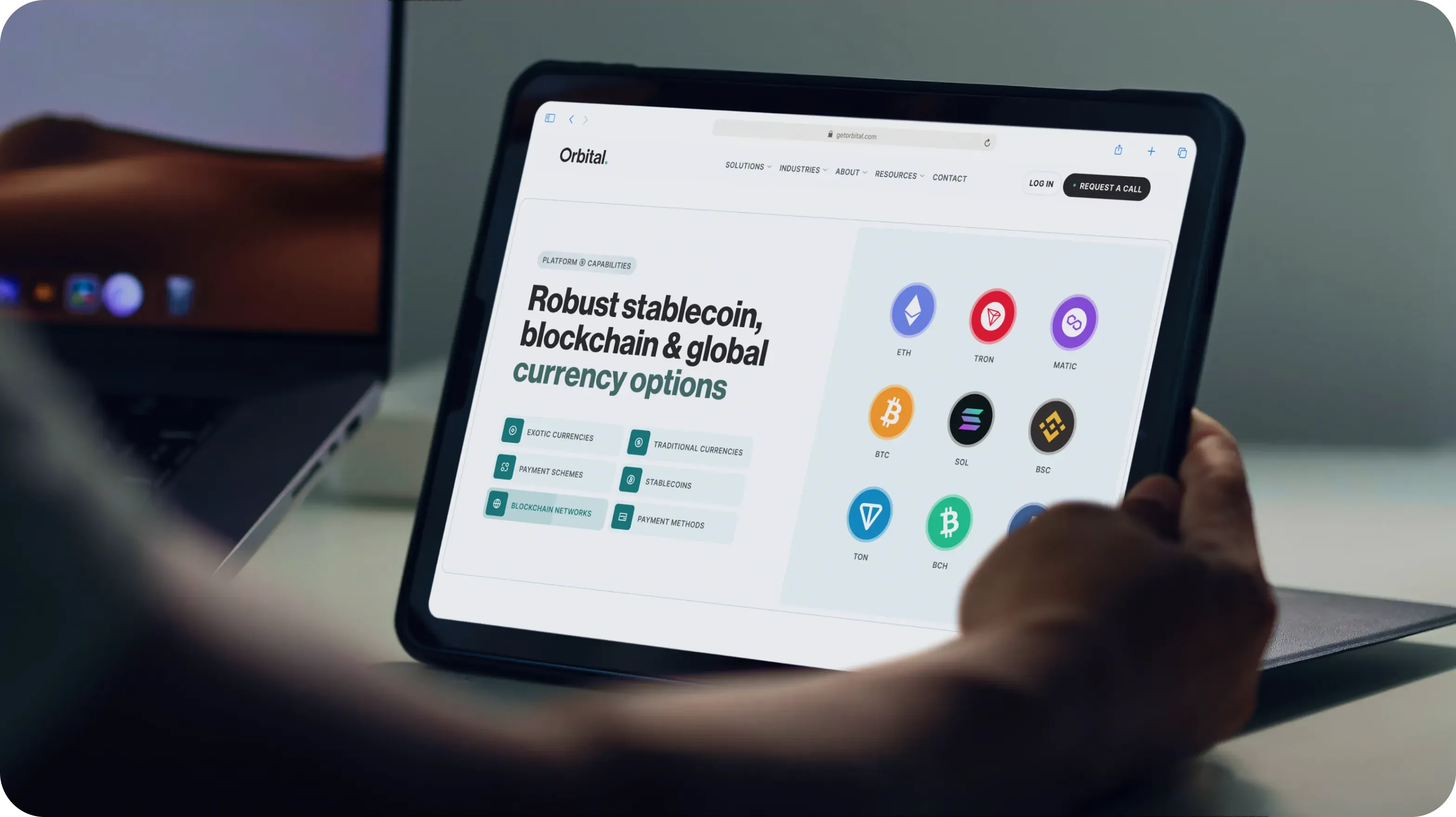
A site that explains the platform in plain steps
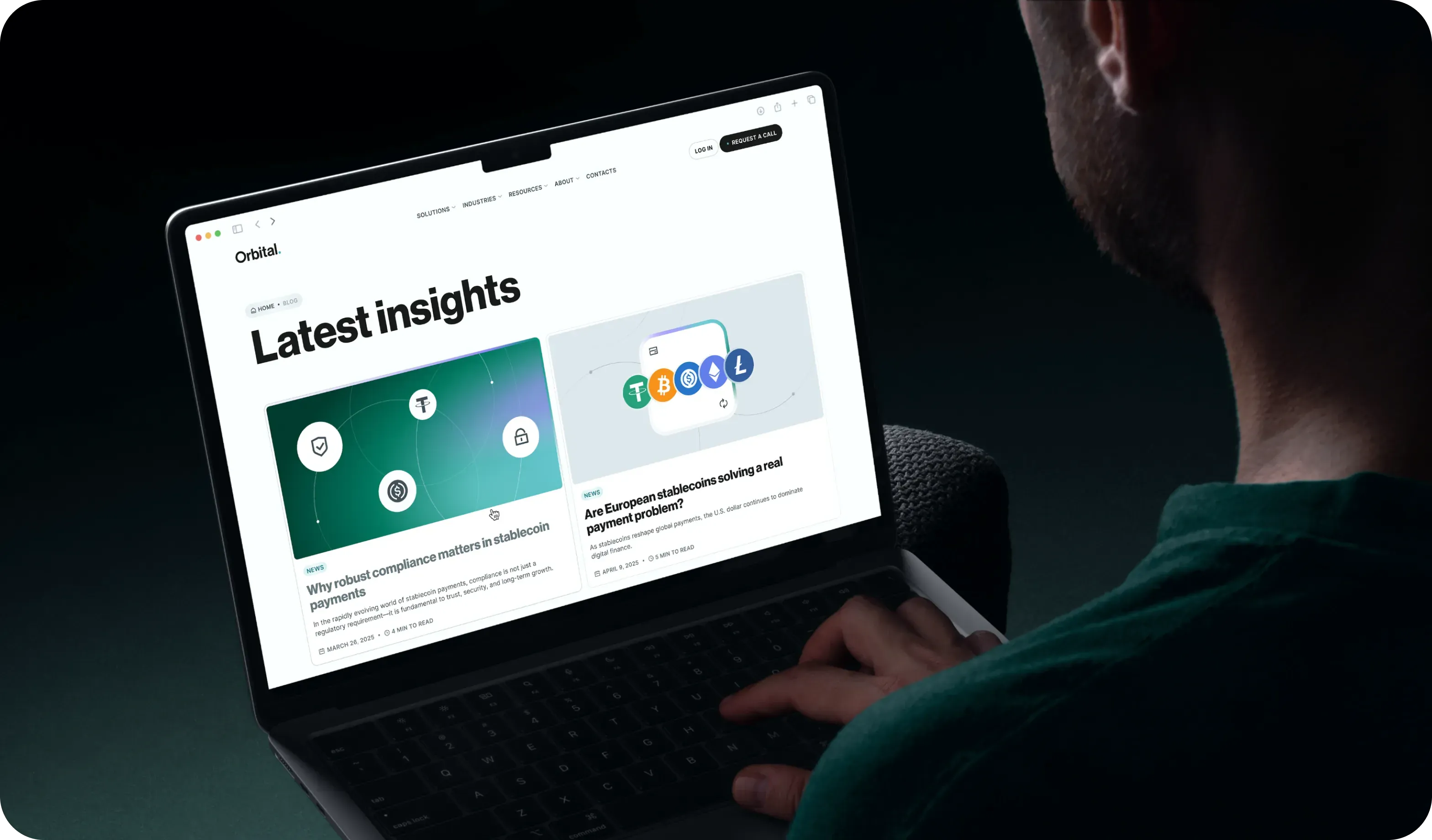
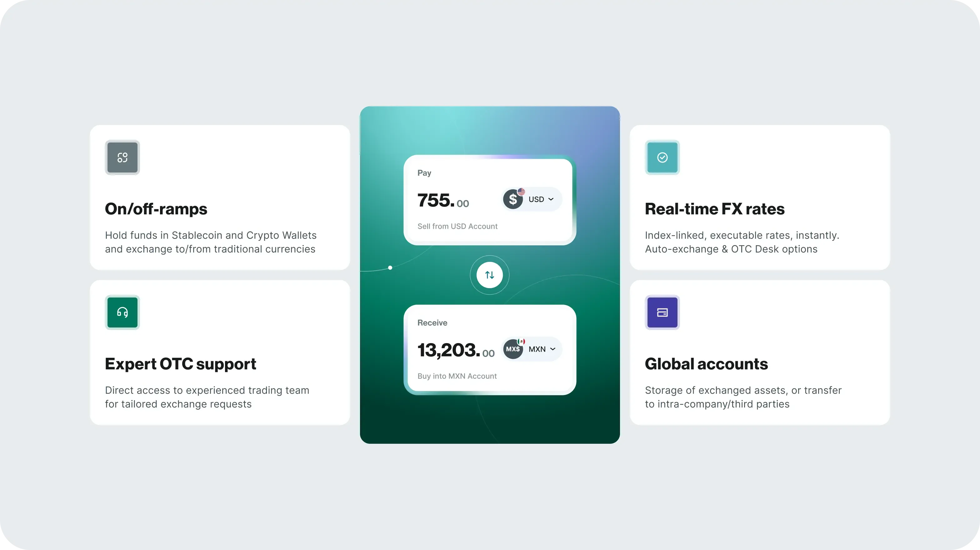
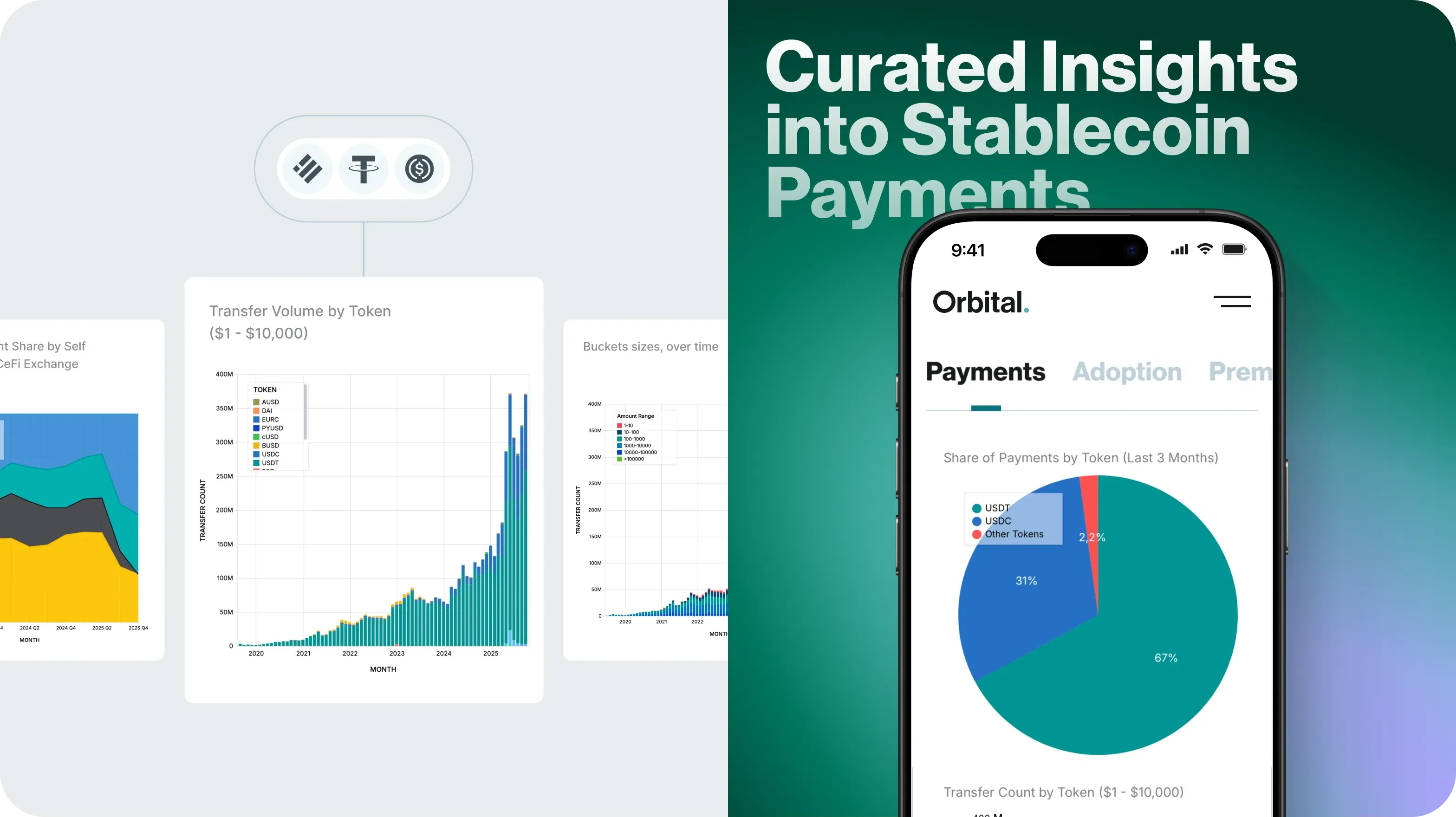
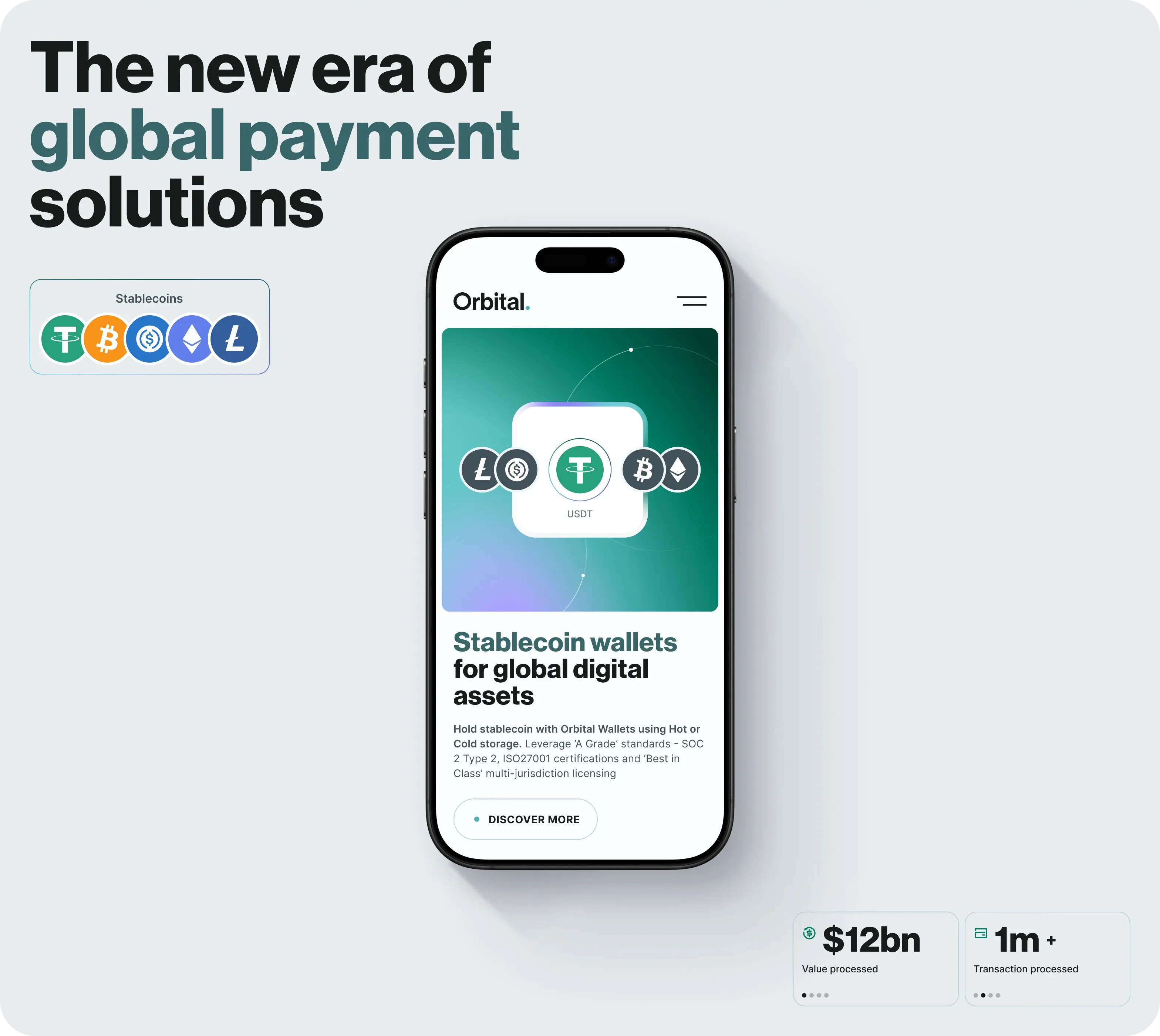
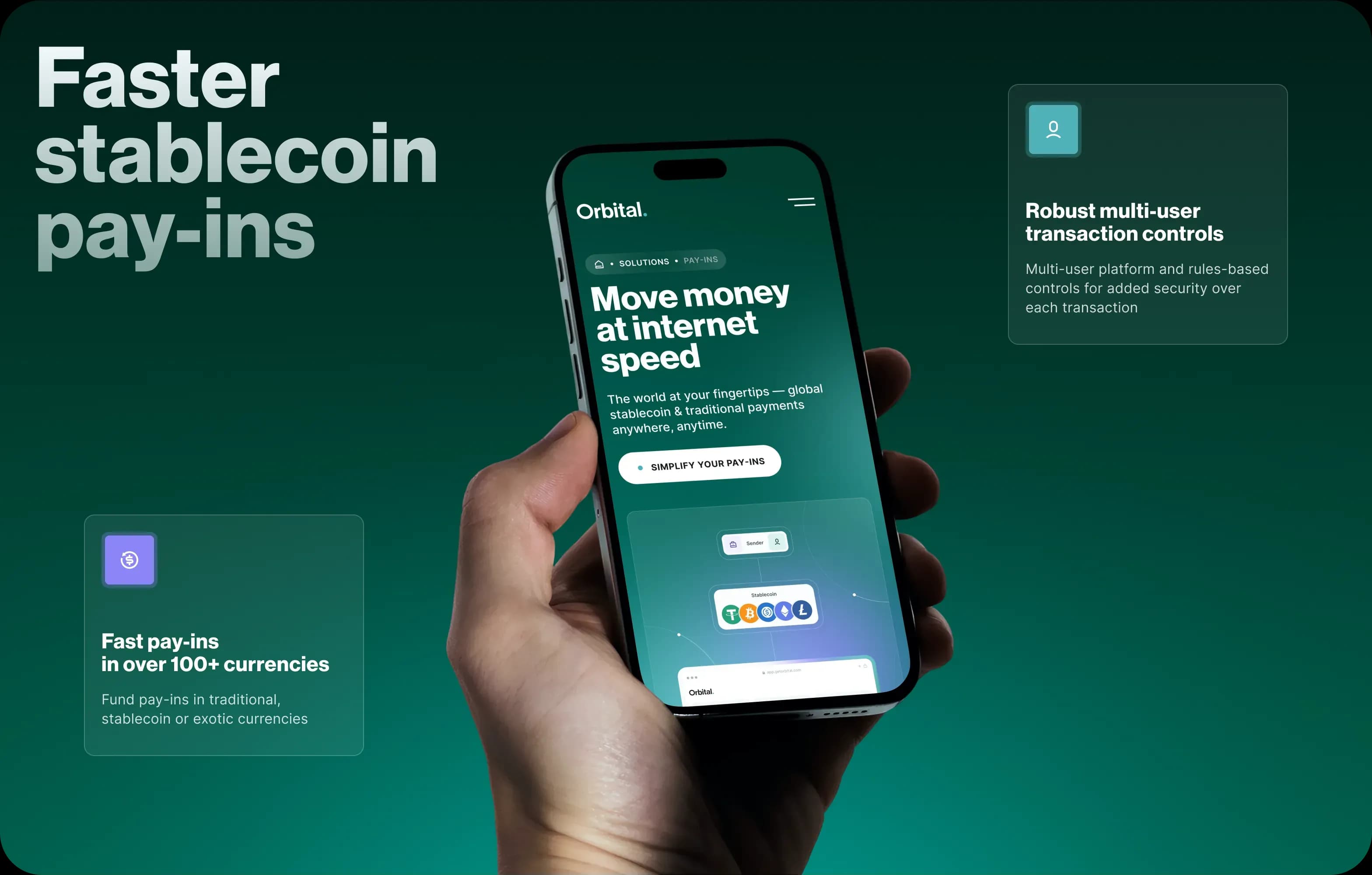
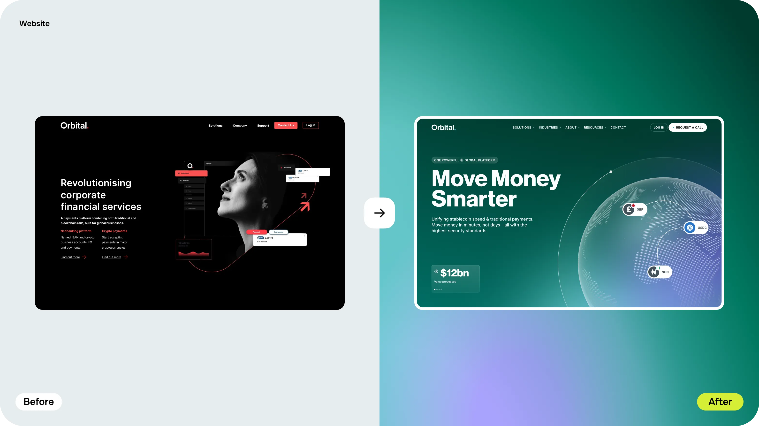
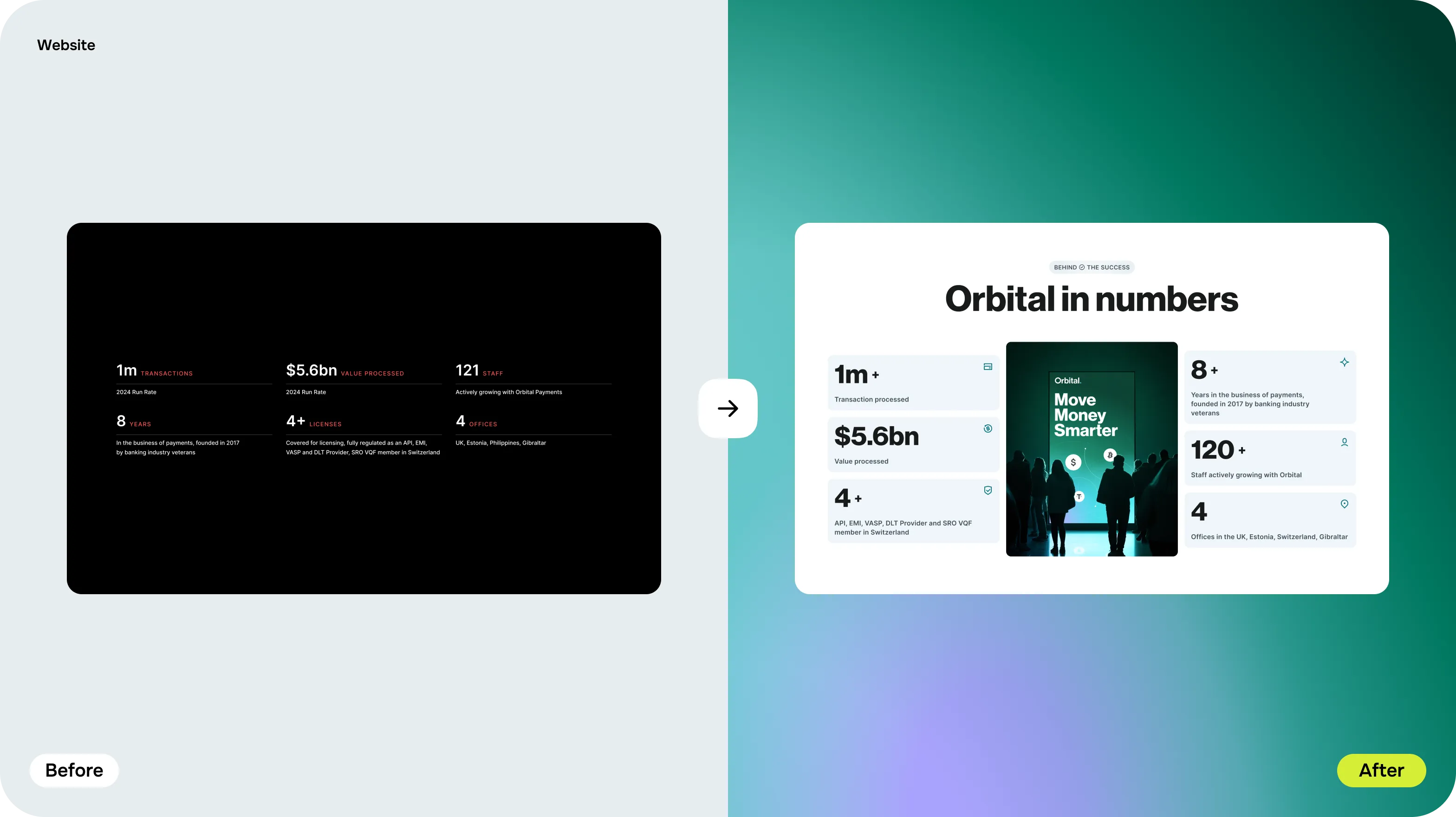
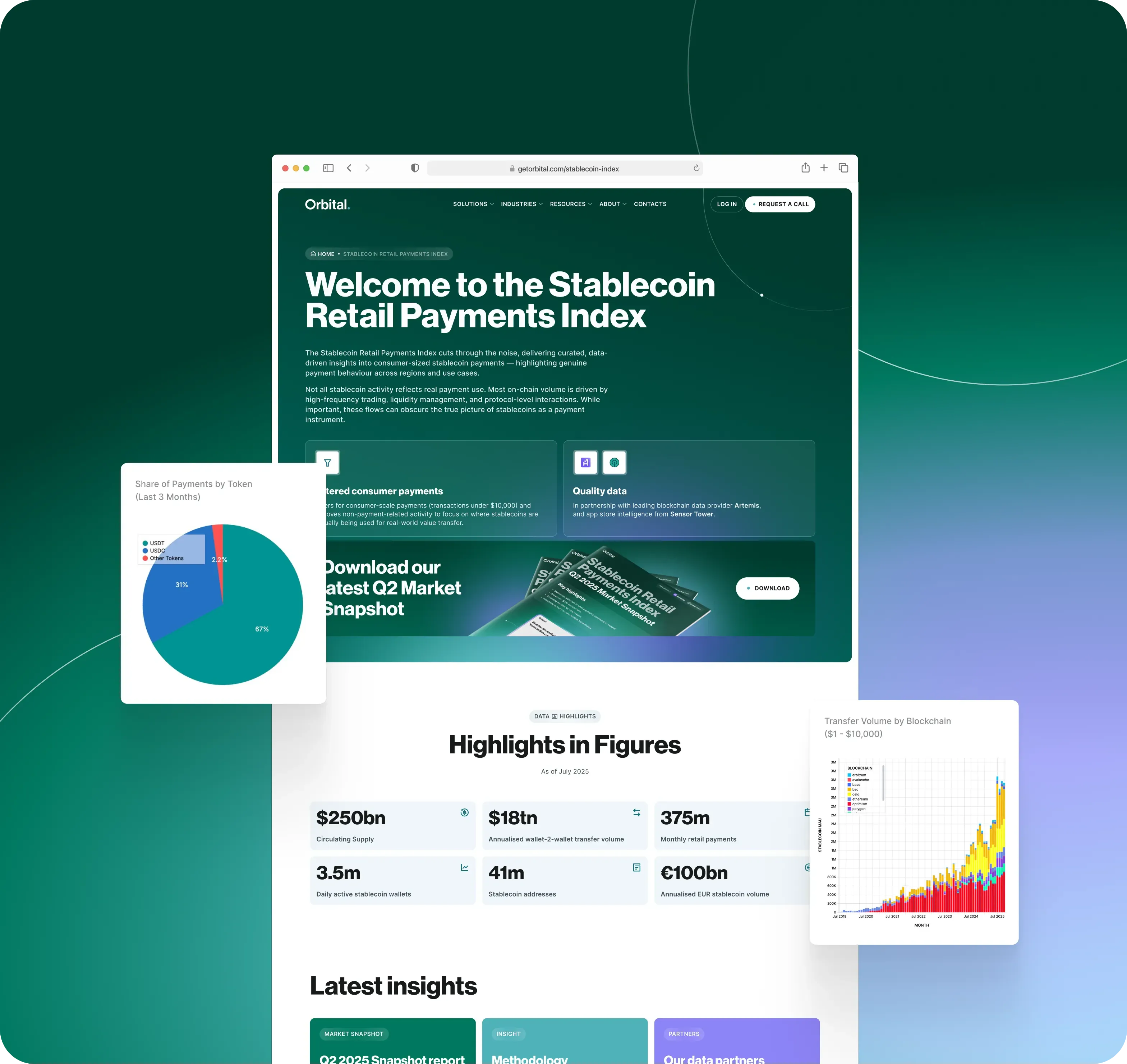
The redesigned site leads with the promise, then shows the platform: on/off-ramps, real-time FX rates, OTC support and global accounts. Insights and numbers give finance teams the proof they look for, and the navigation is built so each kind of buyer finds their route in a click or two.
05Before and after
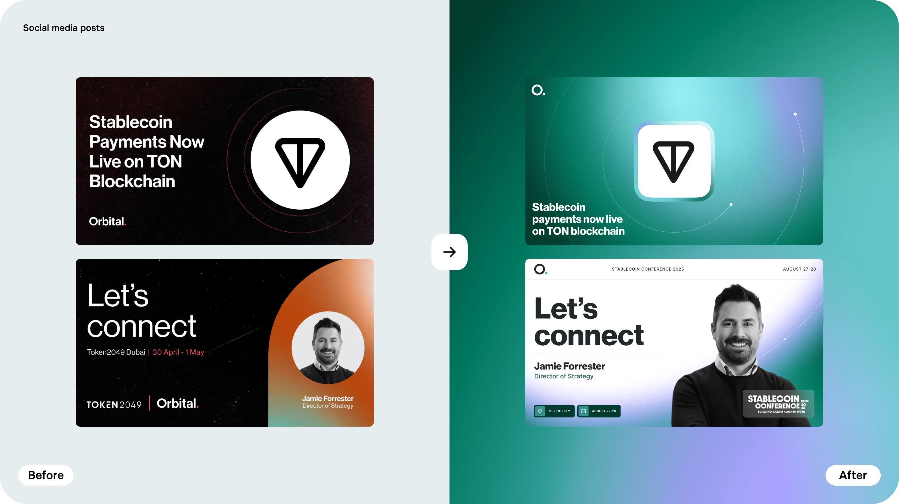
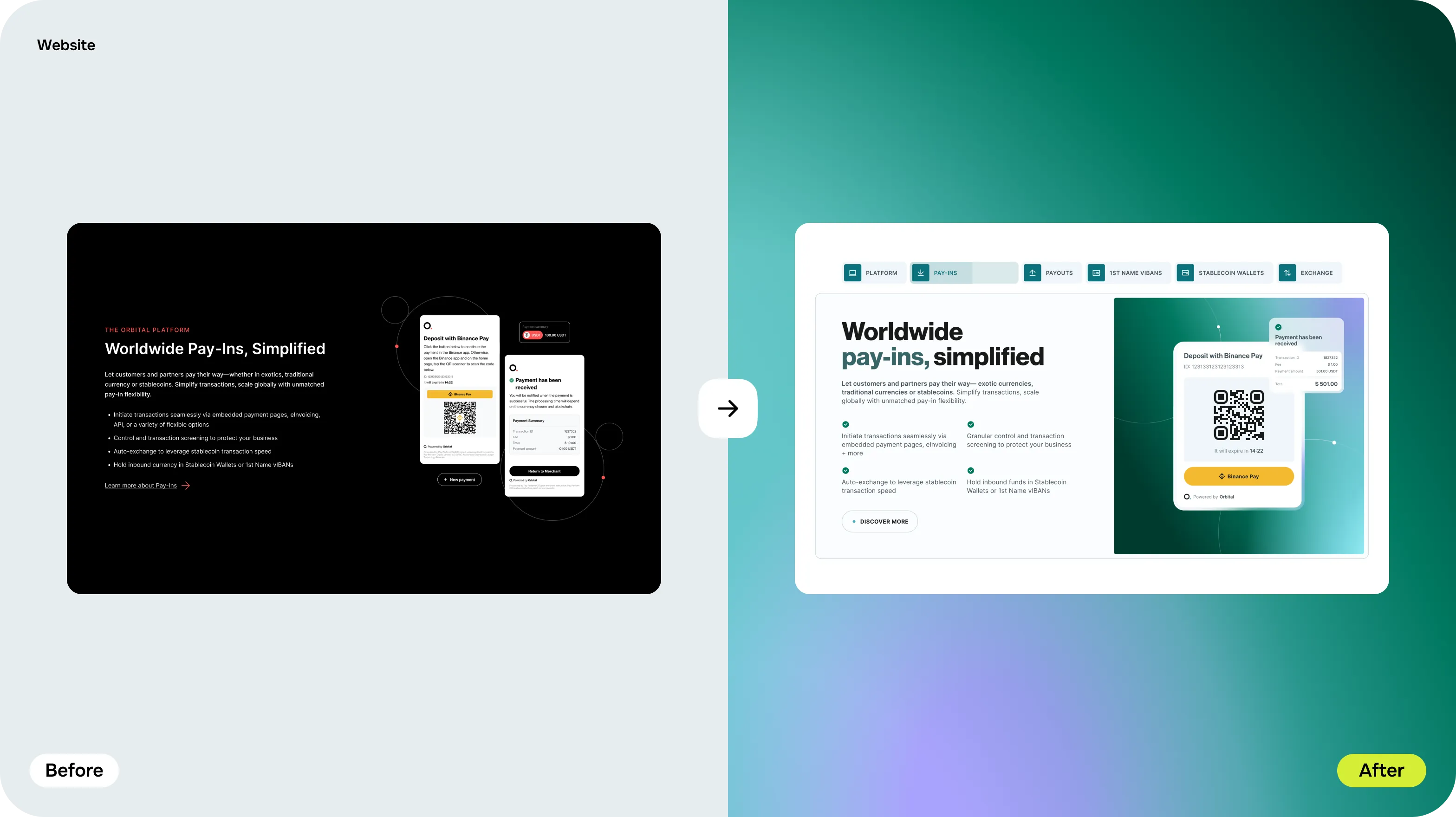
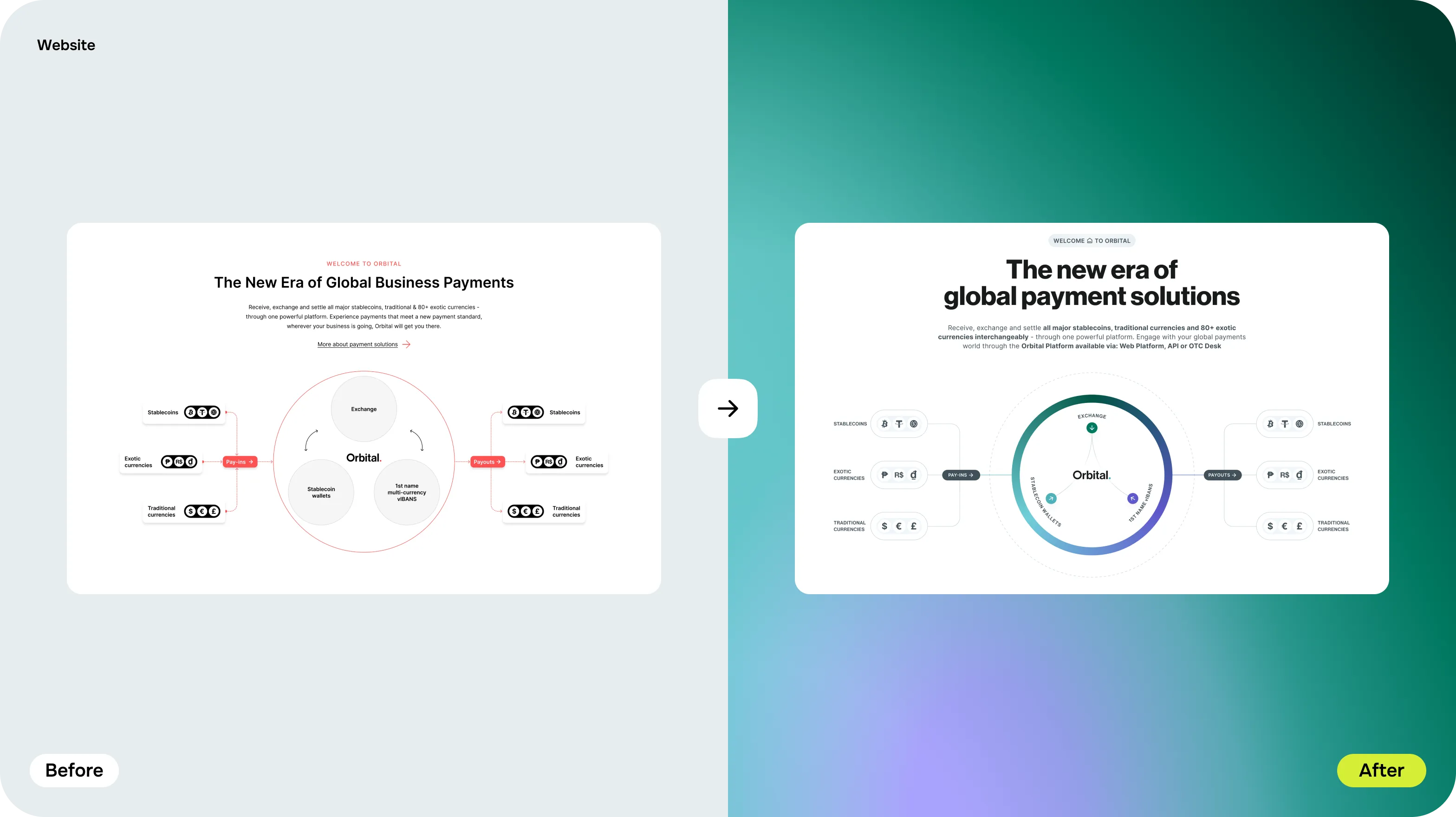
From a dense dark page to a calm, clear one
The same content, before and after the redesign: clearer hierarchy, real people and diagrams that do the explaining, so a complicated product stops looking complicated.
06Diagrams and motion
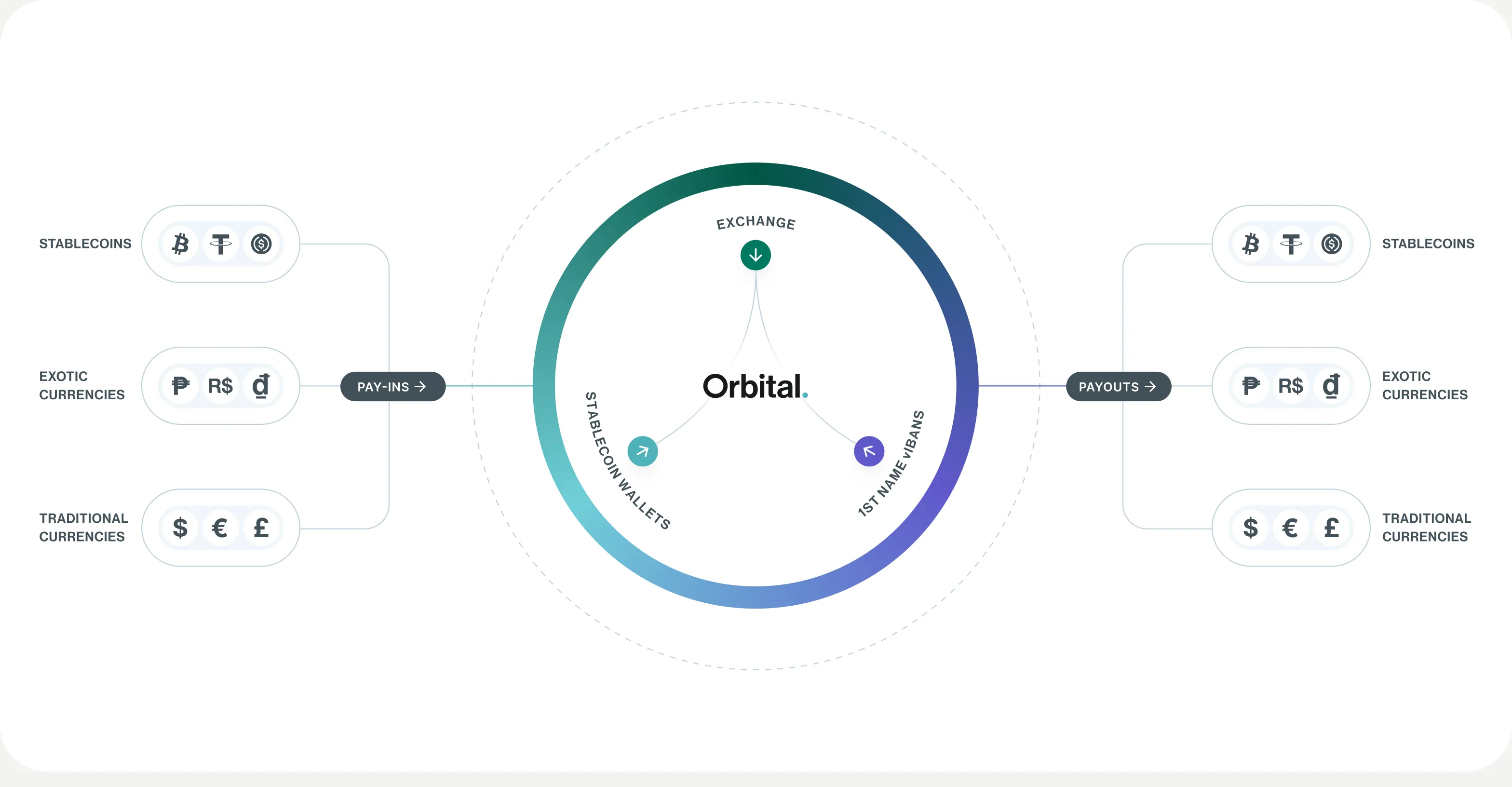
Showing how the money moves
The hardest idea to sell is the hybrid one, so we drew it: currencies, stablecoins and blockchains orbiting a single platform, and the connections between them. Motion shows the flow, so a visitor sees how money moves before reading a word about it.
07Impact & proof
- 100M+
- Monthly stablecoin payments processed
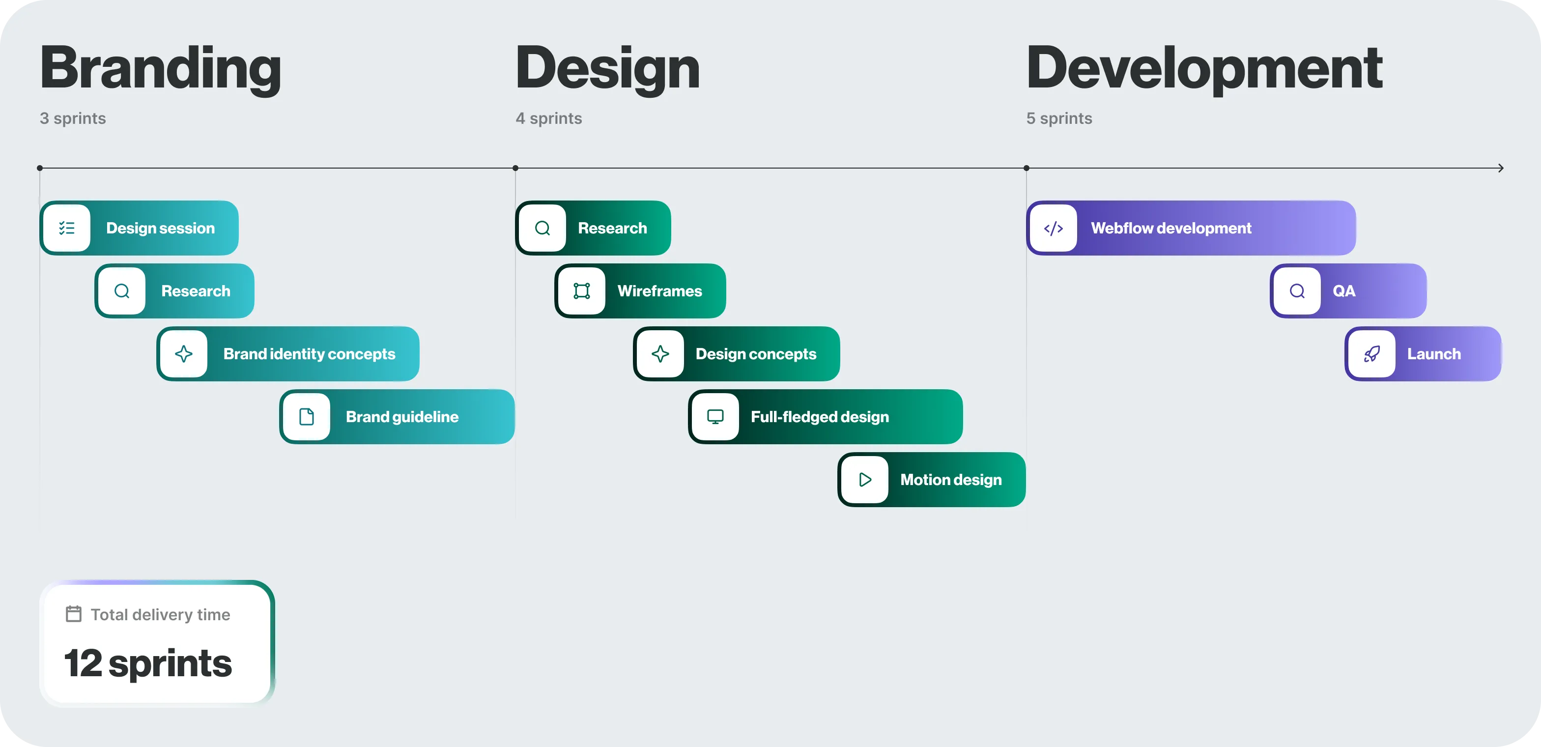
- 12 sprints
- End-to-end brand & platform design delivery
- 99.99%
- Platform uptime across enterprise gateway nodes
Metrics published by Orbital as of 2025 across active payment gateway deployments.
Brand
- Identity refresh
- Wordmark and app mark
- Brand guideline
Website
- Sitemap and navigation
- Homepage and platform pages
- Insights and team pages
Systems
- UI components
- Diagrams and icon set
Motion
- 3D and animated visuals
- Out-of-home and event applications