Case study 23 / 27

Payop

A global payment gateway's scale, made easy to see: 170+ countries, 500+ local methods, one API.

Client
Payop
Category
Fintech · Merchant payments · Payment gateway
Scope
Website redesign, brand strategy, interactive 3D
Delivery
3 sprints, 23 pages

01 · Challenge

Payop moves payments across 170+ countries and 500+ local methods, but its old website hid that scale and speed, and buried visitors in technical tables.

02 · Approach

We rebuilt the site as a modular system with bold type, interactive 3D and a page for each industry, so a startup and a multinational each find their own payment story fast.

03 · Outcome

A redesigned 23-page website, delivered in 3 sprints, that turns complex payment routing into a clear storefront for merchants of every size.

01The challenge

A payment gateway's value is its reach, and the old Payop website hid almost all of it.

Show the breadth without the tables

Payop is a global payment platform with a unified API. Merchants use it to accept local payment methods in markets they don't operate in, which is exactly the kind of promise a buyer needs to see in seconds, not decode from a table.

The legacy site didn't communicate that scale, versatility or speed. It also had to speak to two very different buyers at once: fast-growing startups and multinational e-commerce enterprises, without overwhelming either.

02Strategy

A modular site, one page per kind of merchant

We rebuilt the site from the ground up as a modular system: bold typography, interactive 3D visuals and a dedicated page for each industry, so a games studio, a marketplace and a travel brand each land on a story written for them. Throughout, the message is the same: zero-friction integration and payment options that feel local.

170+
Countries served
500+
Local payment methods
100+
Currencies

Payop's figures, as published by Payop.

Concept

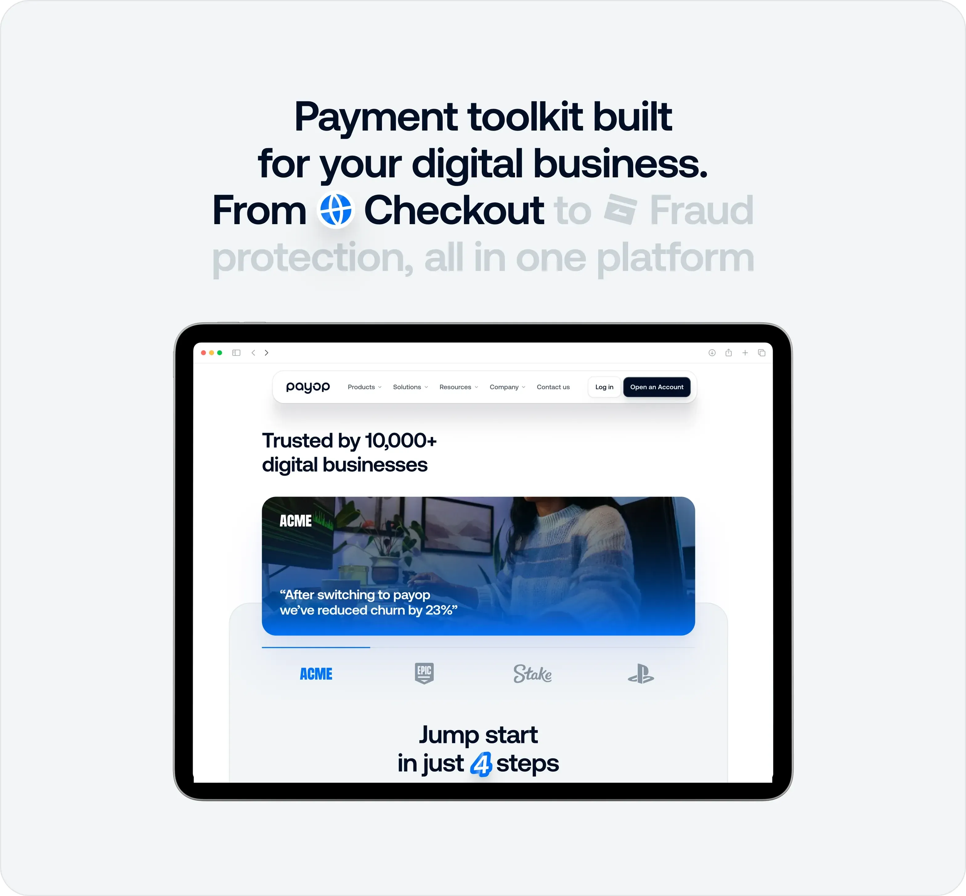
A payment toolkit built for your digital business
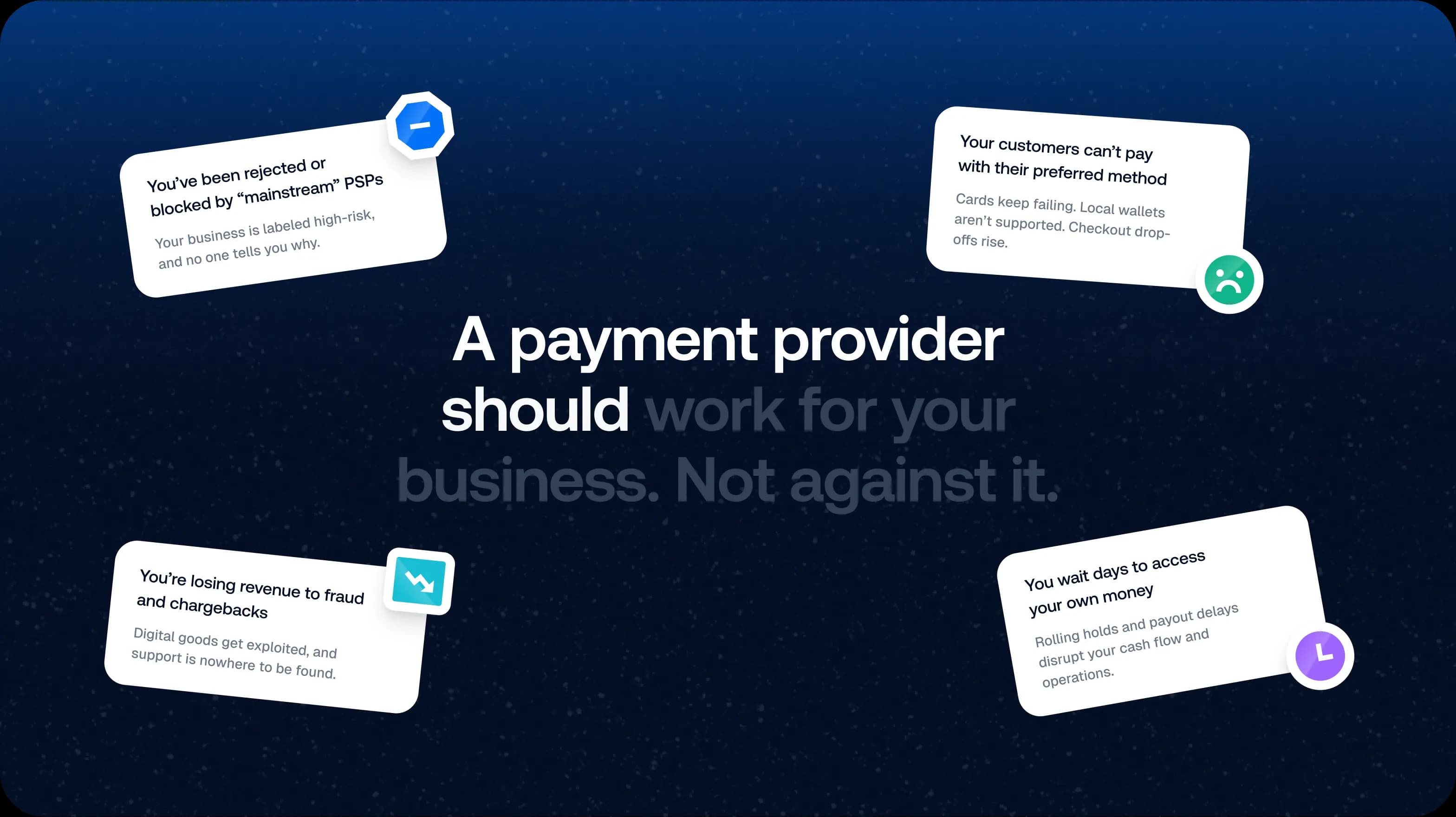
'A payment provider should work for your business. Not against it.' with floating cards listing common payment problems

03Website

From a dense page to a clear one

The homepage leads with the promise in big type and a playful 3D world, then walks through the platform: products, industries and the full toolkit from checkout to fraud protection.
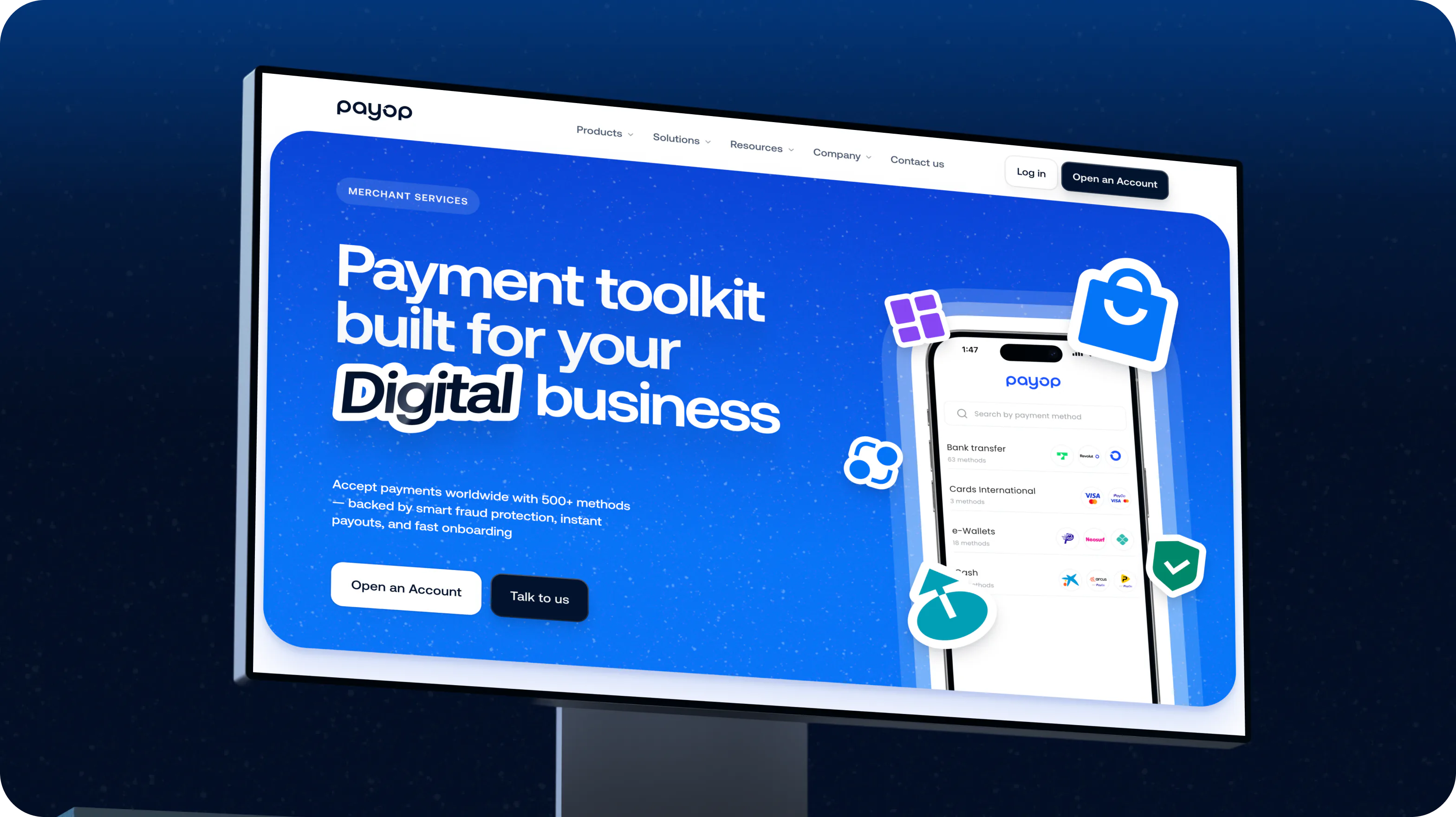
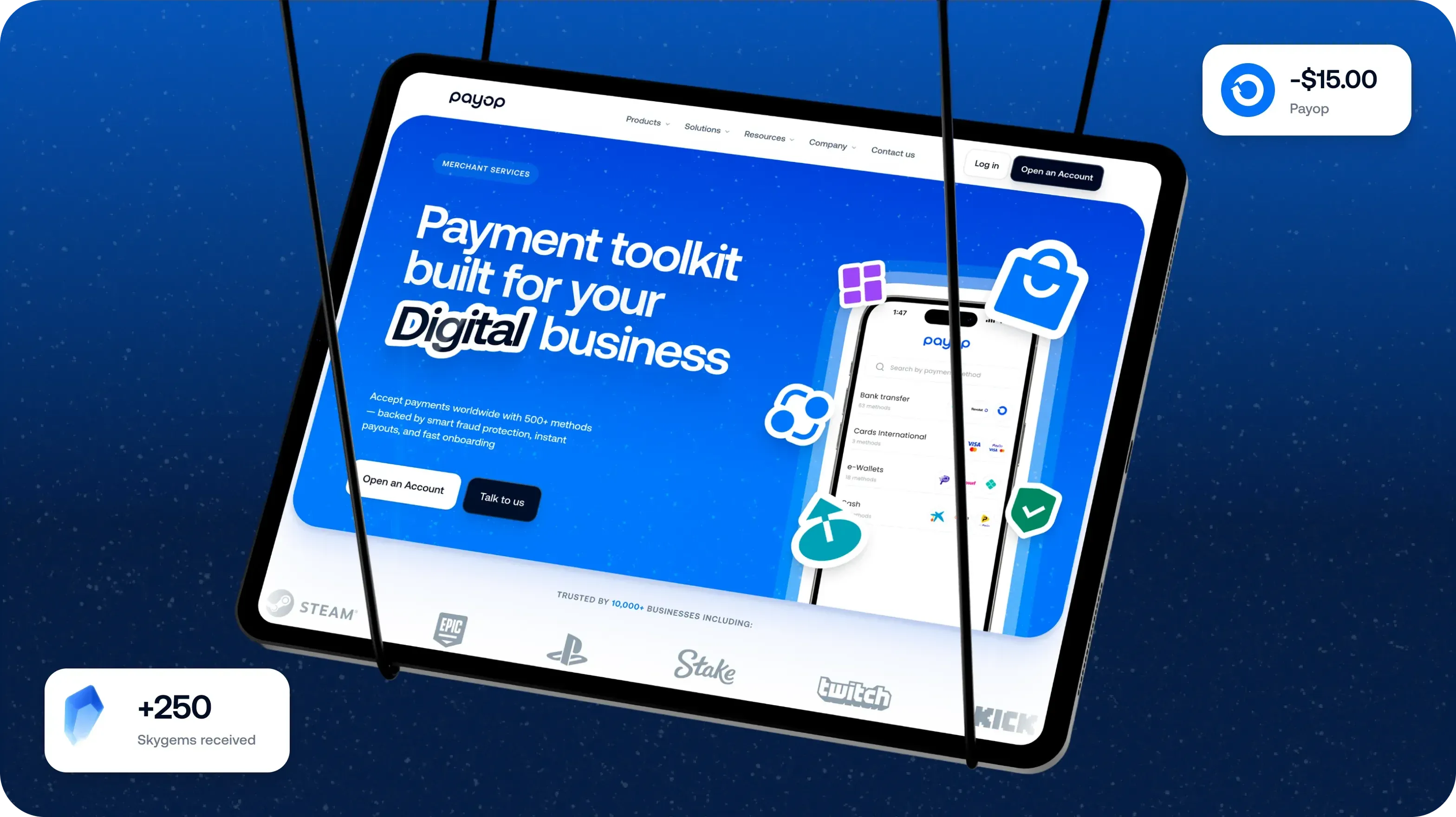
The Payop merchants page on a monitor: 'Payment toolkit built for your digital business'
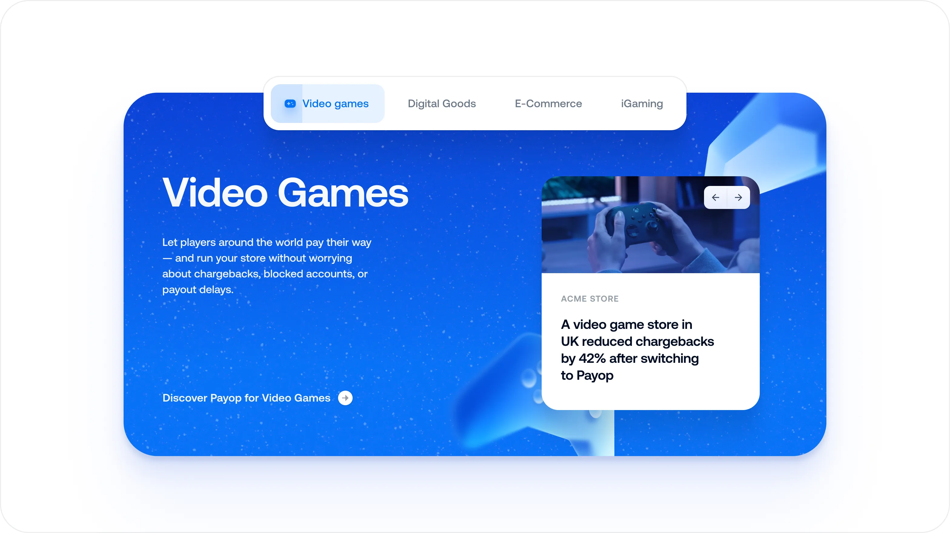
An industry page: 'Video Games' with a card about reduced chargebacks
A tablet and phone on a blue field showing the Payop toolkit page
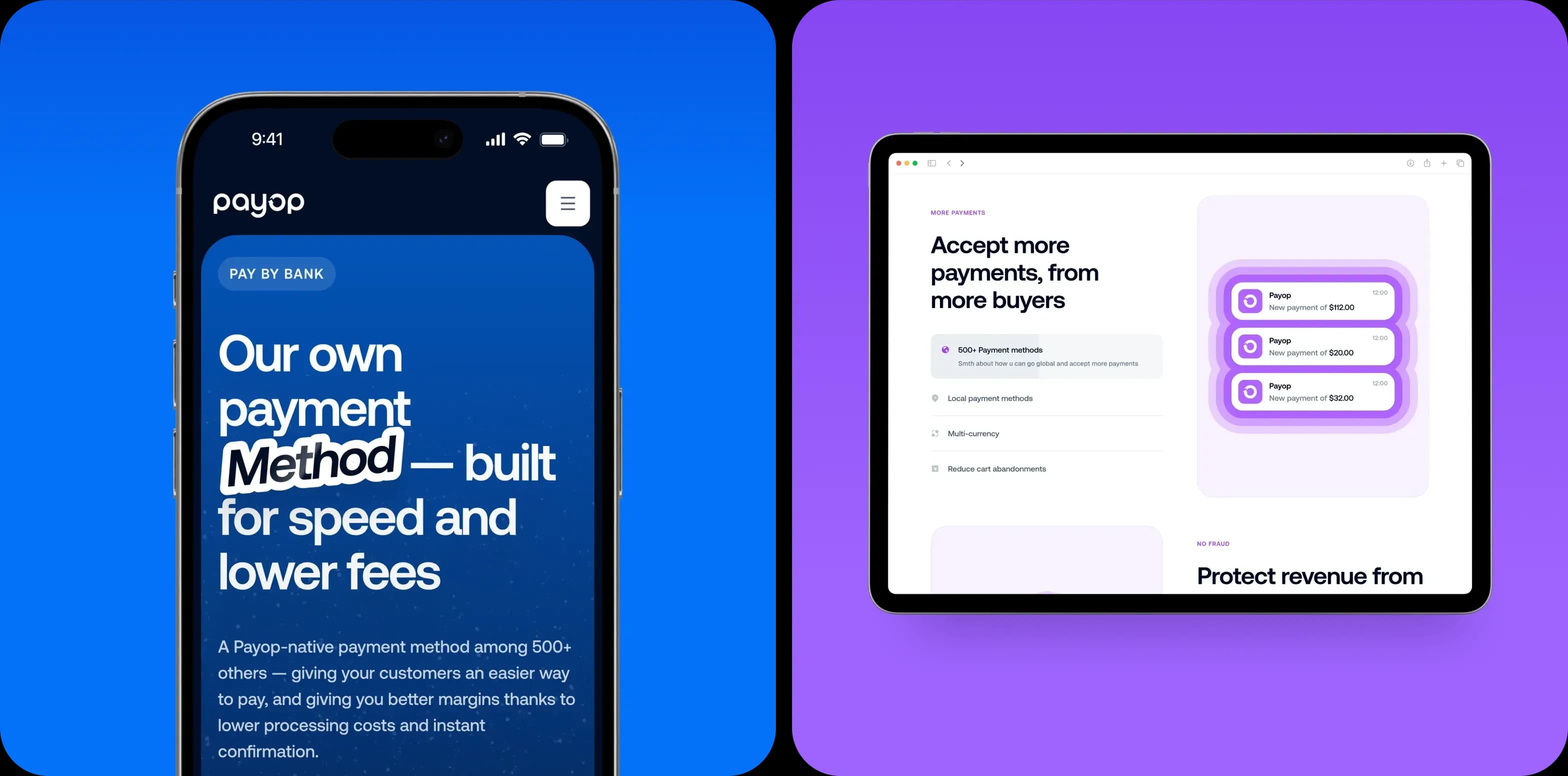
A phone and tablet: 'Our own payment Method, built for speed and lower fees'
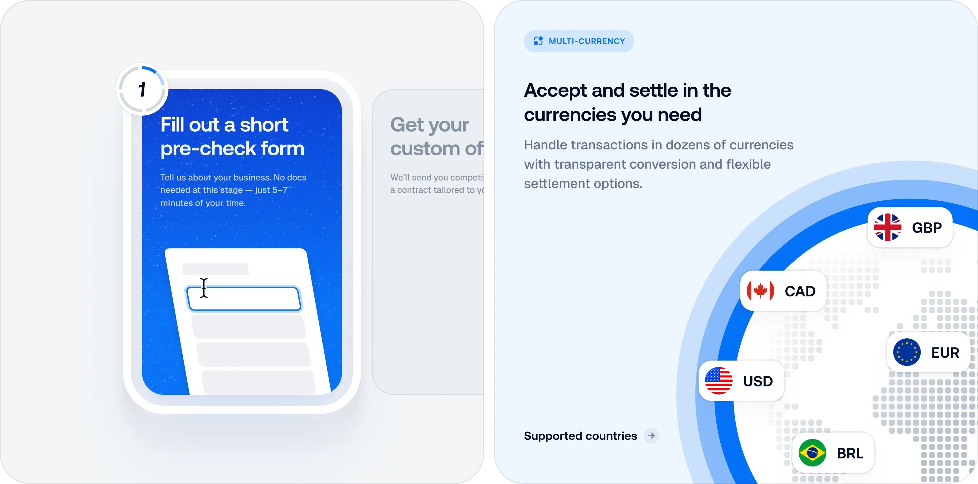
A step-by-step flow: fill out a short pre-check form, then accept and settle in the currencies you need
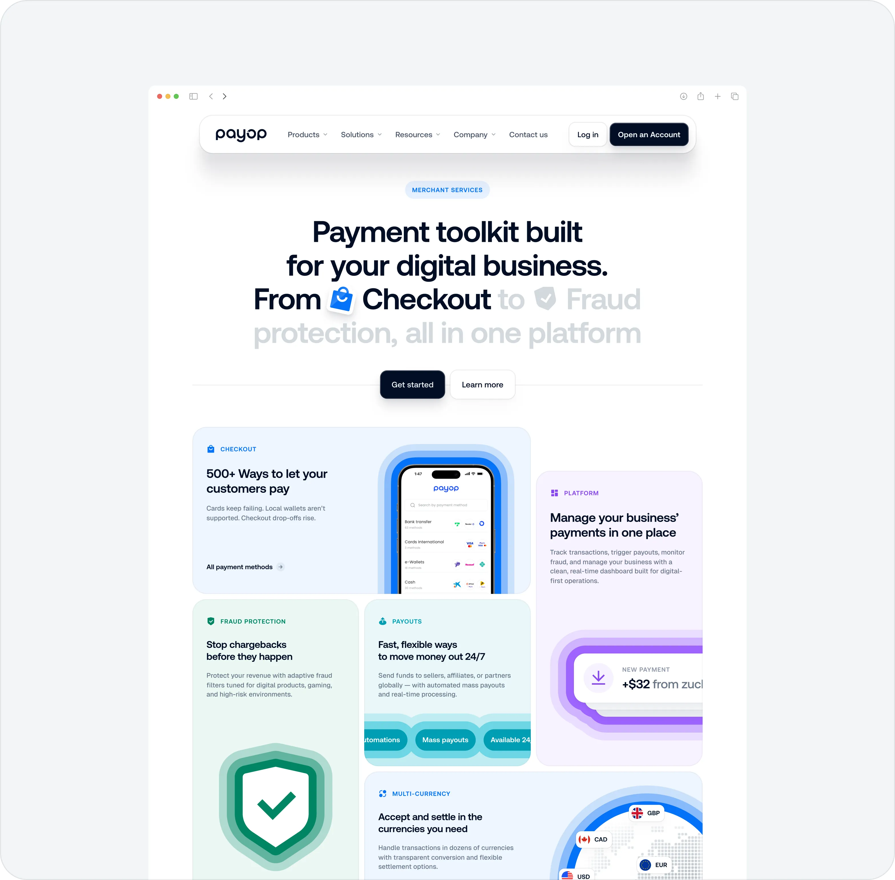
A long services page showing the toolkit, products and fraud protection
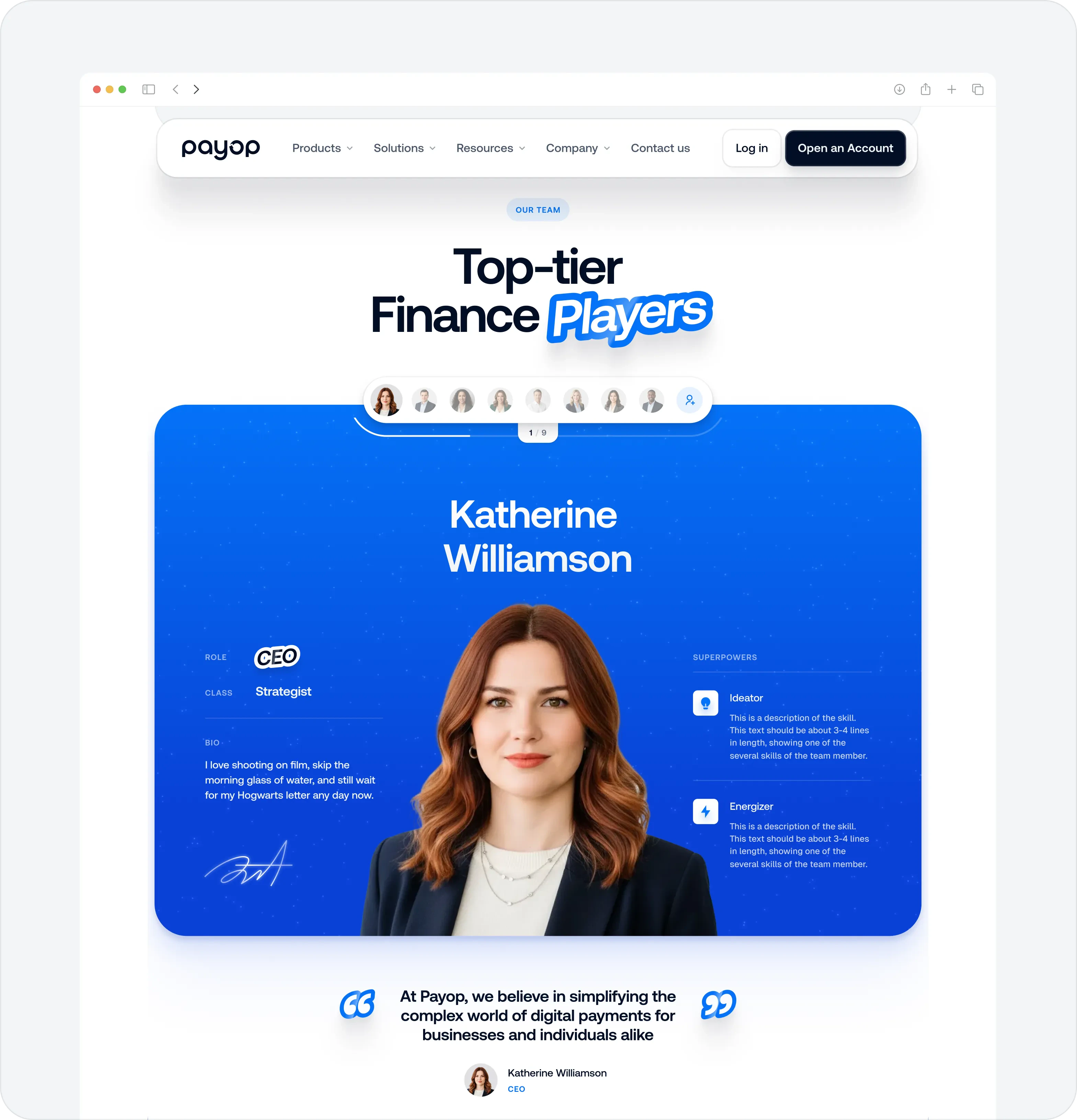
A team page: 'Top-tier Finance Players' with a profile card
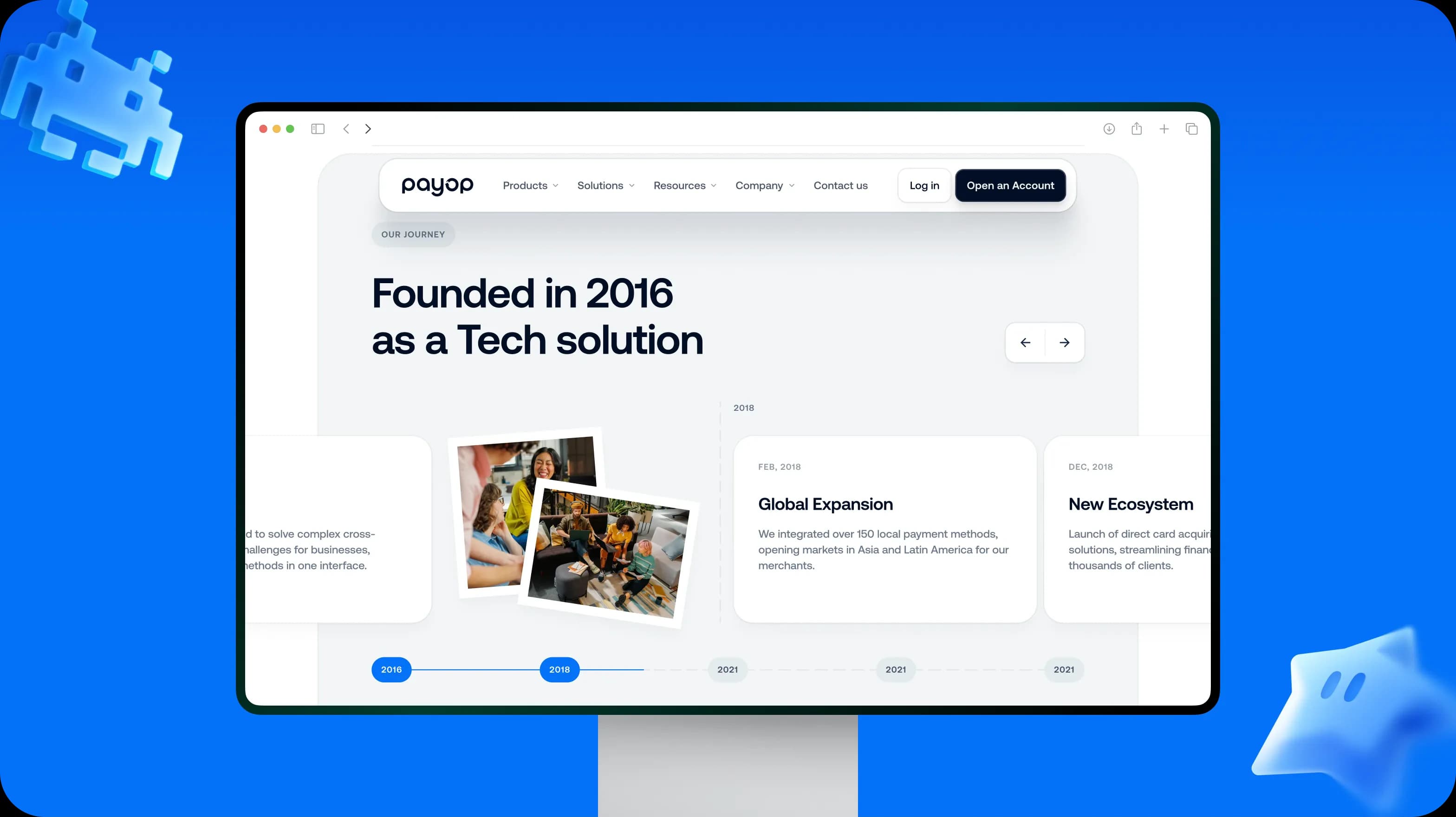
'Founded in 2016 as a Tech solution': a company timeline on a monitor

04Before and after

The same pages, before and after

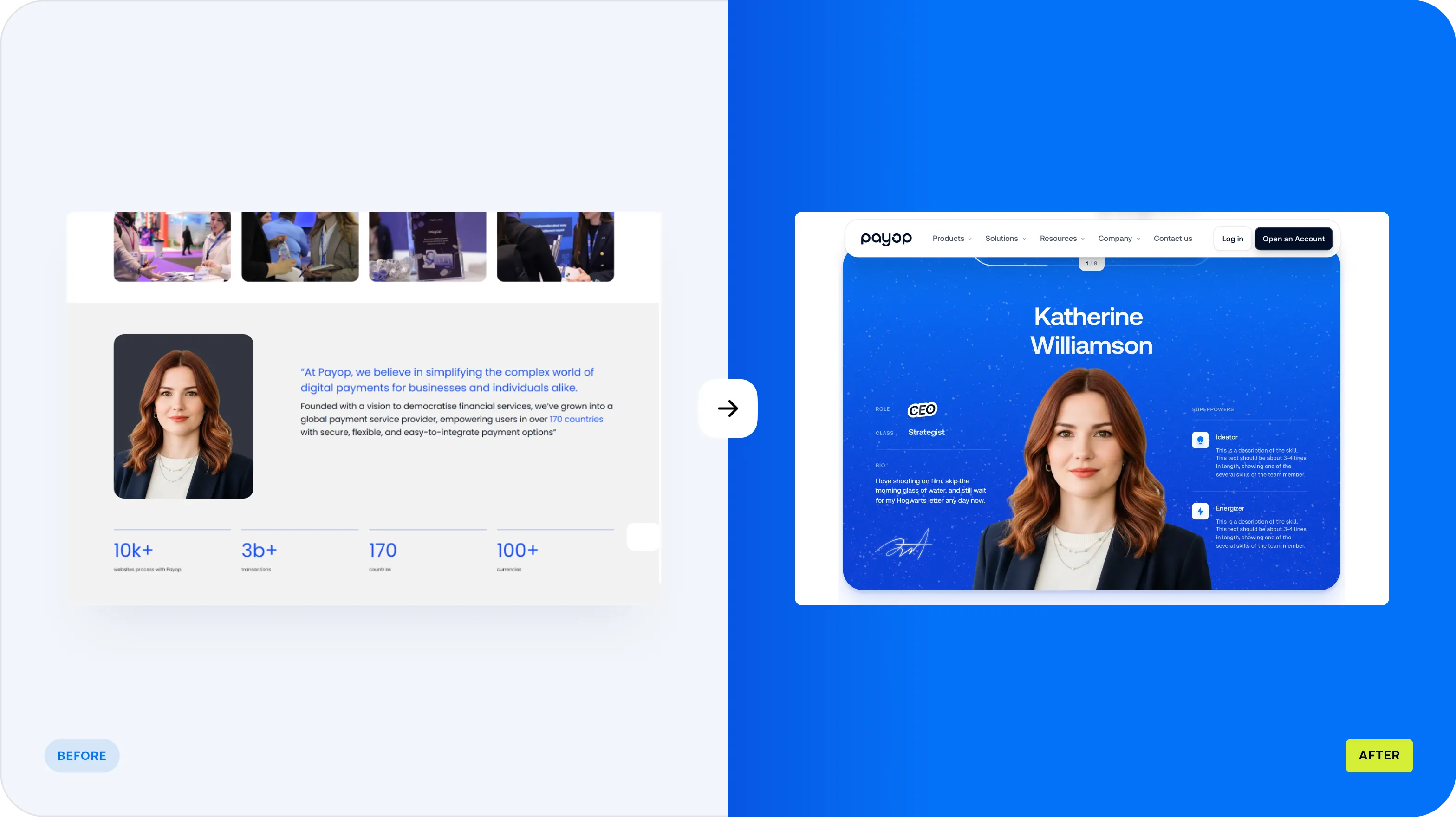
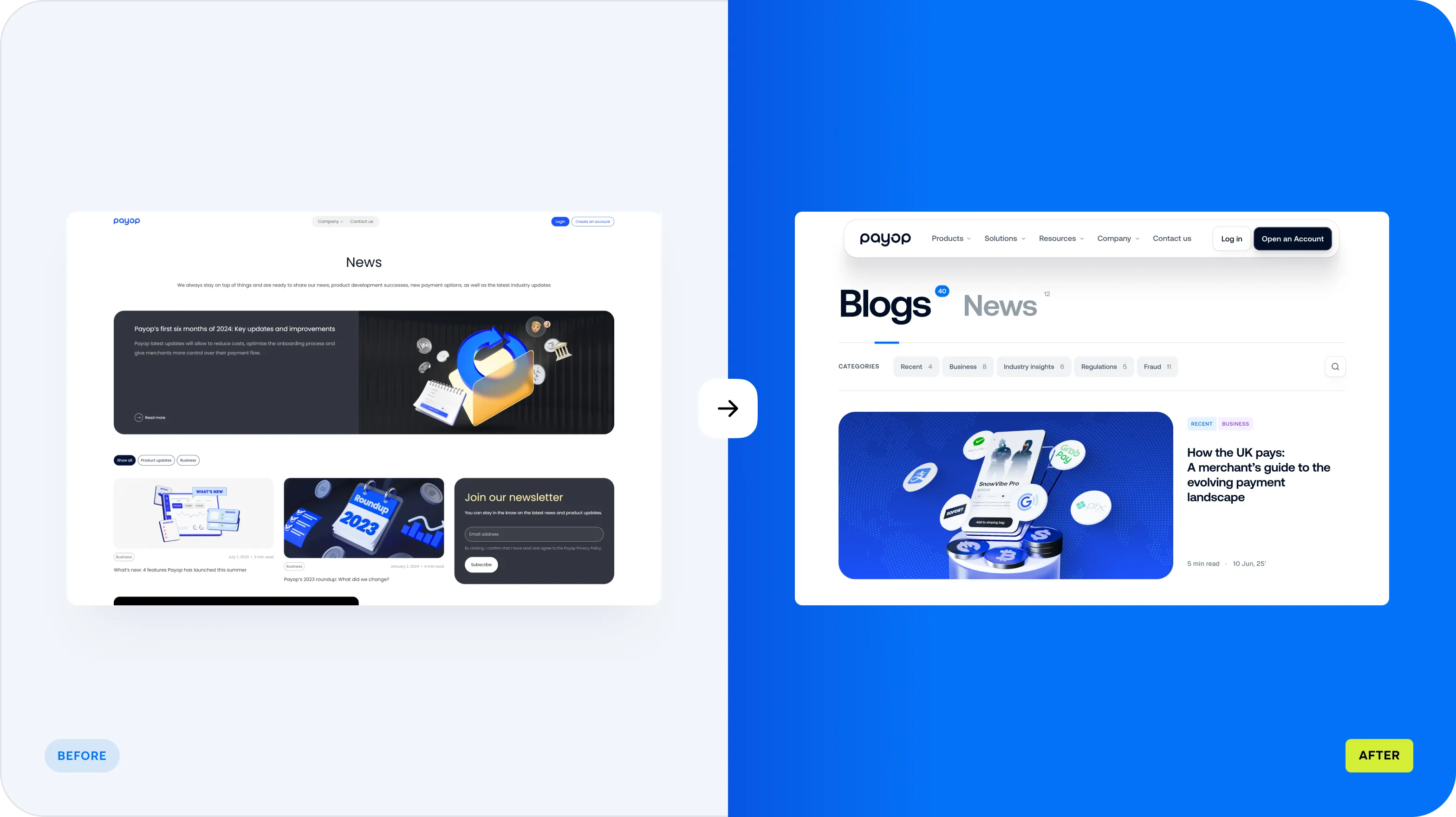
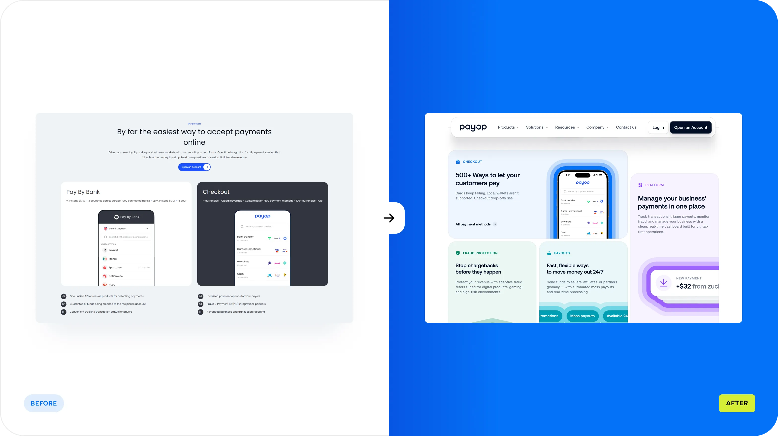
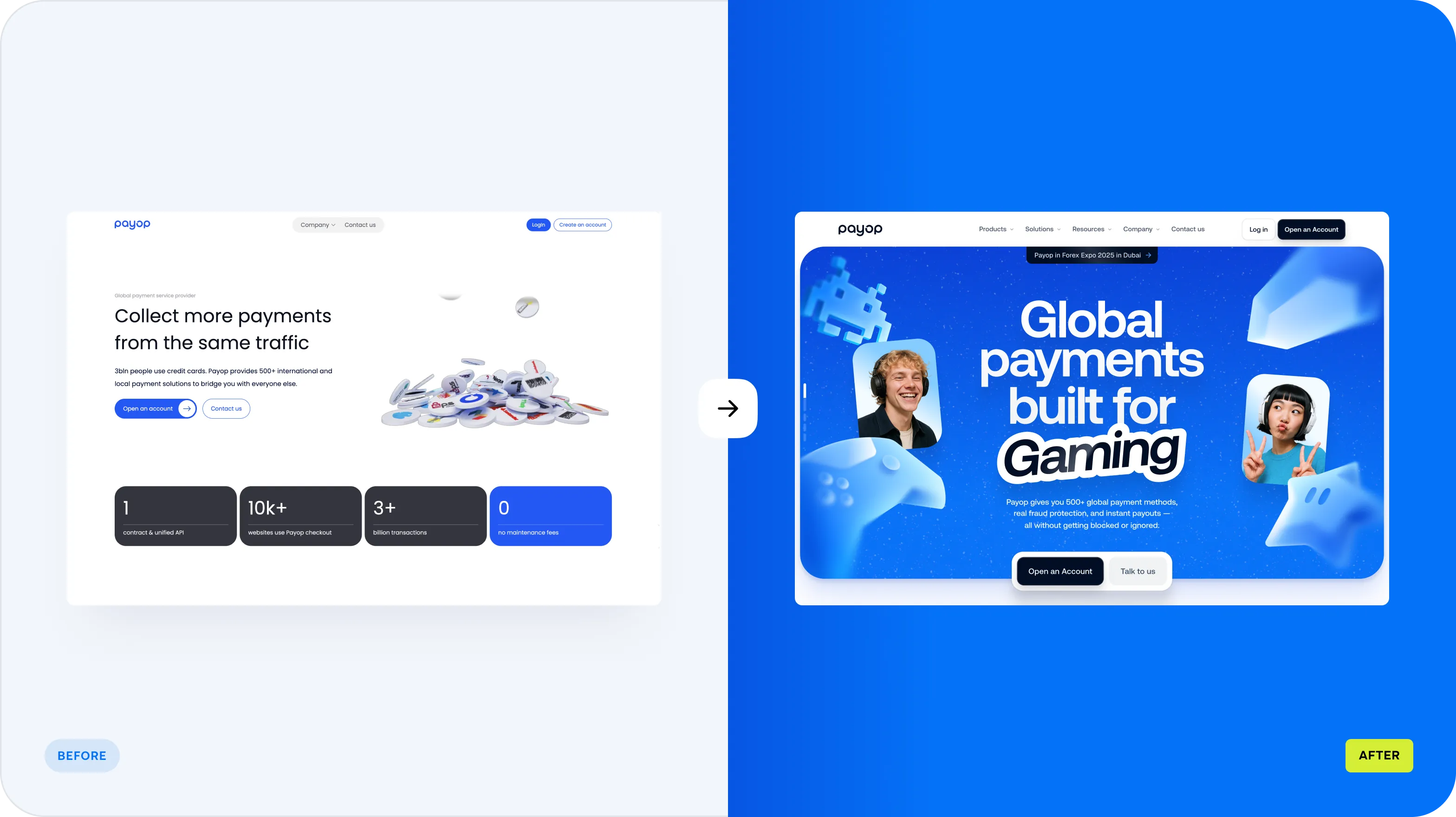
The old site was dark, dense and generic. The new one is bright, human and easier to scan, with one idea per section.
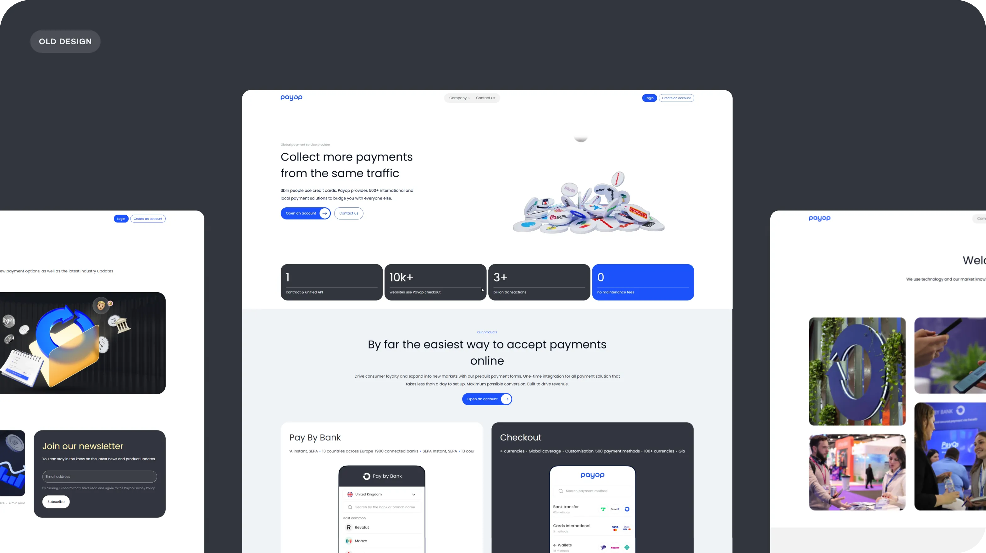
The previous Payop site: dark sections, tight text and small illustrations
Before and after: the homepage hero
Before and after: the team page
Before and after: the blog
Before and after: the product page

05Brand

Electric blue, playful 3D and clear type

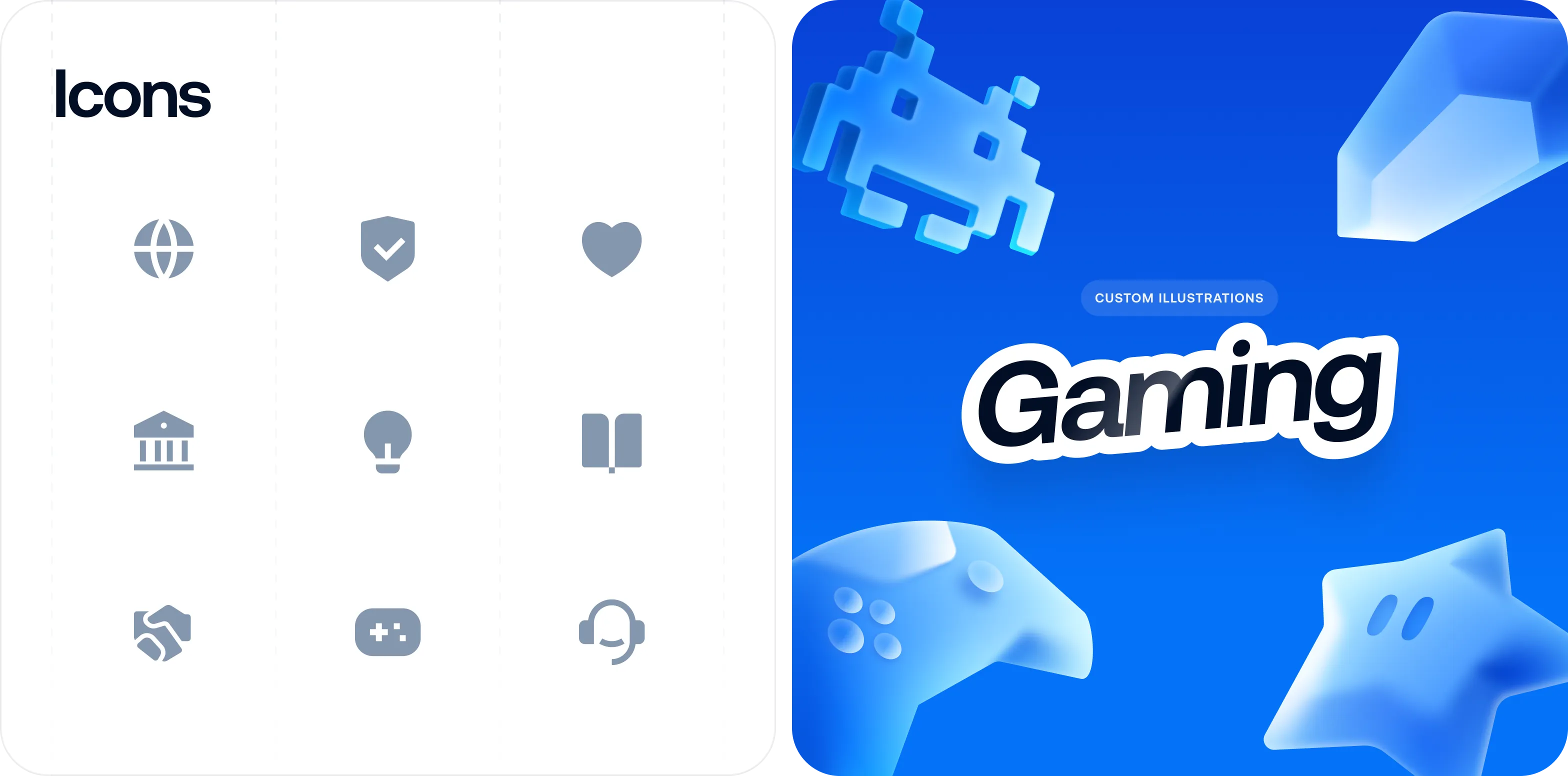
A saturated blue, soft cyan and violet lights and glossy 3D objects give a utility product some energy, while a clean type system keeps the information easy to read. Payments are serious, so the playfulness is in the visuals and never in the data.

Typography and colour palette: a headline style, body copy, blue, purple, cyan and green
A set of line icons beside a 3D 'Gaming' illustration with a pixel character
A tablet on a plain background showing the payment toolkit page
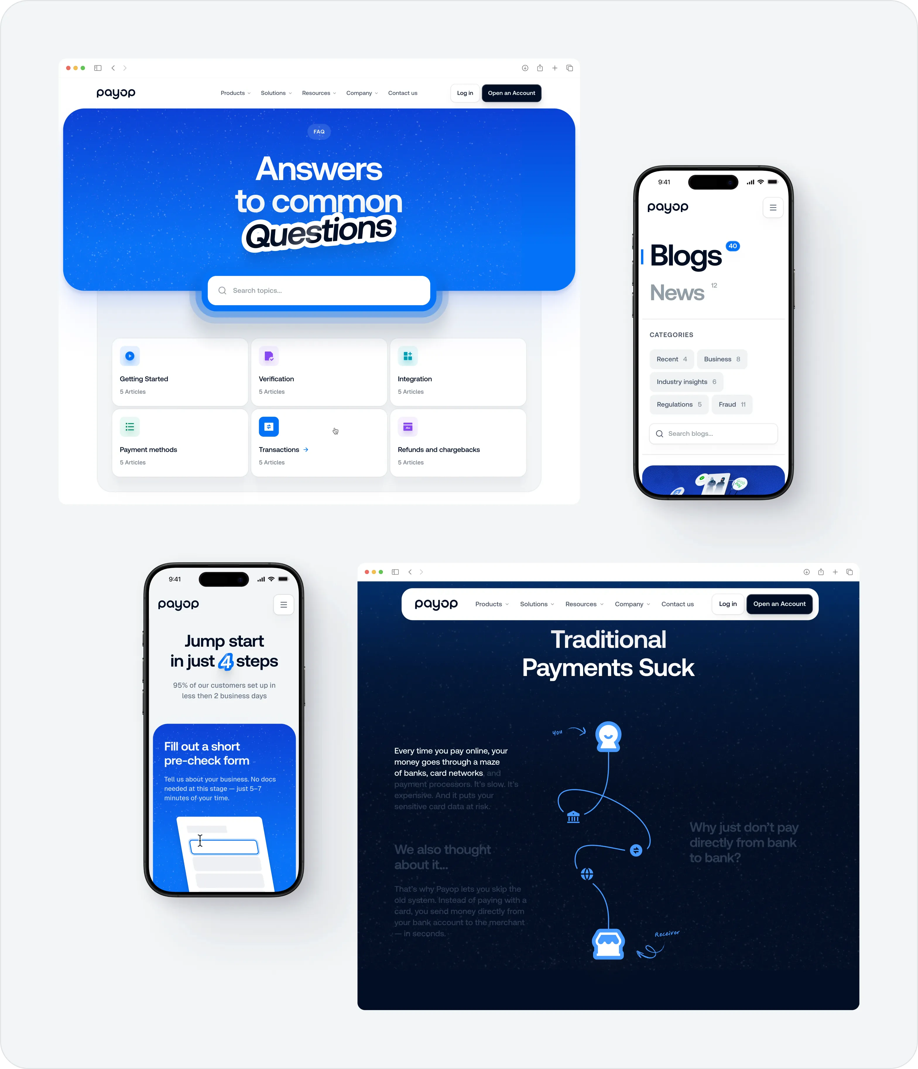
Desktop and mobile layouts: FAQ, blog and a 'Traditional Payments Suck' comparison

06Process

Researched first, built in 3 sprints

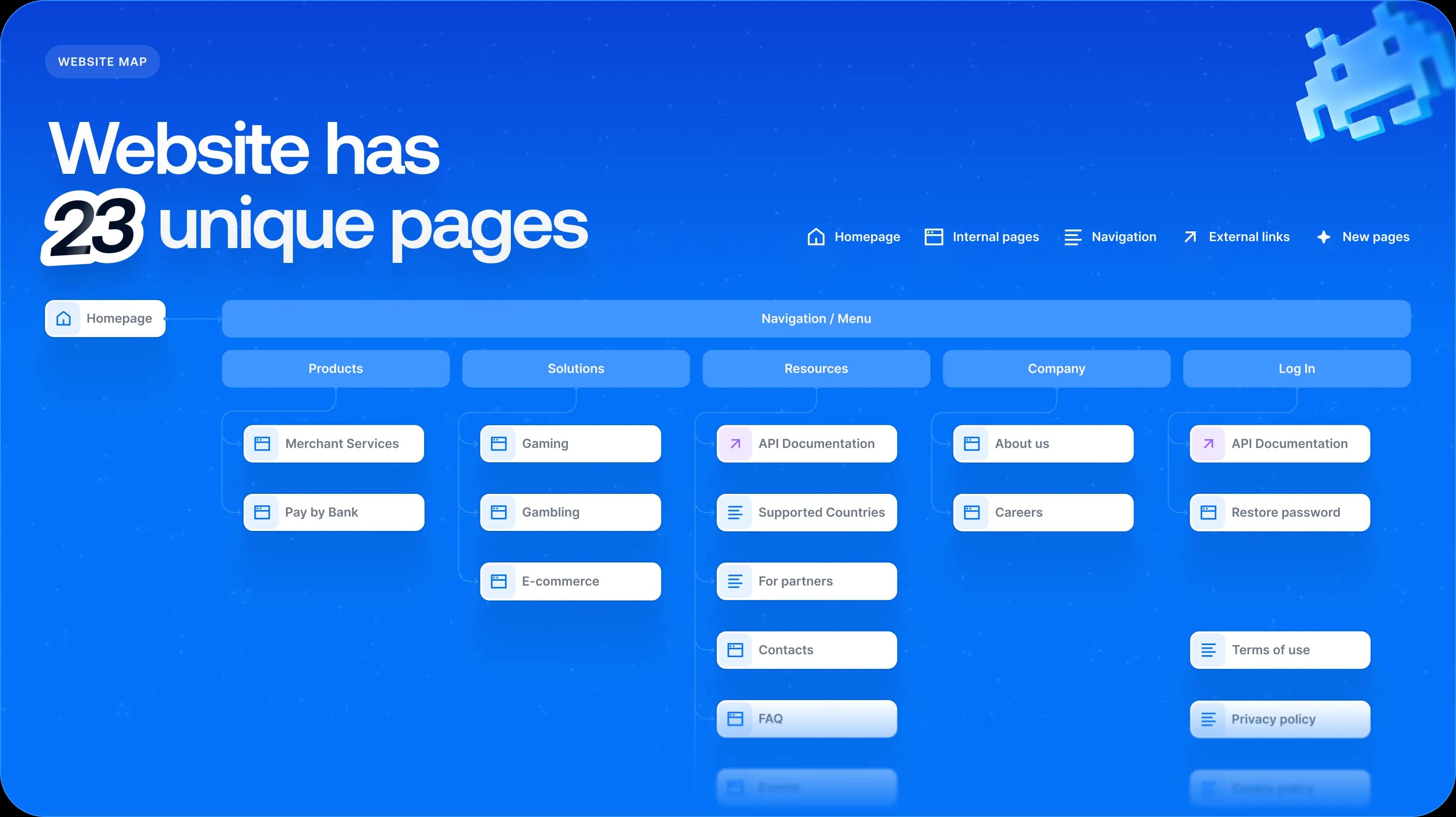
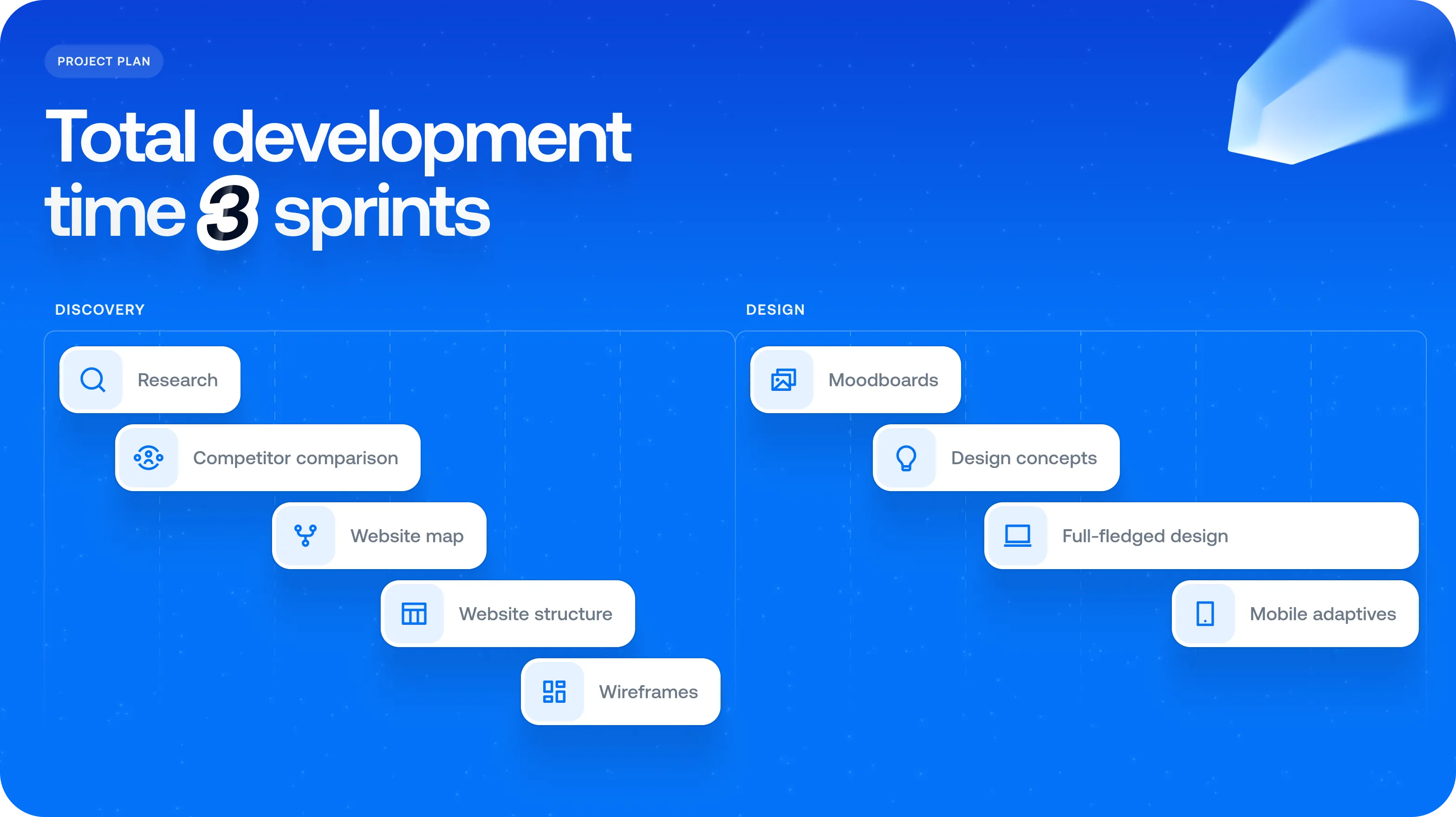
We started by comparing the platform against six direct competitors, then mapped a 23-page site and delivered it in three focused sprints: discovery, design and development.
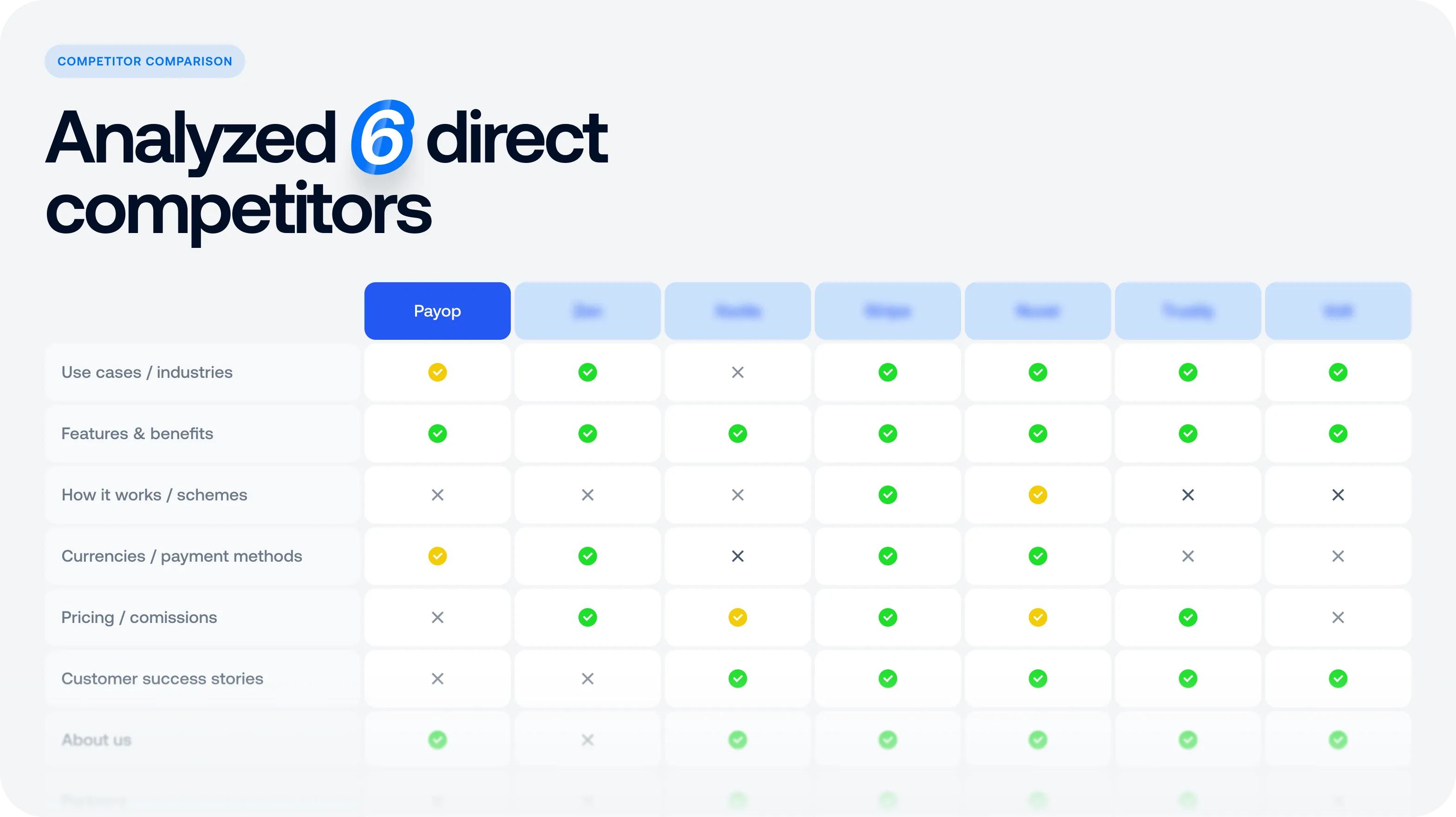
'Analyzed 6 direct competitors': a feature comparison table
'Total development time 3 sprints': discovery, design and development steps
'Website has 23 unique pages': a sitemap from the homepage

07Deliverables

Strategy

  • Competitor analysis
  • Site map and page narrative

Design

  • Website redesign
  • Industry pages
  • Typography and colour

Visuals

  • 3D illustration
  • Icon set
  • Interactive motion
Next case studyCompoundMaking healthcare insightfully honest.