01The challenge
A product that holds your most sensitive information has to feel calm before it asks for trust.
A tool for teams without a security department
Unraven helps small teams manage passwords, API keys and other shared credentials: storage, sharing, access controls and activity records in one product. Teams get a practical way to manage sensitive information without a long setup.
Security brands tend to pick one of two poses: fortress or toy. Small teams need neither. The brief was a name and identity that say, at a glance, serious enough to trust with a production key and simple enough for a team of five.
02Strategy
The keeper of every key.
The name and the idea work together: a raven is watchful and clever, and to unravel is to untangle. Together they describe a product that keeps your keys in order and your access clear. We wanted the brand to feel like a trusted custodian, calm, attentive and never alarmed.
03Identity
A name, a mark and a quiet palette
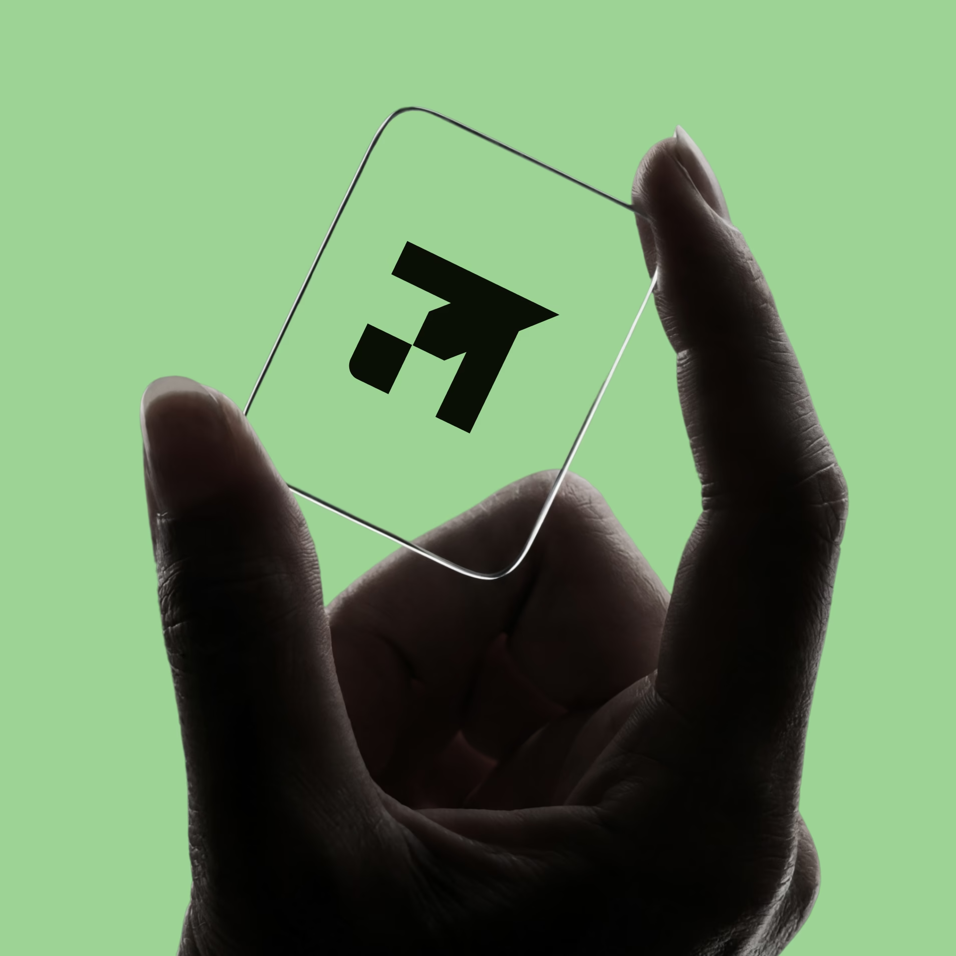
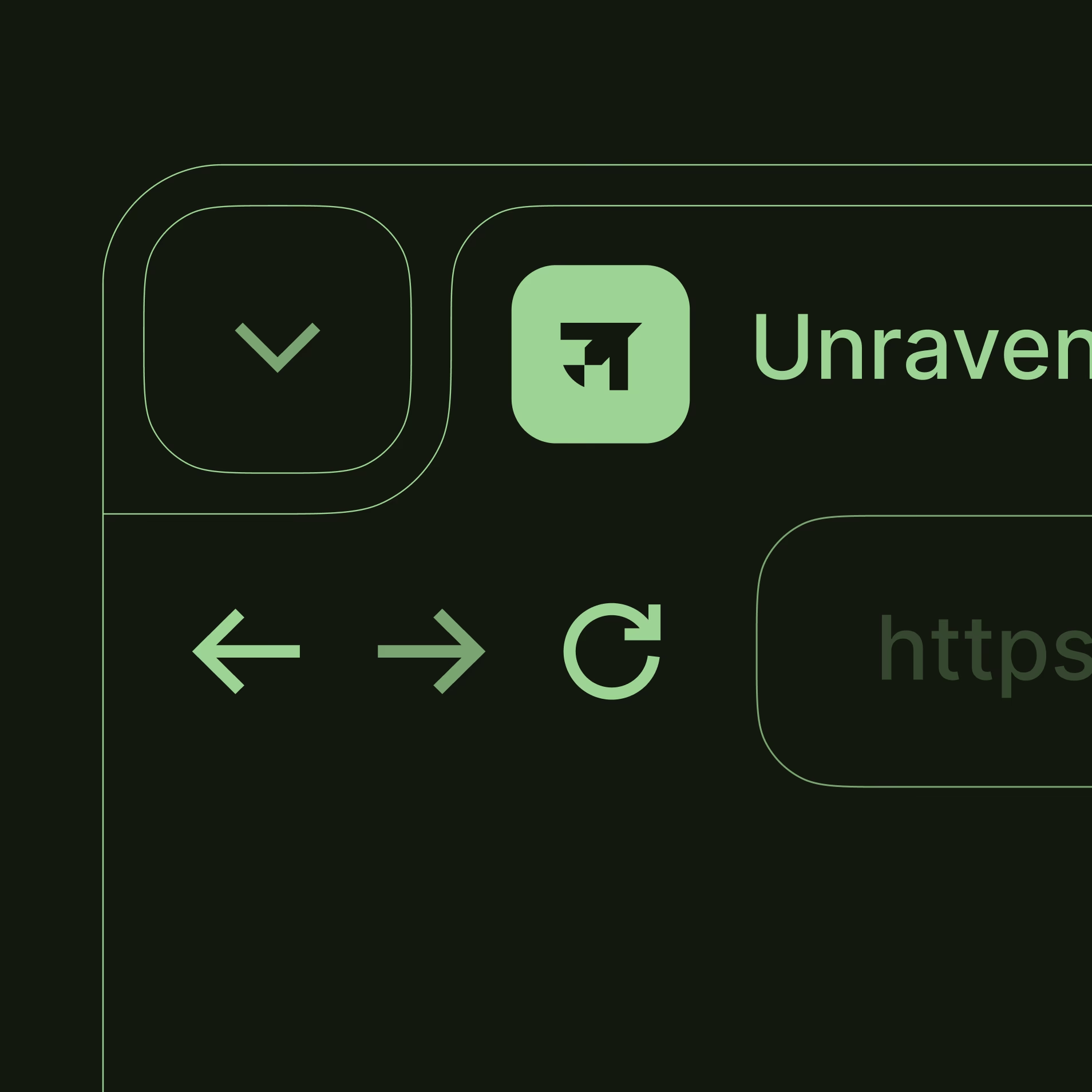
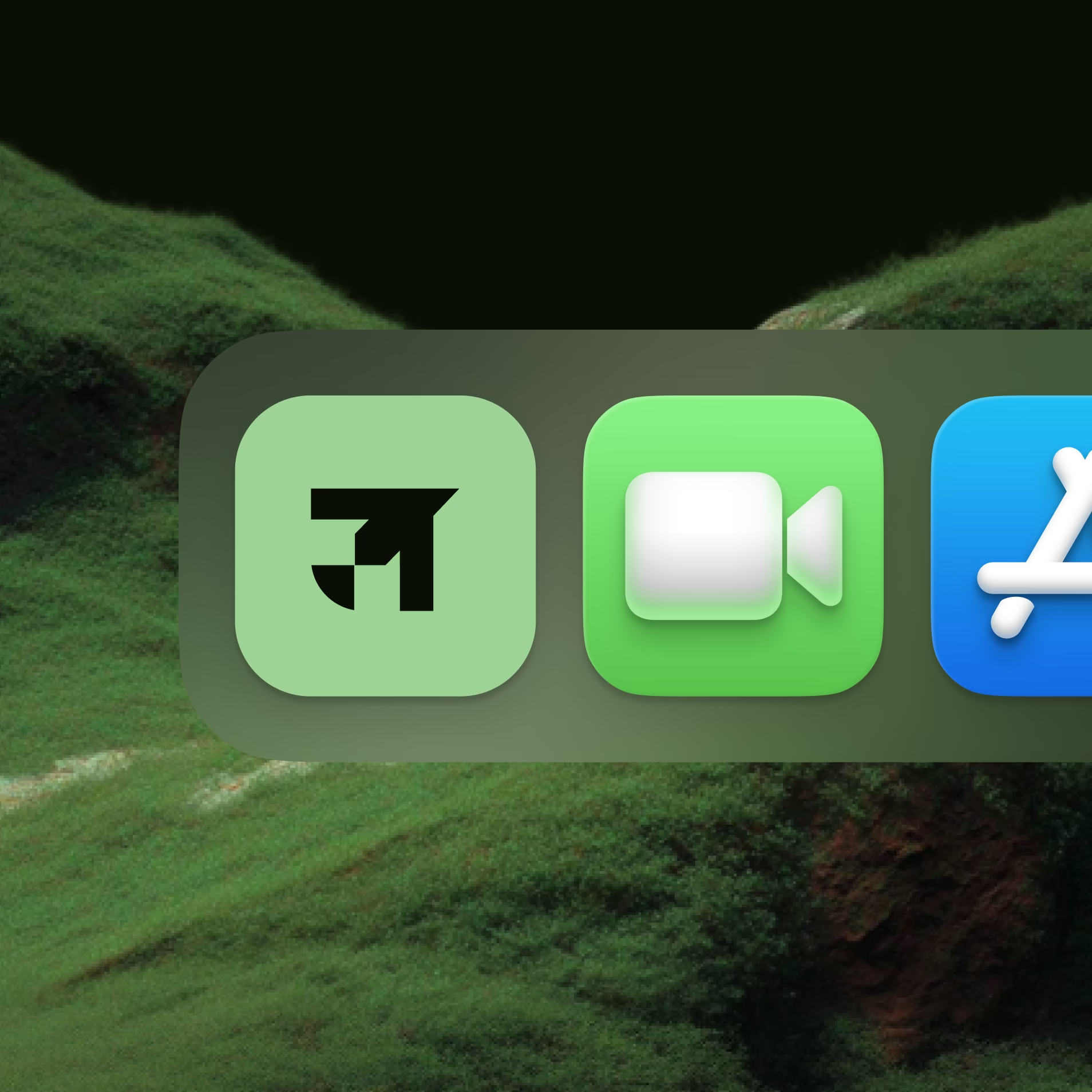
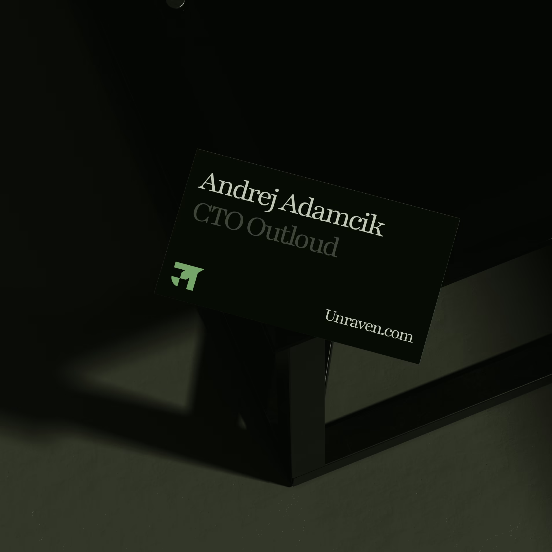
The mark is a single, confident shape in sage green that holds up on glass, on a browser tab and in a dock. Mossy hills and deep shadow give the identity a calm, grounded world, and a restrained palette keeps it feeling like a tool you could use all day instead of a warning sign.
04In the world
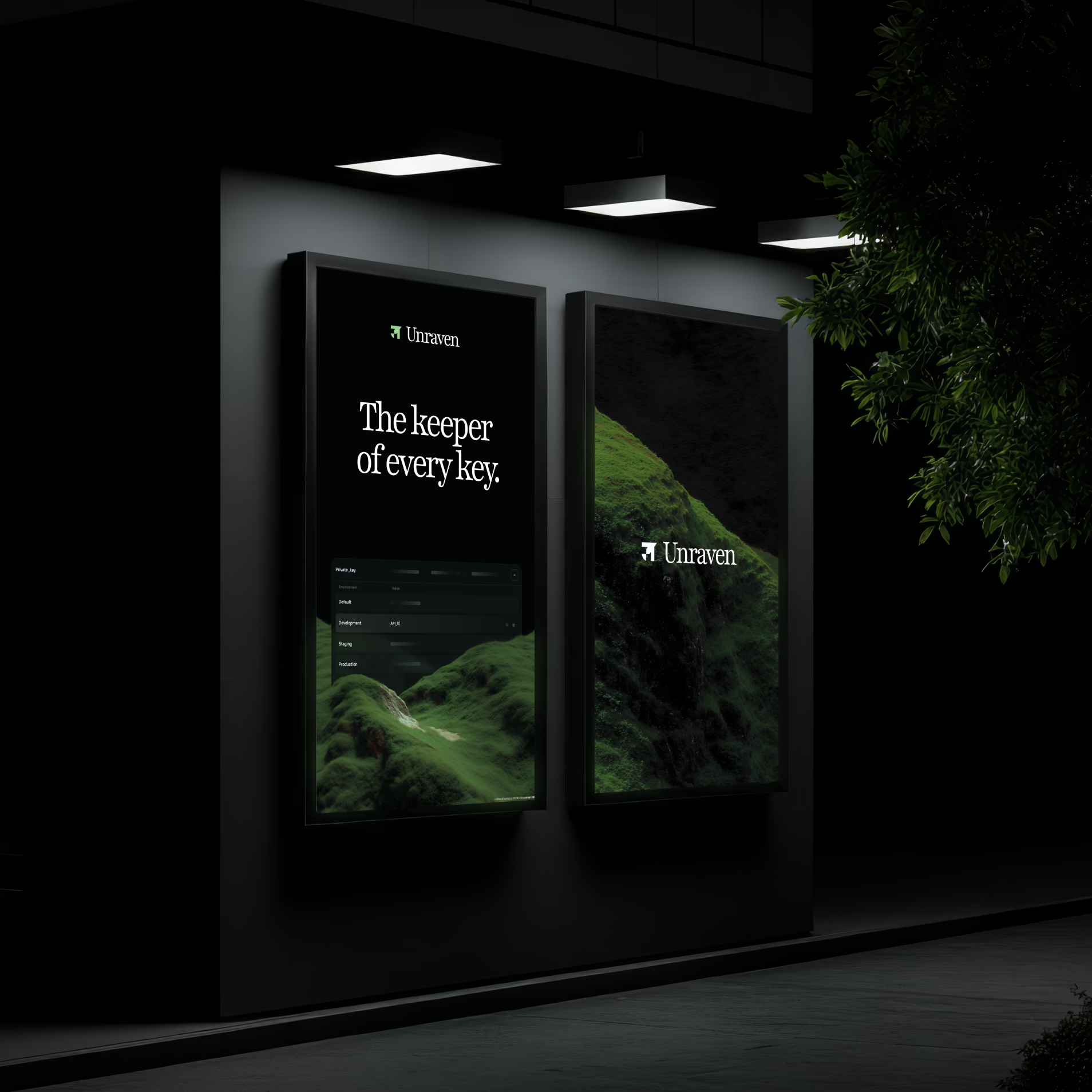
A brand that reads from the street
Out-of-home applications set the tone: dark, quiet and confident, with plain lines that say what the product does. A security product that whispers is more believable than one that shouts.

05In the product
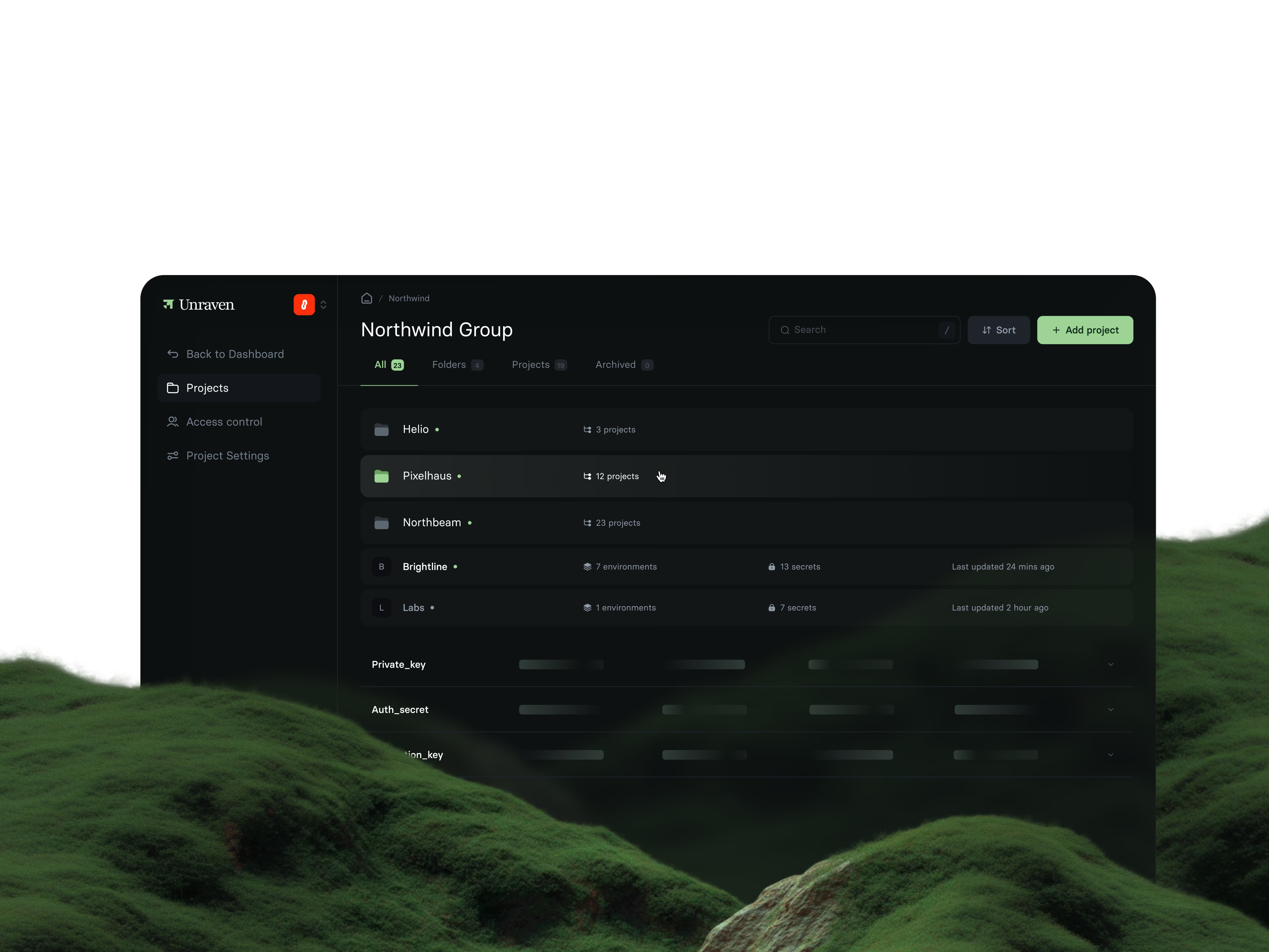
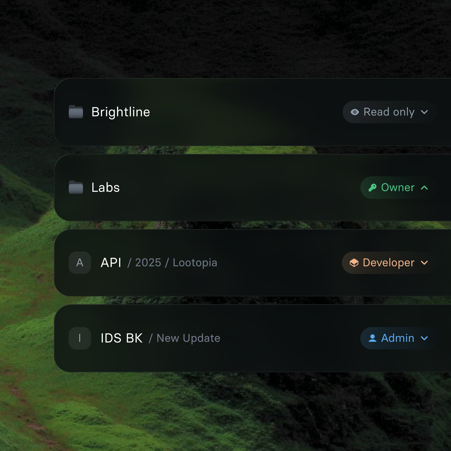
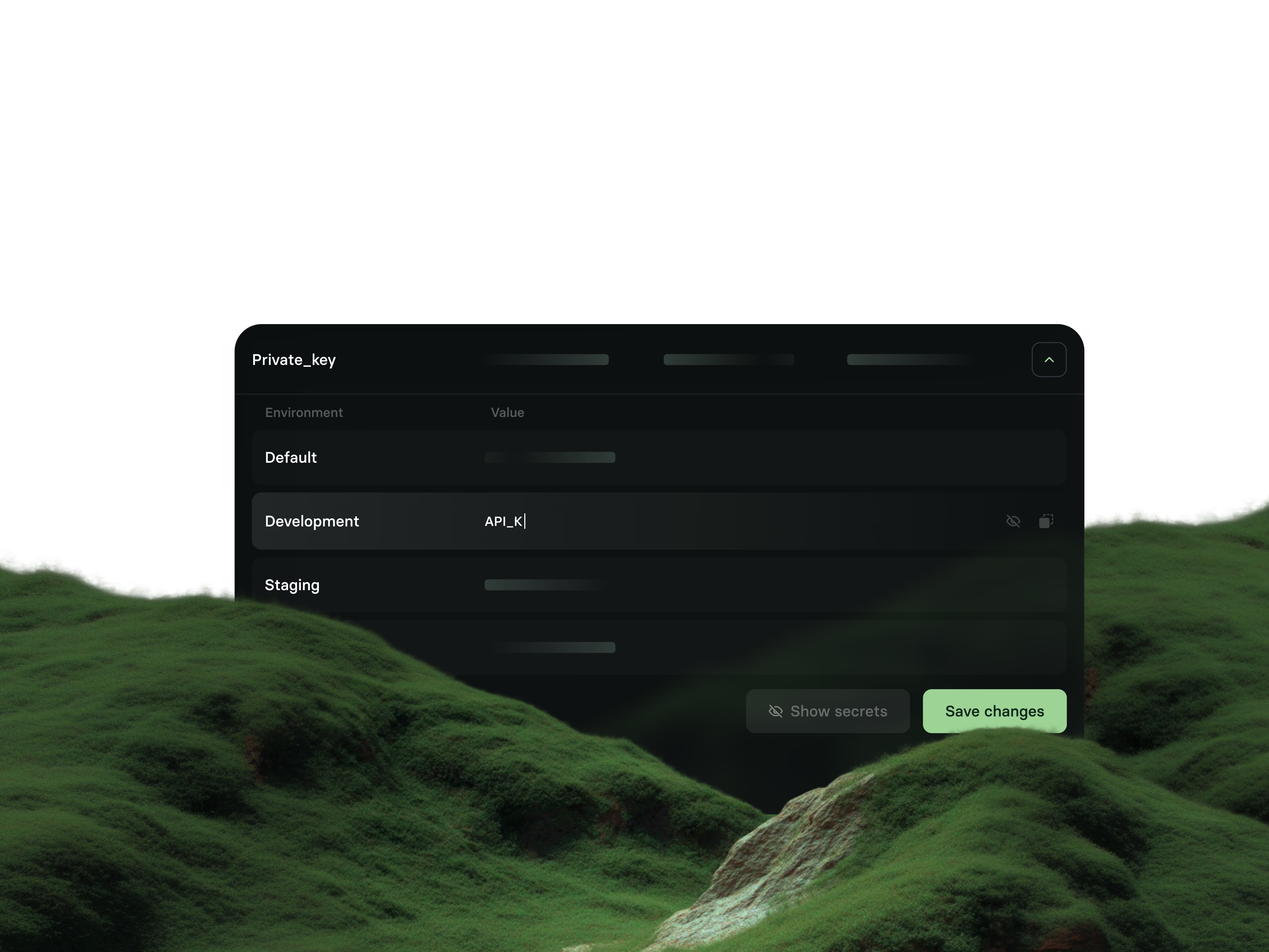
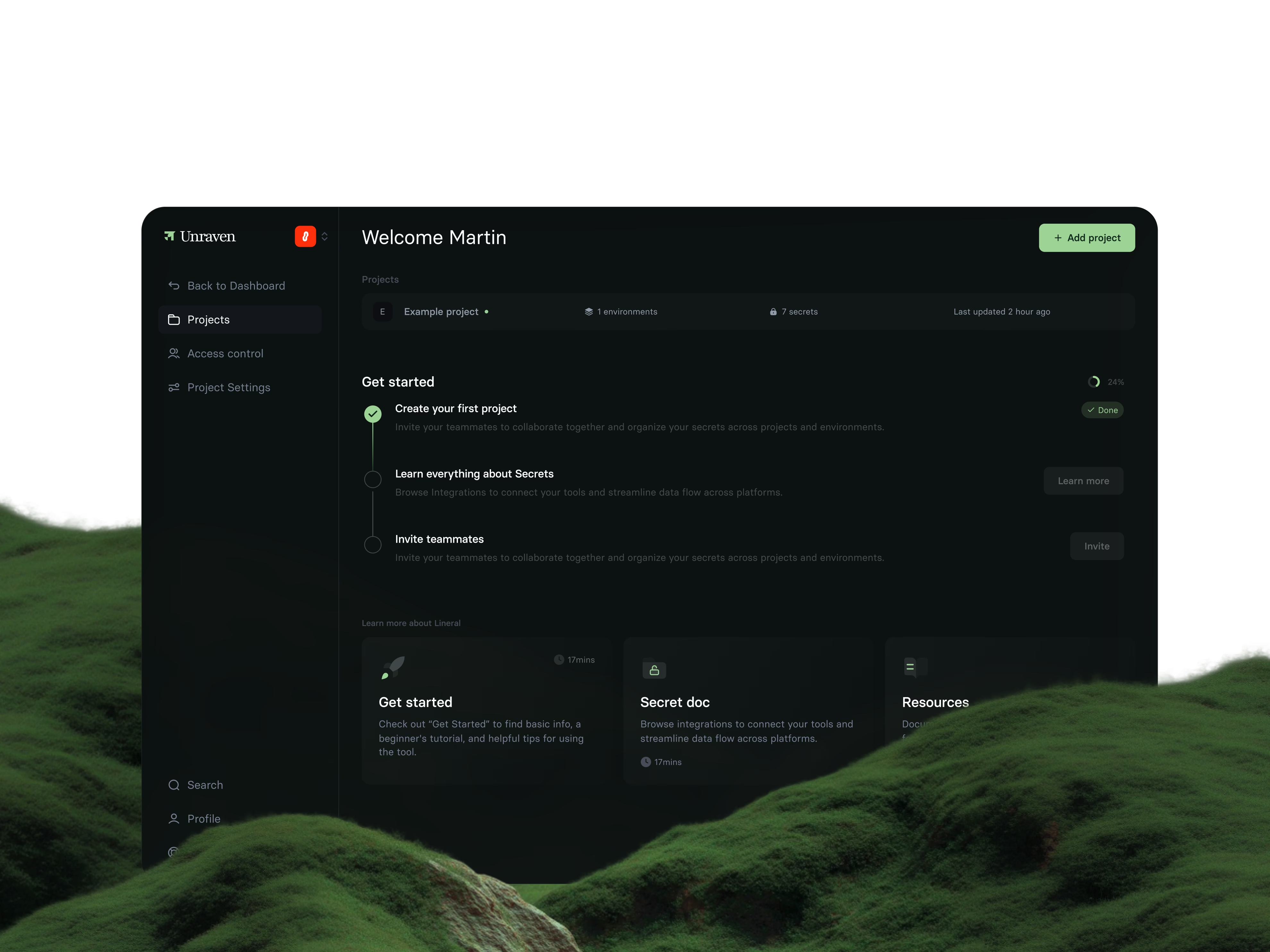
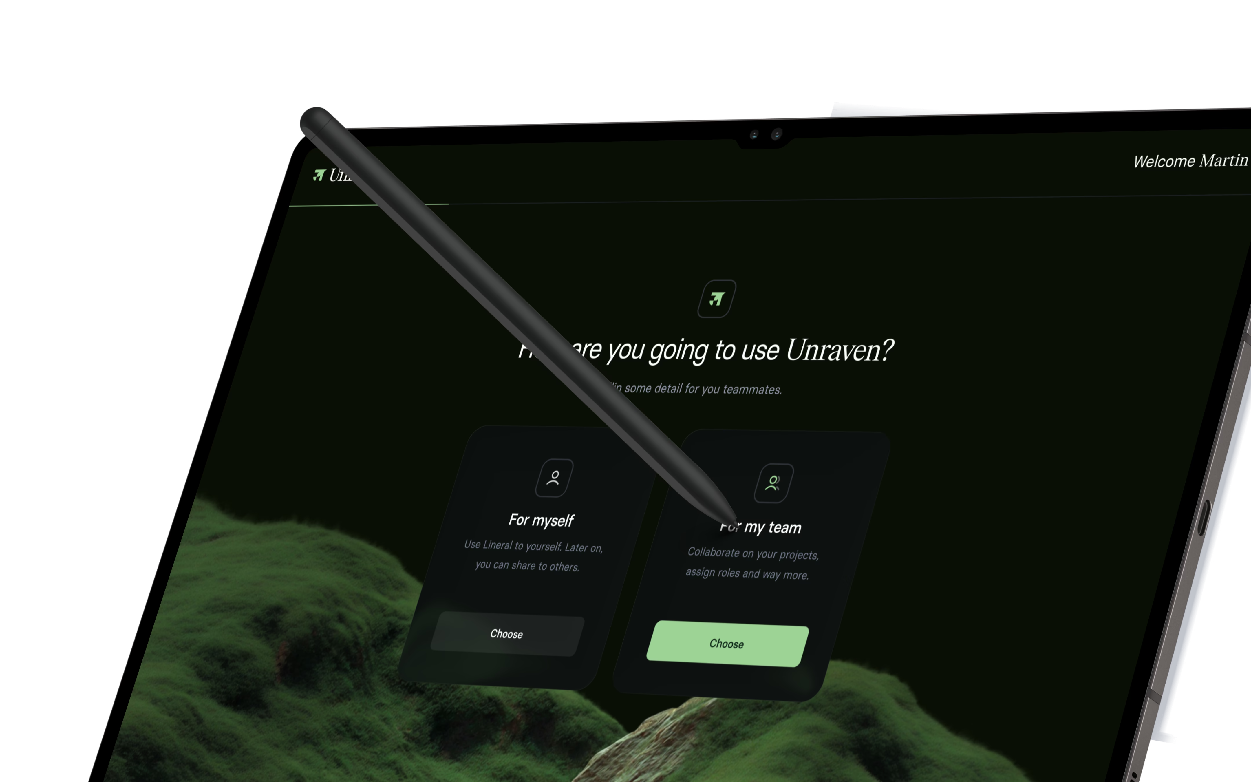
The brand carried into the interface
The same palette and calm run through the product interface, so the first login feels like the same place as the first poster. Consistency is part of trust: a brand that looks the same everywhere reads as one that behaves the same everywhere.
06Impact & proof
- 0
- Plaintext secrets exposed across vaults
- 100%
- End-to-end cryptographic key verification
- 3 weeks
- Full naming, brand identity and vault UI delivery
Security metrics published by Unraven across active cryptographic test suites as of 2025.
Naming
- Name
- Tagline: shared secrets, clear control
Identity
- Mark and wordmark
- Colour and imagery
- Business cards and icon
Applied
- Out-of-home posters
- Product interface styling